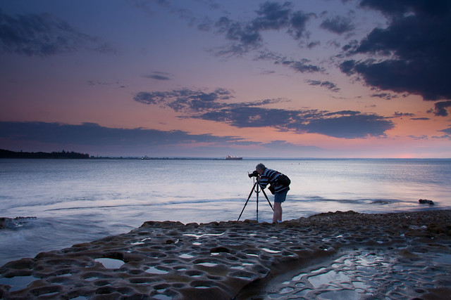
Jenno wrote:Good images Gerry...enhanced by some lovely green rocks in the foreground

The second image could be improved by evening up the exposure across the frame The RHS appears to be a lot darker than the rest of the image.
Like the way you have used the rock shelf in #1 to lead the eye into the image. Shame there wasnt any sky colour for #1...perhaps you could add some for impact

I love my green rocks, as you are probably well aware of

I agree with trying to draw out a bit more light in the second to even up the exposure

surenj wrote:#1 has great composition with the lines. I would like to see a calmer water version where the bottom is not too blurred. Watch that D-light slider though...ease up on it a little.
I like the blurred water verison better to be honest, I do have another version where teh water is more clear and you can see the detail in the underwater items - however the frame gets muddled as to where to look, the sharp distinct green rock amounst the unfocussed water really draws the viewer in and locks them there! the rest is complimentary and should not compete imo.
surenj wrote:#2 Looks very representative of what I saw that day. Loved those orange tones reflecting on the clouds. We don't have a good history with clouds but we seem to have improving on those lately...
yeah, sometimes the colours are intense and they do look fake, but I agree there was certianly alot of red in that sunset due the haze and teh picture is pretty close to what I saw.
surenj wrote:Where is the rest of them?
I am getting there, I have not had a spare moment to scratch myself.


 if your keen just PM - at the very worst, you will get a nice seaside walk..


 That Wedding photog had a big one too....

 I think that D-lighting or whatever you have done pre or post is just right...did you use a grad for this?
