.Peter
A discussion forum - and more - for users of Digital Single Lens Reflex cameras.
Photo critiqueModerators: Greg B, Nnnnsic, Geoff, Glen, gstark, Moderators
Forum rules
Please note that image critiquing is a matter of give and take: if you post images for critique, and you then expect to receive criticism, then it is also reasonable, fair and appropriate that, in return, you post your critique of the images of other members here as a matter of courtesy. So please do offer your critique of the images of others; your opinion is important, and will help everyone here enjoy their visit to far greater extent. Also please note that, unless you state something to the contrary, other members might attempt to repost your image with their own post processing applied. We see this as an acceptable form of critique, but should you prefer that others not modify your work, this is perfectly ok, and you should state this, either within your post, or within your signature. Images posted here should conform with the general forum guidelines. Image sizes should not exceed 950 pixels along the largest side (height or width) and typically no more than four images per post or thread. Please also ensure that you have a meaningful location included in your profile. Please refer to the FAQ for details of what "meaningful" is.
Previous topic • Next topic
5 posts
• Page 1 of 1
Photo critique
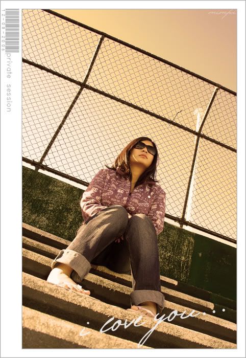
Just sharing this shot. this is what i did for my uni projects, i had to write about 2000 words on the composition
.Peter
Hey Peter..
I like it. I like the attention detail; the feet turned in, the general treatment. It's very good. The only niggle I have is the line of light on the girls face, once you notice it it keeps distracting! The framing with the barcode etc also adds an interesting element - was there a purpose behind it? I'm guessing you explained it somewhere in your 2000 words, just paste it in here!! Where are you studying?
beetleboy: thank you
i study in UniSa magill, are u a student also?
Ah, Magill Uni - you lucky bugger!! I hear the Male to Female ratio is very unbalanced there (or at least it was when I did my Bachelor of Vis Comm at UniSA City West)!!!
I finished my studies in '01. Working in a Commercial Studio in Norwood now (not far from your campus!)
Previous topic • Next topic
5 posts
• Page 1 of 1
|


