alright....
I always seem to get distracted...
but its hard not to when there is so much cool stuff to shoot around you.. I just can't help myself...
I think I was supposed to be...Moderators: Greg B, Nnnnsic, Geoff, Glen, gstark, Moderators
Forum rules
Please note that image critiquing is a matter of give and take: if you post images for critique, and you then expect to receive criticism, then it is also reasonable, fair and appropriate that, in return, you post your critique of the images of other members here as a matter of courtesy. So please do offer your critique of the images of others; your opinion is important, and will help everyone here enjoy their visit to far greater extent. Also please note that, unless you state something to the contrary, other members might attempt to repost your image with their own post processing applied. We see this as an acceptable form of critique, but should you prefer that others not modify your work, this is perfectly ok, and you should state this, either within your post, or within your signature. Images posted here should conform with the general forum guidelines. Image sizes should not exceed 950 pixels along the largest side (height or width) and typically no more than four images per post or thread. Please also ensure that you have a meaningful location included in your profile. Please refer to the FAQ for details of what "meaningful" is.
Previous topic • Next topic
11 posts
• Page 1 of 1
I think I was supposed to be...taking pics of the boats... (at Jet Sprint races)...but I sometimes get a little distracted...
alright.... I always seem to get distracted... but its hard not to when there is so much cool stuff to shoot around you.. I just can't help myself... 


 The last thing I want to do is hurt you... but it's still on the list...
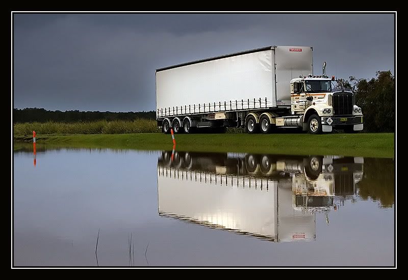
Nice reflection of the truck in 1.
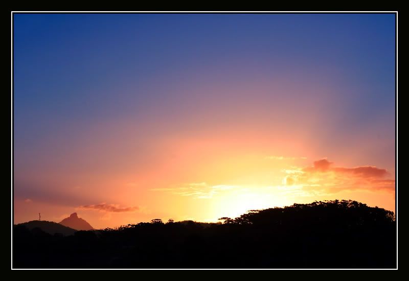
Nice colours in 4, but the overexposed sun seems to grab the attention. Can you darken the sun a bit? Russell
Nikon D700 // 50 1.4 // 70-200 2.8 VRII // 24-120 f4// Tamron 90 // SB-800 // 70-300G I'm on Redbubble too ... http://www.redbubble.com/people/rflower If you can make one of my photos look better and you have the inclination ... please do so.
...And maybe move the planet a bit to the left? (Sorry Russell, nothing wrong with your suggestion, just me) Sue, I love the first one, the truck, reflection, great sky/light. Fantastic. Greg - - - - D200 etc
Talent hits a target no one else can hit; Genius hits a target no one else can see. - Arthur Schopenhauer
Sue,
I like them all, especially the truck. I think it would be better if the truck was heading into the picture than leaving it - i.e. more space in front of it than behind. To me it looks like it is trying to escape.
Love the first one, it is a screamer, can we maybe clone out the orange marker posts? Maybe "Truckin' Life" or whatever would be interested in purchasing this? Fantastic image.
Ozi. President, A.A.A.A.A (Australian Association Against Acronym Abuse)
Canon EOS R6, RF 24-105 F4, RF 70-200 F4, RF 35mm F1.8, RF 16mm F2.8 "And ye shall know the truth, and the truth shall make you free." (John 8:32)
I'm with Max on the first one, including the orange posts. Sue, you know you're supposed to go and remove them before you shoot the image!
But I also love the way you've included the nude female in the fourth of these as well. Very subtle. g.
Gary Stark Nikon, Canon, Bronica .... stuff The people who want English to be the official language of the United States are uncomfortable with their leaders being fluent in it - US Pres. Bartlet
Beautiful work Sue - just what I'd expect. Who else but you would go to a Jet Boat Race and come back with outstanding shots of trucks and mountains?!
Simon
D300 l MB-D10 l D70 l SB-800 l 70-200 VR l TC 17-E l 18-70 f3.5-4.5 l 70-300 f4-5.6 l 50 f1.4 l 90 Macro f2.8 l 12-24 f4 http://www.redbubble.com/people/manta
Love the first one of the truck. Go Optimus Prime! No wait...
Hassy, Leica, Nikon, iPhone
Come follow the rabbit hole...
Previous topic • Next topic
11 posts
• Page 1 of 1
|