Fishing
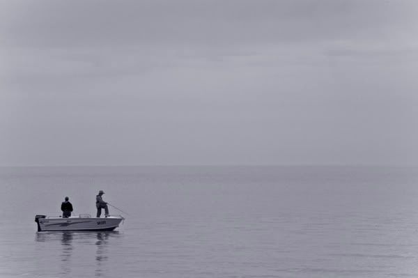
Solitary
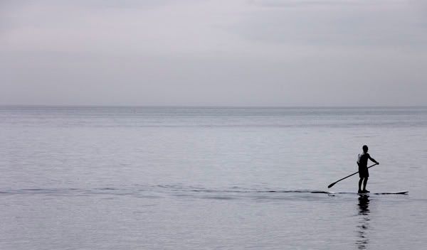
Up for a chat?
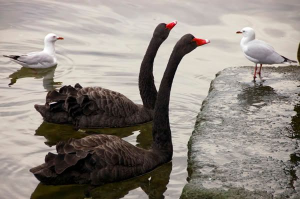
Looking at the preview they look a bit grey which is kind of moody for the first one, not too sure about the second.
Anyway, thanks for looking, comments and advice appreciated!
Cheers, Elena
More from Mexican MinimeetModerators: Greg B, Nnnnsic, Geoff, Glen, gstark, Moderators
Forum rules
Please note that image critiquing is a matter of give and take: if you post images for critique, and you then expect to receive criticism, then it is also reasonable, fair and appropriate that, in return, you post your critique of the images of other members here as a matter of courtesy. So please do offer your critique of the images of others; your opinion is important, and will help everyone here enjoy their visit to far greater extent. Also please note that, unless you state something to the contrary, other members might attempt to repost your image with their own post processing applied. We see this as an acceptable form of critique, but should you prefer that others not modify your work, this is perfectly ok, and you should state this, either within your post, or within your signature. Images posted here should conform with the general forum guidelines. Image sizes should not exceed 950 pixels along the largest side (height or width) and typically no more than four images per post or thread. Please also ensure that you have a meaningful location included in your profile. Please refer to the FAQ for details of what "meaningful" is.
Previous topic • Next topic
7 posts
• Page 1 of 1
More from Mexican MinimeetI had a great day last Sunday and took heaps of photos but am struggling a bit with getting them to look 'right'! Here are some that stood out for me subject-wise but I think still need some work:
Fishing  Solitary  Up for a chat?  Looking at the preview they look a bit grey which is kind of moody for the first one, not too sure about the second. Anyway, thanks for looking, comments and advice appreciated! Cheers, Elena
Re: More from Mexican MinimeetLooks like you didn't have any luck with the light that day... however you seemed to have handled it well.. I really liked the first two... although the second would have been more appealing if the subject was on the other side of the frame (so he somewhere to go to rather than out of the frame - does that make sense?).. the first one is my favourite.. and I hope you don't mind but I had a little play with it .. if it bothers you let me know and I'll remove it straight away.. I just applied the hollywood filter (in virtual photographer - a free photoshop plugin that you can download off the net).. and cropped it.. the halo aound the subject bothers me but thats just because its a small file..
 The last thing I want to do is hurt you... but it's still on the list...
Re: More from Mexican MinimeetIt is never a problem to experiment with my images!
I like what you have done with the first one, the boat is more prominent now and looks a lot better. With the second, I know it is 'bad' to have subjects 'leaving' an image but I thought maybe because the trail he was carving through the water was still visible and part of him it would kind of work but I guess not. Thanks for your comments! Elena
Re: More from Mexican Minimeet
You know.. there are all these 'rules' with photography... the rule of thirds.. the one about leaving room in the frame etc.. we've all heard them time and time again.. The thing is while generally its good to follow these 'rules' sometimes the image will work better if you ignore them.. photography is an art.. its our own interpretation of what we see and if the photographer likes it (and it isnt a paid job) then thats good enough.. and even though that shot doesn't fully work for me it doesn't mean that its not a good image or that others won't like it.. thats just my own pesonal opinion.. The last thing I want to do is hurt you... but it's still on the list...
Re: More from Mexican MinimeetI like the subjects but the light seems very flat, maybe you could increase the contrast and go black and white?
Re: More from Mexican MinimeetLove the isolation and tranquility of the first two. If you want to increase the contrast, use the curve adjustment in pshop. The basic way is to create a curve in the shape of a tilted S. From left to right, it controls the shadows to highlights of the image respectively.
 The purple tinge looks like it's due to the filter as you picked up the other day. Hassy, Leica, Nikon, iPhone
Come follow the rabbit hole...
Re: More from Mexican Minimeet
Anything is possible ... Thanks so much for the curve demo, it all makes a lot more sense when I can see what people are talking about, to me anyway! It does look more like what I was aiming for now and is probably more like what potato1 is getting at. And thank you also for your comments Elena
Previous topic • Next topic
7 posts
• Page 1 of 1
|