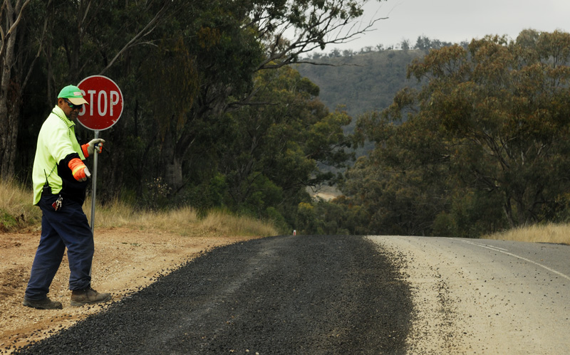
I have cropped slightly, and rather inexpertly cloned out a raindrop on the windscreen. Otherwise OOC.

C&C invited.
CommunicationModerators: Greg B, Nnnnsic, Geoff, Glen, gstark, Moderators
Forum rules
Please note that image critiquing is a matter of give and take: if you post images for critique, and you then expect to receive criticism, then it is also reasonable, fair and appropriate that, in return, you post your critique of the images of other members here as a matter of courtesy. So please do offer your critique of the images of others; your opinion is important, and will help everyone here enjoy their visit to far greater extent. Also please note that, unless you state something to the contrary, other members might attempt to repost your image with their own post processing applied. We see this as an acceptable form of critique, but should you prefer that others not modify your work, this is perfectly ok, and you should state this, either within your post, or within your signature. Images posted here should conform with the general forum guidelines. Image sizes should not exceed 950 pixels along the largest side (height or width) and typically no more than four images per post or thread. Please also ensure that you have a meaningful location included in your profile. Please refer to the FAQ for details of what "meaningful" is.
Previous topic • Next topic
5 posts
• Page 1 of 1
CommunicationI took this with a view to using it in the Weekender8 comp. Then I realised that the photo was too early to qualify. Damn.
I have cropped slightly, and rather inexpertly cloned out a raindrop on the windscreen. Otherwise OOC.  C&C invited. Greg
It's easy to be good... when there is nothing else to do
Re: CommunicationGreg,
I like this a lot. Well captured. g.
Gary Stark Nikon, Canon, Bronica .... stuff The people who want English to be the official language of the United States are uncomfortable with their leaders being fluent in it - US Pres. Bartlet
Lets play "spot the edit"!
Ok, after looking hard for a few minutes, was it below his right foot?
Re: Lets play "spot the edit"!
No. Hey this could become a new "Spot the ball competition" Any other guesses? I will post the original in a day or so to give the answer. Greg
It's easy to be good... when there is nothing else to do
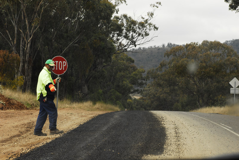
Re: CommunicationThe original:
 This is the OOC JPG. Simply resized. (I usually shoot JPG+RAW) Greg
It's easy to be good... when there is nothing else to do
Previous topic • Next topic
5 posts
• Page 1 of 1
|