|
Got a thin skin? Then look elsewhere. Post a link to an image that you've made, and invite others to offer their critiques. Honesty is encouraged, but please be positive in your constructive criticism. Flaming and just plain nastiness will not be tolerated. Please note that this is not an area for you to showcase your images, nor is this a place for you to show-off where you have been. This is an area for you to post images so that you may share with us a technique that you have mastered, or are trying to master. Typically, no more than about four images should be posted in any one post or thread, and the maximum size of any side of any image should not exceed 950 px.
Moderators: Greg B, Nnnnsic, Geoff, Glen, gstark, Moderators
Forum rules
Please note that image critiquing is a matter of give and take: if you post images for critique, and you then expect to receive criticism, then it is also reasonable, fair and appropriate that, in return, you post your critique of the images of other members here as a matter of courtesy. So please do offer your critique of the images of others; your opinion is important, and will help everyone here enjoy their visit to far greater extent.
Also please note that, unless you state something to the contrary, other members might attempt to repost your image with their own post processing applied. We see this as an acceptable form of critique, but should you prefer that others not modify your work, this is perfectly ok, and you should state this, either within your post, or within your signature.
Images posted here should conform with the general forum guidelines. Image sizes should not exceed 950 pixels along the largest side (height or width) and typically no more than four images per post or thread.
Please also ensure that you have a meaningful location included in your profile. Please refer to the FAQ for details of what "meaningful" is.
 by norwest on Thu Aug 05, 2010 7:18 pm by norwest on Thu Aug 05, 2010 7:18 pm
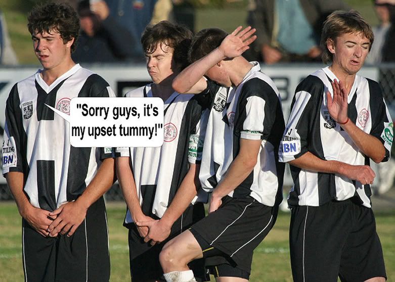
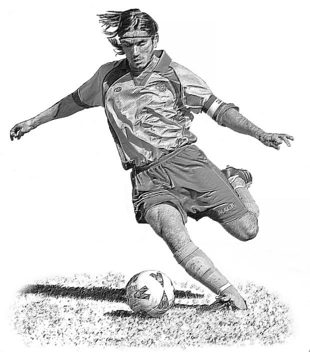
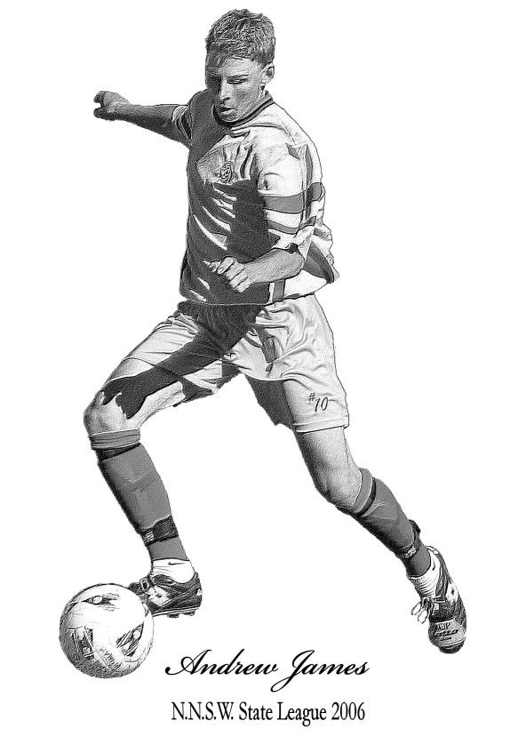
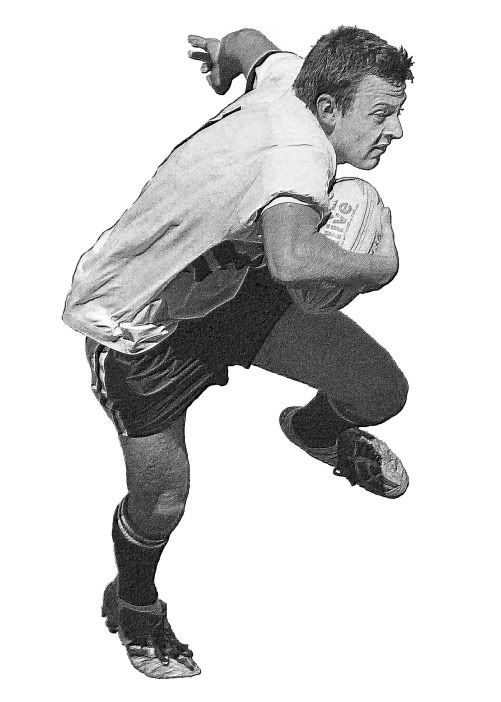
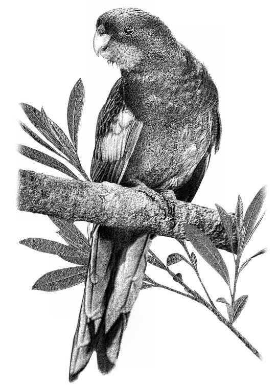
Something different from the norm and I hope not out of order. Before we moved to Woop woop, I posted a regular Pic of the week on my sports photography website, (now deceased) for a bit of humour. It was well received by players ect, so I kept it up, and there' was always a shot or three that could be twisted to find some humour. The one below, is a set defensive wall for a free kick in state league soccer, with the players reacting to the ball about to smash them. The shots are all from 2004-2006 period. Self explained  Something that was quite popular, sales wise, were action shots layered with background removed, converted to a pencil sketch, printed on grained, off white cotton papers and black framed with a black edged white mat.  
-
norwest
- Member
-
- Posts: 265
- Joined: Mon Oct 13, 2008 3:12 pm
- Location: Namoi Valley North West NSW
 by Marvin on Thu Aug 05, 2010 8:45 pm by Marvin on Thu Aug 05, 2010 8:45 pm
Haha, love the first one!
Nikon D7000
-

Marvin
- Senior Member
-
- Posts: 1486
- Joined: Tue Aug 10, 2004 9:33 pm
- Location: Back in the hot Riverland, SA.
 by aim54x on Thu Aug 05, 2010 9:46 pm by aim54x on Thu Aug 05, 2010 9:46 pm
I can see why that conversion is popular sales wise....I'd want one!
Cameron Nikon F/Nikon 1 | Hasselblad V/XPAN| Leica M/LTM |Sony α/FE/E/Maxxum/M42Wishlist Nikkor 24/85 f/1.4| Fuji Natura BlackScout-Images | Flickr | 365Project
-

aim54x
- Senior Member
-
- Posts: 7305
- Joined: Fri Feb 01, 2008 10:13 pm
- Location: Penshurst, Sydney
-
 by surenj on Fri Aug 06, 2010 2:47 pm by surenj on Fri Aug 06, 2010 2:47 pm
Great idea with the pencil sketches. How long do you take to do one? It looks like moderate amounts of work. (esp masking that hair) 20 minutes per picture?
-

surenj
- Senior Member
-
- Posts: 7197
- Joined: Fri Sep 15, 2006 8:21 pm
- Location: Artarmon NSW
 by Big V on Fri Aug 06, 2010 5:51 pm by Big V on Fri Aug 06, 2010 5:51 pm
The pencil process suits these shots really well.
Canon
-

Big V
- Senior Member
-
- Posts: 2301
- Joined: Mon Apr 18, 2005 1:37 am
- Location: Adelaide
 by norwest on Sun Aug 08, 2010 3:07 pm by norwest on Sun Aug 08, 2010 3:07 pm
surenj wrote:Great idea with the pencil sketches. How long do you take to do one? It looks like moderate amounts of work. (esp masking that hair) 20 minutes per picture?
I wish. Being careful and thorough, but not too thorough relative to the required pencil sketch appearance, meant a minimum of an hour with most. The hair and hands was always the pain.  And not limited to people. 
-
norwest
- Member
-
- Posts: 265
- Joined: Mon Oct 13, 2008 3:12 pm
- Location: Namoi Valley North West NSW
 by aim54x on Sun Aug 08, 2010 10:14 pm by aim54x on Sun Aug 08, 2010 10:14 pm
That last parrot looks like it has come out of an old text.
Cameron Nikon F/Nikon 1 | Hasselblad V/XPAN| Leica M/LTM |Sony α/FE/E/Maxxum/M42Wishlist Nikkor 24/85 f/1.4| Fuji Natura BlackScout-Images | Flickr | 365Project
-

aim54x
- Senior Member
-
- Posts: 7305
- Joined: Fri Feb 01, 2008 10:13 pm
- Location: Penshurst, Sydney
-
 by norwest on Mon Aug 09, 2010 1:02 pm by norwest on Mon Aug 09, 2010 1:02 pm
aim54x wrote:That last parrot looks like it has come out of an old text.
That's what I aimed for and hopeful achieved. It's on cotton and framed behind a black mat in a an old antique dark wooden frame. Just for something different on the wall. The parrit was shot at Barrington in the Hunter Valley. Some members would be quite familiar with the area.
-
norwest
- Member
-
- Posts: 265
- Joined: Mon Oct 13, 2008 3:12 pm
- Location: Namoi Valley North West NSW
 by surenj on Mon Aug 09, 2010 1:21 pm by surenj on Mon Aug 09, 2010 1:21 pm
norwest wrote:I wish. Being careful and thorough, but not too thorough relative to the required pencil sketch appearance, meant a minimum of an hour with most. The hair and hands was always the pain.
 That makes sense though. I hope you are charging appropriately. I guess you need to set your self apart from the rest. The parrot especially looks great!!
-

surenj
- Senior Member
-
- Posts: 7197
- Joined: Fri Sep 15, 2006 8:21 pm
- Location: Artarmon NSW
 by norwest on Mon Aug 09, 2010 3:52 pm by norwest on Mon Aug 09, 2010 3:52 pm
surenj wrote:norwest wrote:I wish. Being careful and thorough, but not too thorough relative to the required pencil sketch appearance, meant a minimum of an hour with most. The hair and hands was always the pain.
 That makes sense though. I hope you are charging appropriately. I guess you need to set your self apart from the rest. The parrot especially looks great!!
Charged. Sports shooting is almost a thing of the past since moving from the city. I only do a few sports shots for the local papers for content nowadays.
-
norwest
- Member
-
- Posts: 265
- Joined: Mon Oct 13, 2008 3:12 pm
- Location: Namoi Valley North West NSW
Return to Image Reviews and Critiques
|
