|
Got a thin skin? Then look elsewhere. Post a link to an image that you've made, and invite others to offer their critiques. Honesty is encouraged, but please be positive in your constructive criticism. Flaming and just plain nastiness will not be tolerated. Please note that this is not an area for you to showcase your images, nor is this a place for you to show-off where you have been. This is an area for you to post images so that you may share with us a technique that you have mastered, or are trying to master. Typically, no more than about four images should be posted in any one post or thread, and the maximum size of any side of any image should not exceed 950 px.
Moderators: Greg B, Nnnnsic, Geoff, Glen, gstark, Moderators
Forum rules
Please note that image critiquing is a matter of give and take: if you post images for critique, and you then expect to receive criticism, then it is also reasonable, fair and appropriate that, in return, you post your critique of the images of other members here as a matter of courtesy. So please do offer your critique of the images of others; your opinion is important, and will help everyone here enjoy their visit to far greater extent.
Also please note that, unless you state something to the contrary, other members might attempt to repost your image with their own post processing applied. We see this as an acceptable form of critique, but should you prefer that others not modify your work, this is perfectly ok, and you should state this, either within your post, or within your signature.
Images posted here should conform with the general forum guidelines. Image sizes should not exceed 950 pixels along the largest side (height or width) and typically no more than four images per post or thread.
Please also ensure that you have a meaningful location included in your profile. Please refer to the FAQ for details of what "meaningful" is.
 by Remorhaz on Sat Jan 07, 2012 3:47 pm by Remorhaz on Sat Jan 07, 2012 3:47 pm
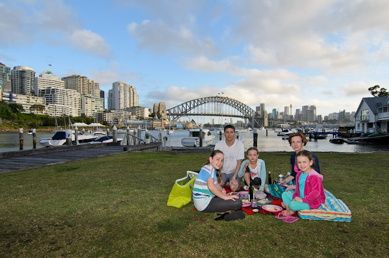
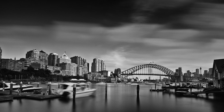
On Christmas evening my girls and I went for a picnic down on Sydney Harbour. We first parked under the bridge and went for a walk in Bradfield park under the bridge itself and along the boardwalks next to Luna Park. It was a little windy here for a picnic so we drove a little further around to Lavender Bay for our picnic dinner. It was a very quiet evening with very few people around so it was just a relaxing time with the kids. Never one to miss an opportunity I'd also packed photographic essentials  A picnic at Lavender Bay  NIKON D7000 + 12.0-24.0 mm f/4.0 @ 12 mm, 1/200 sec at f/6.3, ISO 100 This last was taken with my ten stop ND filter for some nice cloud movement and then processed to monochrome for some really moody skies - feedback on this second one welcomed... Monochromatic Lavender  NIKON D7000 + 12.0-24.0 mm f/4.0 @ 12 mm, 42 sec at f/9, ISO 100 D600, D7000, Nikon/Sigma/Tamron Lenses, Nikon Flashes, Sirui/Manfrotto/Benro SticksRodney - My Photo BlogWant: Fast Wide (14|20|24)
-

Remorhaz
- Senior Member
-
- Posts: 2547
- Joined: Thu Apr 29, 2010 8:14 pm
- Location: Sydney - Lower North Shore - D600
-
 by Reschsmooth on Sat Jan 07, 2012 3:55 pm by Reschsmooth on Sat Jan 07, 2012 3:55 pm
I do like the mono version, however two things distract me: firstly, the movement in the clouds and boats is overwhelming and, secondly, there appears to be a lean to the right.
Regards, Patrick
Two or three lights, any lens on a light-tight box are sufficient for the realisation of the most convincing image. Man Ray 1935.
Our mug is smug
-

Reschsmooth
- Senior Member
-
- Posts: 4164
- Joined: Tue Aug 01, 2006 2:16 pm
- Location: Just next to S'nives.
-
 by Matt. K on Sat Jan 07, 2012 4:08 pm by Matt. K on Sat Jan 07, 2012 4:08 pm
I love the 'Goethic' feel of the city that you have created. It's a beautiful image.
Regards
Matt. K
-

Matt. K
- Former Outstanding Member Of The Year and KM
-
- Posts: 9981
- Joined: Mon Sep 06, 2004 7:12 pm
- Location: North Nowra
 by Remorhaz on Sun Jan 08, 2012 10:30 am by Remorhaz on Sun Jan 08, 2012 10:30 am
Reschsmooth wrote:I do like the mono version, however two things distract me: firstly, the movement in the clouds and boats is overwhelming and, secondly, there appears to be a lean to the right.
I guess that was the result I was going for. I think the lean may be an optical illusion tho - I think it may just be because "close" stuff is on the left and "far" stuff in the middle and right and we're not perpendicular to the bridge and buildings and maybe the UWA also distorts stuff. I'm not sure how to fix all this however  D600, D7000, Nikon/Sigma/Tamron Lenses, Nikon Flashes, Sirui/Manfrotto/Benro SticksRodney - My Photo BlogWant: Fast Wide (14|20|24)
-

Remorhaz
- Senior Member
-
- Posts: 2547
- Joined: Thu Apr 29, 2010 8:14 pm
- Location: Sydney - Lower North Shore - D600
-
 by zafra52 on Sun Jan 08, 2012 10:45 am by zafra52 on Sun Jan 08, 2012 10:45 am
I prefer your second photograph and that "'Goethic' feel of the city that you have created"
as well put by Matt. K. The first photo though it comes across as a montage of two
different pictures. In similar circumstances, I normaly try use the fill in setting of the
flash to avoid that effect. The other problem is that the background (landscape)
has a better and more even lighting than the subjects (foreground), and both are also
sharp to the eye. Theese effects create a distraction.
Obviously, the subjects are the important element in this picture and they should be bigger,
sharp and have good lighting; while the background is there just to provide a context and should
be slightly blurred to make the viewer focus in the main element of the picture - your subject.
-

zafra52
- Senior Member
-
- Posts: 4895
- Joined: Thu Dec 01, 2005 10:22 pm
- Location: Brisbane
Return to Image Reviews and Critiques
|


