|
Got a thin skin? Then look elsewhere. Post a link to an image that you've made, and invite others to offer their critiques. Honesty is encouraged, but please be positive in your constructive criticism. Flaming and just plain nastiness will not be tolerated. Please note that this is not an area for you to showcase your images, nor is this a place for you to show-off where you have been. This is an area for you to post images so that you may share with us a technique that you have mastered, or are trying to master. Typically, no more than about four images should be posted in any one post or thread, and the maximum size of any side of any image should not exceed 950 px.
Moderators: Greg B, Nnnnsic, Geoff, Glen, gstark, Moderators
Forum rules
Please note that image critiquing is a matter of give and take: if you post images for critique, and you then expect to receive criticism, then it is also reasonable, fair and appropriate that, in return, you post your critique of the images of other members here as a matter of courtesy. So please do offer your critique of the images of others; your opinion is important, and will help everyone here enjoy their visit to far greater extent.
Also please note that, unless you state something to the contrary, other members might attempt to repost your image with their own post processing applied. We see this as an acceptable form of critique, but should you prefer that others not modify your work, this is perfectly ok, and you should state this, either within your post, or within your signature.
Images posted here should conform with the general forum guidelines. Image sizes should not exceed 950 pixels along the largest side (height or width) and typically no more than four images per post or thread.
Please also ensure that you have a meaningful location included in your profile. Please refer to the FAQ for details of what "meaningful" is.
 by Remorhaz on Sat Mar 30, 2013 4:49 pm by Remorhaz on Sat Mar 30, 2013 4:49 pm
Headed down to nearby Manns Point at Greenwich on Sydney Harbour with my daughter to check out sunset. There were far too many clouds for a nice sunset so I headed around the point to see if we could frame the city in the distance being hit by the setting suns rays. Quickly setup with this fallen tree, the rocks (and oysters  ) and this pillar out in the water (made from railway line) for foreground interest. You'll notice immediately that one of these (the second) has been flipped horizontally - I did this with the idea that it might be nice if the tree leads in from the bottom left corner pointing out towards the city in the top right third. I'd be keen to know if you think this works or not? and any other feedback on the composition generally and/or which of the two shots you might prefer (excluding the horizontal flip) - they are a similar "exposure" but vastly different exposure times due to before and after sunset times?About 15 minutes before sunset - 16-35/4 at 23mm, 1.6 sec @ f/11 and ISO 100 with the Heliopan CPL and Lee 0.9 grad ND 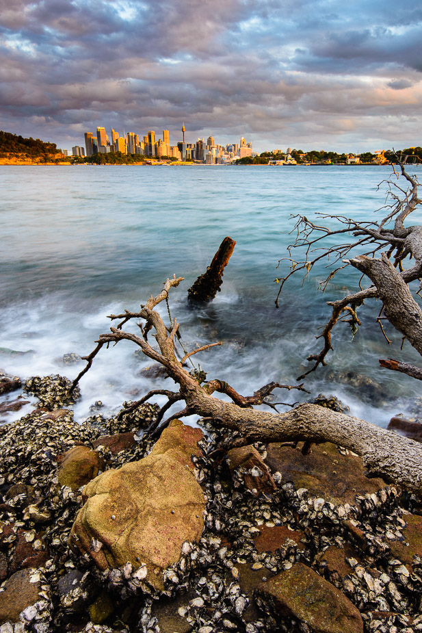 and this is about 15 minutes after sunset - 16-35/4 at 26mm, 124 sec @ f/11 and ISO 100 with the Heliopan CPL and Lee 0.9 grad ND 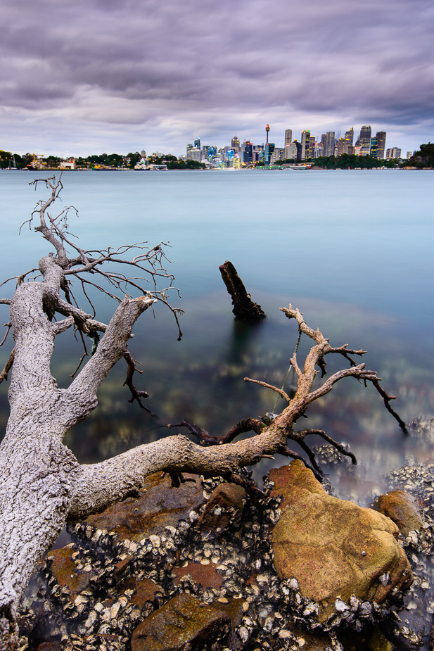 D600, D7000, Nikon/Sigma/Tamron Lenses, Nikon Flashes, Sirui/Manfrotto/Benro SticksRodney - My Photo BlogWant: Fast Wide (14|20|24)
-

Remorhaz
- Senior Member
-
- Posts: 2547
- Joined: Thu Apr 29, 2010 8:14 pm
- Location: Sydney - Lower North Shore - D600
-
by Matt. K on Sat Mar 30, 2013 6:12 pm
Rodney It warms my heart to know that there are photographers out there mulling about in an attempt to catch a great sunset...  Reminds me I need to get out more often. I like the second shot more than the first but I'm not sure why? It has something to do with that leaning peg, which seems to have a lot of power for such a small element in the image. It is darker than most of the other elements so that gives it extra weight/push/pull. But apart from that I'm not sure why #2 seems to be a more complete image. Your image is a good example ofhow important a foreground element is in land/sea/scapes. OK...looked again. It may have something to do with the way we scan text from left to right. In #1 the peg points to the right and when we scan into it there is little resistance to the eye as they are both travelling in the same direction. In the flipped image we scan into the peg which is now leaning into our direction of travel and creats more resistance. The eye crashes into it. This seems to work in the images favour. Anyone else want to deconstruct this? Regards
Matt. K
-

Matt. K
- Former Outstanding Member Of The Year and KM
-
- Posts: 9981
- Joined: Mon Sep 06, 2004 7:12 pm
- Location: North Nowra
by chrisk on Sat Mar 30, 2013 6:53 pm
I think the tree trunk is too bright personally.
I haven't heard the idea about flipping an image like you did. So bloody clever !
EM1 l 7.5 l 12-40 l 14 l 17 l 25 l 45 l 60 l 75 l AW1 l V3
-

chrisk
- Senior Member
-
- Posts: 3317
- Joined: Fri Mar 09, 2007 8:50 pm
- Location: Oyster Bay, Sydney
-
by Murray Foote on Sun Mar 31, 2013 3:33 am
In the second one, given that the skyline will be recognisable to Sydney people, why not just flip the sea and tree part of the image? I'd be inclined to try to correct the perspective of the buildings too, though that will make it narrower at the top which may or may not be a problem.
-

Murray Foote
- Senior Member
-
- Posts: 1291
- Joined: Sun Feb 10, 2008 1:31 pm
- Location: Ainslie, Canberra
by Remorhaz on Sun Mar 31, 2013 8:57 am
Thanks for the suggestions guys. Matt - thanks for your insightful breakdown and analysis Chris - I'll see how it looks with the tree reduced in exposure a little Murray - could be onto something - although that would move the city to the left side of the image and might make that side a little heavy. I did try correcting the building lean quickly in LR before but I couldn't seem to make it much better (and the image lost quite a bit of the sides - too much in the end). Maybe PS's puppet warp or something might do a better job (if I could figure out how to use it properly ). D600, D7000, Nikon/Sigma/Tamron Lenses, Nikon Flashes, Sirui/Manfrotto/Benro SticksRodney - My Photo BlogWant: Fast Wide (14|20|24)
-
Remorhaz
- Senior Member
-
- Posts: 2547
- Joined: Thu Apr 29, 2010 8:14 pm
- Location: Sydney - Lower North Shore - D600
-
by gstark on Sun Mar 31, 2013 11:13 am
Matt, Matt. K wrote:I like the second shot more than the first but I'm not sure why? It has something to do with that leaning peg, which seems to have a lot of power
It leans to the left and has a lot of power? Princess Jullia is looking for something exactly like this. OK...looked again. It may have something to do with the way we scan text from left to right.
That would be my guess as well. The direction of the lean allows the eye to follow the trunk down, in the same direction. g.
Gary Stark
Nikon, Canon, Bronica .... stuff
The people who want English to be the official language of the United States are uncomfortable with their leaders being fluent in it - US Pres. Bartlet
-

gstark
- Site Admin
-
- Posts: 22926
- Joined: Thu Aug 05, 2004 11:41 pm
- Location: Bondi, NSW
by Murray Foote on Sun Mar 31, 2013 1:17 pm
Remorhaz wrote:Maybe PS's puppet warp or something might do a better job (if I could figure out how to use it properly ).
My first thought would be content aware fill to reinvent what you've lost. Also, since the city is going to be on a different layer than the harbour and the tree, you could convert the city layer to a smart object and scale it up.
-
Murray Foote
- Senior Member
-
- Posts: 1291
- Joined: Sun Feb 10, 2008 1:31 pm
- Location: Ainslie, Canberra
by zafra52 on Sun Mar 31, 2013 2:15 pm
I prefer the first to the second; maybe the colours are
warmer. I also agree that the foreground tree is on the
bright side and detracts rather than adding to overall picture.
At the risk of being too picky, I think you should correct
the distortion of the buildings in the horizon; they lean
to either side giving an almost surreal look to both pictures,
which I believe it is not your intention.
-

zafra52
- Senior Member
-
- Posts: 4895
- Joined: Thu Dec 01, 2005 10:22 pm
- Location: Brisbane
by Remorhaz on Thu Apr 04, 2013 2:46 pm
Murray Foote wrote:My first thought would be content aware fill to reinvent what you've lost. Also, since the city is going to be on a different layer than the harbour and the tree, you could convert the city layer to a smart object and scale it up.
zafra52 wrote:I prefer the first to the second; maybe the colours are warmer. I also agree that the foreground tree is on the bright side and detracts rather than adding to overall picture. At the risk of being too picky, I think you should correct the distortion of the buildings in the horizon; they lean to either side giving an almost surreal look to both pictures, which I believe it is not your intention.
Thanks Zafra and Murray - I've revisted this (finally) and just used some puppet warping to fix the city lean without loosing too much of the rest of the image, plus some darkening down of the tree, etc 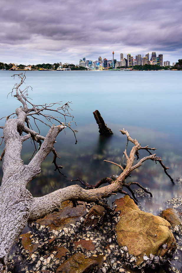 D600, D7000, Nikon/Sigma/Tamron Lenses, Nikon Flashes, Sirui/Manfrotto/Benro SticksRodney - My Photo BlogWant: Fast Wide (14|20|24)
-
Remorhaz
- Senior Member
-
- Posts: 2547
- Joined: Thu Apr 29, 2010 8:14 pm
- Location: Sydney - Lower North Shore - D600
-
by Murray Foote on Thu Apr 04, 2013 4:05 pm
I think that's much improved.
I don't think I've ever used puppet warp except just to test it out. Free transform would probably have done the same thing here, too.
-
Murray Foote
- Senior Member
-
- Posts: 1291
- Joined: Sun Feb 10, 2008 1:31 pm
- Location: Ainslie, Canberra
by zafra52 on Thu Apr 04, 2013 7:26 pm
I also think this version is a big improvement and in large
print would look superb.
-
zafra52
- Senior Member
-
- Posts: 4895
- Joined: Thu Dec 01, 2005 10:22 pm
- Location: Brisbane
Return to Image Reviews and Critiques
|
