Page 1 of 1

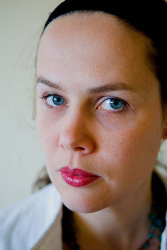
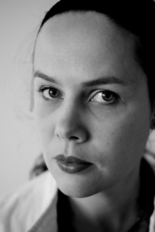
Ran with the chance..

PostPosted: Thu Aug 10, 2006 6:53 pm
by Geoff
It's not often Bel openly lets me take photos of her, tonight she was getting ready to go out with her girlfriends and I asked, and she agreed!!

I think I prefer the vibrance of the colour one. Taken without flash, mixture of window and tungsten light, shot at 2.8 with the 17-55DX. A little bit of curves adjustment and increased saturation, don't think I over did it. It's a serious pose but I instructed her to stay serious and look straight down the lens. Comments and critique welcomed:

Image

Image

PostPosted: Thu Aug 10, 2006 7:27 pm
by JordanP
I'm glad you confirmed the serious look was your idea ... otherwise I would have thought you were in trouble :shock:

cute (but scarey) Bel.

Certainly crisp at 2.8, the leading eye a good focal point and you probably couldn't go much higher with your availible light. Given better lighting I think it would be nicer if you had a bit more DOF ... both eyes sharpe. Particularly as this is such a tight shot.

I agree the colour version is my pick. The B&W would look better softer and lighter IMHO.

Good to see Bel letting you take the odd shot - who knows in the future you might be allowed to take 1 a week.

Cheers,

PostPosted: Thu Aug 10, 2006 7:29 pm
by Glen
I prefer the colour Geoff. I must say I have never seen Bel look so serious, the instruction you gave her must have been very firm.

PostPosted: Thu Aug 10, 2006 7:30 pm
by Oscar
Great shot Geoff. Lovely use of the available light and nice DOF. I prefer the colour version. A serious facial expression but not too harsh. Good work. Cheers, Mick.

PostPosted: Thu Aug 10, 2006 7:55 pm
by mudder
G'day,

The color version seems to have much more life for me so I also prefer the color one, the B&W doesn't seem to have the punch... Maybe it needs more contrast or something?

Not sure about the narrow DOF, maybe it's just me but wondering how a slightly deeper DOF may affect the image... ?

Nice portrait...

PostPosted: Thu Aug 10, 2006 7:57 pm
by Marty
Good shot Geoff,
would look great if you cloned out the wispy hair on the left of the image.
And I actually prefer the b/w over the colour...!!!
Lucky for you B agreed to model, otherwise we might have got a self portarit.. :wink:

PostPosted: Thu Aug 10, 2006 8:07 pm
by Geoff
Thanks for the comments thus far ppls!

Craig - once a week? Hmmm, unlikely! :) As you say a little more DOF would have been good but without a tripod and shooting at 2.8 I didn't have much room to move. Food for thought for 'next' time :)

Glen - yep, it was a slight combination of me asking her not to smile and 'look serious' as well as her needing to keep going and getting ready :)

Oscar - Thanks mate :) I just love doing portraits!!

Mudder - I thought the contrast in the B&W was ok, but will play around with the contrast a little...

Marty - Now that you mention it that wispy bit of hair definately needs to go, I didn't even notice it before hehe.

PostPosted: Thu Aug 10, 2006 9:09 pm
by sirhc55
Geoff - colour by a long mile - the B&W does not do justice to Bel.

Now, critique - the angle at which you have taken this photo has given emphasis to Bel’s forehead. To balance the facial characteristics (i.e. forehead to chin) the angle has to be viewed critically before the shot.

Love it anyway :wink:

PostPosted: Thu Aug 10, 2006 9:24 pm
by Geoff
Thanks for the constructive criticism Chris - Bel was sitting and I was standing for this one...do you think this would have worked more effectively if I was front on to her?

PostPosted: Thu Aug 10, 2006 9:33 pm
by sirhc55
Geoff wrote:Thanks for the constructive criticism Chris - Bel was sitting and I was standing for this one...do you think this would have worked more effectively if I was front on to her?


Yes :wink:

PostPosted: Thu Aug 10, 2006 9:36 pm
by Greg B
It is the colour one for me Geoff - the colour in Bel's eyes is really something and provides a focal point for the portrait for me.

Excellent shot. And a superior quality image technically as well.

PostPosted: Thu Aug 10, 2006 10:21 pm
by Marty
Hey Geoff,
I did a quick fix on the image to remove the wispy hair, also a slightly different b/w conversion.
Working with this small jpeg will not give the results achievable if you work from the original.
Also for next time you shoot Bel, try to use a background with more contrast to her skin (her left cheek blends into the b/g), and as suggested use a different angle to shoot.
Marty


Image

PostPosted: Thu Aug 10, 2006 10:27 pm
by marcotrov
Lovely images Geoff. I think Marty's treatment really enhances the image to the point that I prefer the B&W here. :)
cheers
marco

PostPosted: Thu Aug 10, 2006 10:28 pm
by Geoff
Nice work Martin! It's rare Bel agrees for me to photograph her so I just go with what I've got at the time, but yep, a better background would have been better. Thanks for that! :)

PostPosted: Thu Aug 10, 2006 10:47 pm
by Oscar
Geoff,
Marty's b&w treatment really adds some punch and that version makes it harder to decide which I prefer. But I think it is the colour of the eyes that still pushes me to the colour version. I have no idea of Bel's age but your shot reminds me of a young (and very intelligent) uni student I used to know.
I think you should definately try a few more angles and maybe try a few different lighting levels/background combos to see what you (and Bel) prefer. Perhaps she will get some shots she will cherish down the track. Cheers, Mick

PostPosted: Thu Aug 10, 2006 10:51 pm
by Geoff
Thanks Mick, mate...you wouldn't know my challenge to convince her to let me take one or two shots.... :D :D

PostPosted: Fri Aug 11, 2006 12:03 am
by ozczecho
Martys B&W is great but I still like the colour version...so warm, such great colour. Agree that the DoF is a bit too shallow and maybe bumping the ISO instead of keeping at f2.8 would have been the go...nonetheless a great portrait.

PostPosted: Fri Aug 11, 2006 4:39 am
by wendellt
now thats certainly getting there
i like the coloured one more brings out her eyes

as a suggestion for improvement i would of shot it just a higher and made sure her head is vertically aligned straight
and chin down ever so slightly
but the 1/4 profile suits her best somewhat compreses her face slightly

PostPosted: Fri Aug 11, 2006 9:04 am
by PiroStitch
Very nice and prefer the colour version as well though her skin tends to look a bit blue.

Not sure what you've done with the curves in PP but her face is starting to get lost in the background - might need a bit more contrast in that area to help lift her out.