Page 1 of 1
Love it... or hate it?...

Posted:
Thu Sep 27, 2007 12:41 pmby Bindii
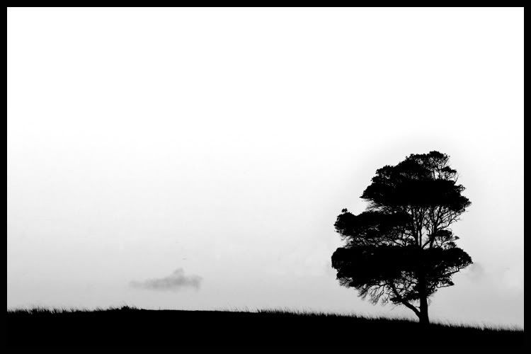
I don't think there is any middle ground with this one... its recieved mixed reactions on another forum so I would be interested to see what you guys think.. taken on Sunday at Jet Sprint races Cabarita...
oh and don't hold back neither...


Posted:
Thu Sep 27, 2007 12:45 pmby Laurie
I like it.
i am undecided about the other trees in the background / or what ever the smudges are.

Posted:
Thu Sep 27, 2007 12:57 pmby bwhinnen
Love it. The whispy clouds in the background add to the feel as does that one rogue cloud close to the horizon!

Posted:
Thu Sep 27, 2007 1:01 pmby colin_12
I like how th yree is leaning into frame.
Not as keen on the louds though.
Nice silhouete though.
Regards Colin

Posted:
Thu Sep 27, 2007 1:03 pmby Manta
One of the very few shots of yours I'm not keen on Sue.
My initial thoughts:
The little clouds behind the tree blend with it sufficiently to look like they are actually moving branches;
The flattened area of grass in the centre draws the eye and had me asking "Why is it there?" Is it a vehicle track? Has the grass blown down there? Is it a crop circle?!!"
There is too much sky and not enough foreground - the subject seems squashed into the bottom of frame.
The exposure and colouring doesn't work for me in this particular image. Lots of detail lost yet not quite a silhouette - somewhere caught in the middle.
Sorry - but that's exactly how I see it.


Posted:
Thu Sep 27, 2007 1:05 pmby PiroStitch
I quite like it. Yes it doesn't quite comply with the rule of thirds but who gives a toss

I can see this used for an ad with the text appearing in the space on the left.

Posted:
Thu Sep 27, 2007 1:10 pmby Bindii
Manta wrote:
Is it a crop circle?!!"
lmao.. yeah thats it...

and don't be sorry.... I would always rather an honest opinion.. if I wanted my ego boosted I could post on countless other forums for that...


Posted:
Thu Sep 27, 2007 1:27 pmby Antsl
PiroStitch wrote:I quite like it. Yes it doesn't quite comply with the rule of thirds but who gives a toss

Rule of thirds.... rule of thirds!!!! Have I not taught you anything!!!! Rules are for people who have trouble thinking for themselves!!! Thats why we have rules like "do up your shoelaces before running with scissors" and "put your underpants on first before putting on your track pants".
I reckon this image needs hard cropping from the top and a little more context in the lower left of the frame. Hang on to it and keep working it!

Posted:
Thu Sep 27, 2007 2:57 pmby ozimax
I don't like the cloud/smudge but otherwise simple, but not in same class as the semi trailer!
Ozi

Posted:
Thu Sep 27, 2007 5:32 pmby zafra52
I think it is quite a pleasant image! It lets the imagination wander.

Posted:
Thu Sep 27, 2007 10:34 pmby Matt. K
In public speaking, silence has its own power. A long, long pause can make people feel uncomfortable or it can settle a fidgety crowd and draw their attention. Empty spaces in photographs have the same power. I like this image because of its sense of emptiness and silence. It takes no effort to enjoy this image...and there is a sense of mystery, of something about to happen. The little cloud looks sad...in pain, and the grass looks ominous, as if it's hiding something. The composition is slightly off balance and creats a sense of visual tension. The stark tones look slightly threatening. This is not a place you would want to spend a night alone.
We see so many images that often we only stop at those that shout and scream at us with colour and vivid contrast...or those that contain graphic violence or are loaded with sexual innuendo. It pays to slow down and look more closely at the quite ones. It's a keeper.

Posted:
Thu Sep 27, 2007 11:16 pmby petermmc
You must be commended on your title as you possibly have doubts yourself as to what this photo is saying. I think I like it because it annoys me. I think Antsl secretly wants to apply the rule of thirds that he is annoyed at pirostitch for mentioning. But I do think Antsl has a good point about cropping.
Yeah!
I refrained from mentioning that I really like all your other photos as I do, as it seemed obvious that this build up would be followed by a "...but this one.
For something so black and white, I am still gray.

Posted:
Thu Sep 27, 2007 11:30 pmby Bindii
Wow.. there are some of the best critques I have ever seen in this thread.. I'm honoured actually...
thanks everyone...


Posted:
Fri Sep 28, 2007 12:23 amby Antsl
petermmc wrote: I think Antsl secretly wants to apply the rule of thirds that he is annoyed at pirostitch for mentioning.
I gave up on the rule of thirds years ago, about the time that I abandoned the camera club scene. These days I just listening that little gut feeling inside that tells me whether things are working or not... the built in signal strength meter. It works a lot better.
If everyone were to make photos using the same rules we would all be making the same photos. Sad to say we can see a lot, not just on this forum but everywhere, photos that have a commonality to them...
Learn all the rules you can and then forget them.

Posted:
Fri Sep 28, 2007 3:05 amby gstark
Antsl wrote:Learn all the rules you can and then forget them.
That's the good thing about rules: they're made to be broken.
I'm still sitting on the fence on this image, Sue.
But you cropped the fence out of it, and I therefore haven't even got my seat any more.


Posted:
Fri Sep 28, 2007 8:18 amby BT*ist
I like it - it's definitely a keeper. I like the graduated sky/background, but I think the cloud unnecessarily draws the eye away from the simple effectiveness of the rest of the shot.

Posted:
Fri Sep 28, 2007 8:22 amby Mr Darcy
Love it

Posted:
Fri Sep 28, 2007 10:04 amby Bindii
Okay... so maybe if I clone out the cloud?... would that make it better..?
I'd have a go now but am at work and don't have any editing software on my puter....


