Page 1 of 1
interview photos... want some crit... pt1

Posted:
Thu Oct 11, 2007 11:38 pmby jamesw
ok 8 shots for crit...
ive asked for crit on shots similar to maybe one or two of these, but since have gone back to drawing board in PP or just plain re-shot the shot.
im submitting these on saturday, so any crit would be nice

thanks
james
1. toothpick hangover rail

2. gap over bin

3. 360 down 8 stairs

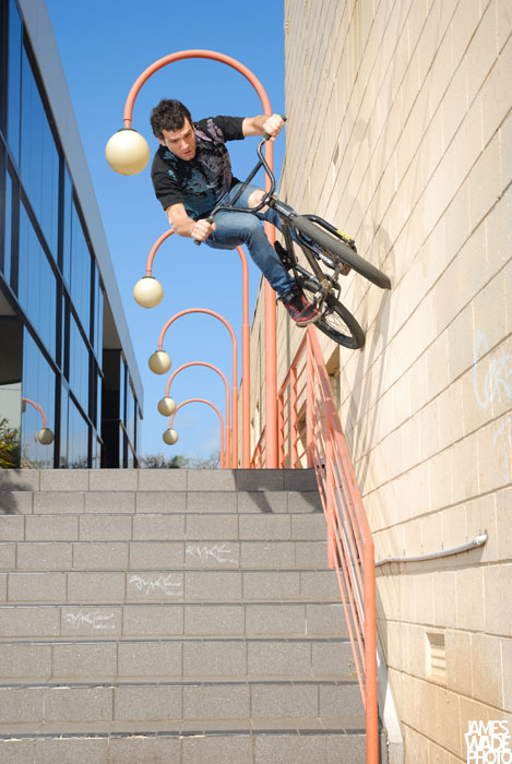
4. wallride over rail down 9 stairs


Posted:
Fri Oct 12, 2007 2:08 amby Bindii
I can't get the last four to download... damn this dial up connection.. *groans*
And of the four that I can see... its the fourth that is speaking to me.. and thats because the background is clear so the rider isn't getting lost in the background... I also like the way he is framed by the lightpost and the fact that you have allowed room in the frame for him to move...
You have used some good angles though... getting down low seems to work but you've accidently left your off camera flash in the shot in one of them which is kinda a no no.. you might consider cloning or cropping that one....
What are you submitting them for
btw?
*ducks before the post police gets in here and nabs ya for posting more than the allowed 4 pics*...

Re: interview photos... want some crit...

Posted:
Fri Oct 12, 2007 9:03 amby gstark
jamesw wrote:ok 8 shots for crit...
How many was that?
When did our posting guidelines change?
Why am I always the last to know ???
Oh, what's that? The posting guidelines haven't changed?
Post edited!


Posted:
Fri Oct 12, 2007 10:04 amby sheepie
Of all of these the only one that really stands out to me is #4. A closer crop of #3 would also work - there's way too much background there atm.
For that matter, one of the big issues I have with most of these is the background - I know it's hard in this sort of environment, but you really need to look at what's behind the subject. Much of the impact of these is lost by clutter I'm afraid

It would help if we had an idea of some of the details of your submission - what sort of image are you attempting to portray?

Posted:
Fri Oct 12, 2007 10:12 amby jamesw
background clutter is something that commonly comes up around here, it seems.
i guess my excuse for not going down the narrow DOF path is that i have to freeze the action. shooting wide open (or near wide open) during the day really isn't an option since i'm limited by a 1/250th shutter speed for flash sync.
and i guess further to this, what i always try to do with street photos is really give a feel for the environment, and what difficulties it presents.
for instance in the first shot, we took that in the middle of the day, and it took about an hour to get a few good shots because josh had to watch out for traffic. the 360 down 8 stairs i admit is a bit cluttered, but i feel that the clutter adds to the shot - its all a part of the urban environment. a
and i think the use of flashes is a close substitute for narrow dof, it pops the rider out.
having said all of that, i do understand your point. it's just that i have limitations placed upon me with equiptment, as do many other bmx and skate photographers. i wish i could shoot MF but its cost prohibitive right now.
and i guess, have a look through many bmx or skate magazines and you'll notice that they have the same issues that i do. sometimes you get lucky compositionally with a shot, you may be able to arrange the shot so its not that busy or the rider is well placed within some vacant space. sometimes its not like that, and you have to work with what you've got...

Posted:
Fri Oct 12, 2007 10:16 amby sheepie
jamesw wrote:i guess my excuse for not going down the narrow DOF path is that i have to freeze the action. shooting wide open (or near wide open) during the day really isn't an option since i'm limited by a 1/250th shutter speed for flash sync.
Have you considered using an ND filter? That could help out here


Posted:
Fri Oct 12, 2007 10:16 amby Willy wombat
#4 and #3 have certainly got potential. #1 and 2 dont grab me if you are doing a profile on this guy as you cant see his face. They are also a little blurry, etc.

Posted:
Fri Oct 12, 2007 10:21 amby jamesw
nd filters would be nice, but unfortunately i don't have flahes that would be able to overpower the filter + daylight...

Posted:
Fri Oct 12, 2007 1:50 pmby Bindii
jamesw wrote:background clutter is something that commonly comes up around here, it seems.
i guess my excuse for not going down the narrow DOF path is that i have to freeze the action. shooting wide open (or near wide open) during the day really isn't an option since i'm limited by a 1/250th shutter speed for flash sync.
and i guess further to this, what i always try to do with street photos is really give a feel for the environment, and what difficulties it presents.
for instance in the first shot, we took that in the middle of the day, and it took about an hour to get a few good shots because josh had to watch out for traffic. the 360 down 8 stairs i admit is a bit cluttered, but i feel that the clutter adds to the shot - its all a part of the urban environment. a
and i think the use of flashes is a close substitute for narrow dof, it pops the rider out.
having said all of that, i do understand your point. it's just that i have limitations placed upon me with equiptment, as do many other bmx and skate photographers. i wish i could shoot MF but its cost prohibitive right now.
and i guess, have a look through many bmx or skate magazines and you'll notice that they have the same issues that i do. sometimes you get lucky compositionally with a shot, you may be able to arrange the shot so its not that busy or the rider is well placed within some vacant space. sometimes its not like that, and you have to work with what you've got...
I totally understand what you are saying..
but... (yeah there is always a but isnt there)...
some advice that I was given years ago by a well known tog that I have always remembered springs to mind here... he said..
"get it right cause you can't write all your excuses on the back on the photo's for others to read when you aren't there to tell them"...


Posted:
Fri Oct 12, 2007 1:53 pmby colin_12
I really like #4 James. Even the background. I like the depth.
If you really wanted the narrow depth look you could blur the background and foreground in your pp.
If you use your d70s then you have a flash sync of 500th of a second.
Regards Colin

Posted:
Fri Oct 12, 2007 1:57 pmby jamesw
colin_12 wrote:I really like #4 James. Even the background. I like the depth.
If you really wanted the narrow depth look you could blur the background and foreground in your pp.
If you use your d70s then you have a flash sync of 500th of a second.
Regards Colin
unfortunately, i dont always carry the d70s around with me... in fact i rarely take it with me anymore.
mags prefer 10mp output

Posted:
Fri Oct 12, 2007 1:58 pmby team piggy
40mm on the wallride

Just umm where was he planning on landing and where were you going !
Is that the building just out of the city on King William Road? looks familiar.
Pics 3 & 4 for me, though the flash in 3 is distracting.

Posted:
Fri Oct 12, 2007 2:01 pmby jamesw
i had to run out of the way when he landed. the first two shots got messed up because i pre-emptively ran!!! hahahah
right on the edge of the city. near the bp as you start driving into... hyde park, i think the suburb is?

Posted:
Mon Oct 15, 2007 12:40 amby team piggy
Figured you ran! Yep, thats the building I thought. Club Marine used to be in there.
Locations lets have a guess..
Image Number:
1: Norwood shopping centre car park or Port Mall?
2: Port Adelaide.
3: Greenhill or Fullarton Road.
4: KW Road.

Posted:
Mon Oct 15, 2007 8:50 amby jamesw
your right.... except 1st is at hutt street adl
and fyi 2nd is at port adelaide, right near the port,

Posted:
Mon Oct 15, 2007 10:14 amby mickb
I love that last one james


