Page 1 of 1

Re-shot the tunnel gap, and 3 other ditch shots for crit

PostPosted: Sat Oct 27, 2007 11:24 am
by jamesw
general note: these shots all look really underexposed on this (crappy old work) monitor. when i pp-ed them early this mornign, they looked great... if anyone has a calibrated monitor would care to comment on the exposure, that'd be great.

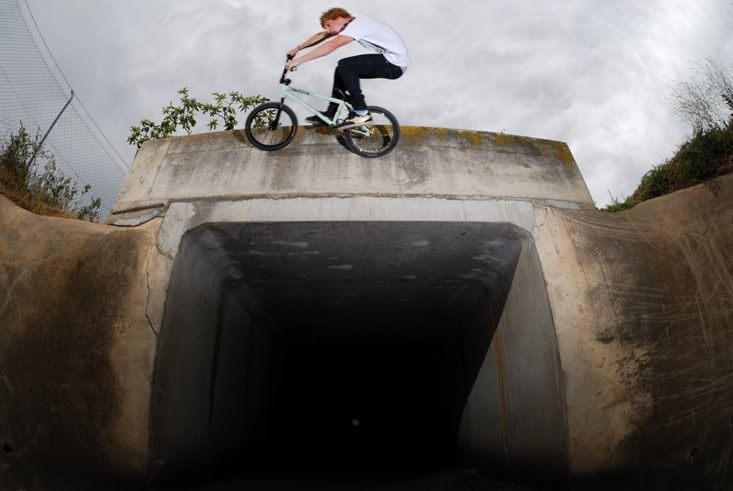
1. the huge gap reshoot... original thread here
Image
self crit... i would have like to shoot this portrait, but when i tried to shoot in close with portrait it cut too much off the sides and you couldn't really tell what was happening. i like the little bit of blur which adds to

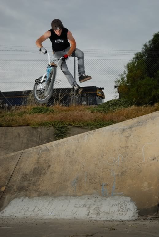
2. tailwhip
Image
self crit... the train is kind of making the wheels and feet blend in a bit... i think the flashes do a bit to pop it out, but yeah, would have been nice without the train. but on the other hand, it adds some character, gives the shot a bit of context... it is in a ditch, next to a trainyard.


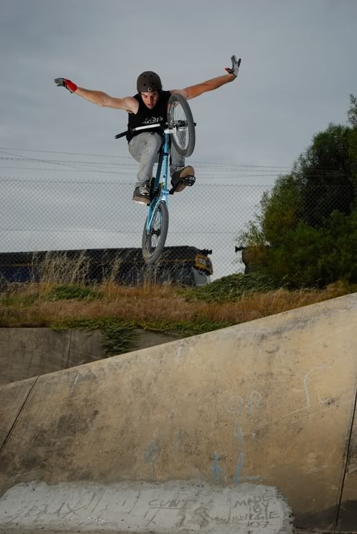
3. old school no hander
Image
self crit... i like this one, except his back wheel is a bit low so its starting to get a bit blended with the train (same as above). the crop is maybe a bit loose at the top and tight at the bottom.

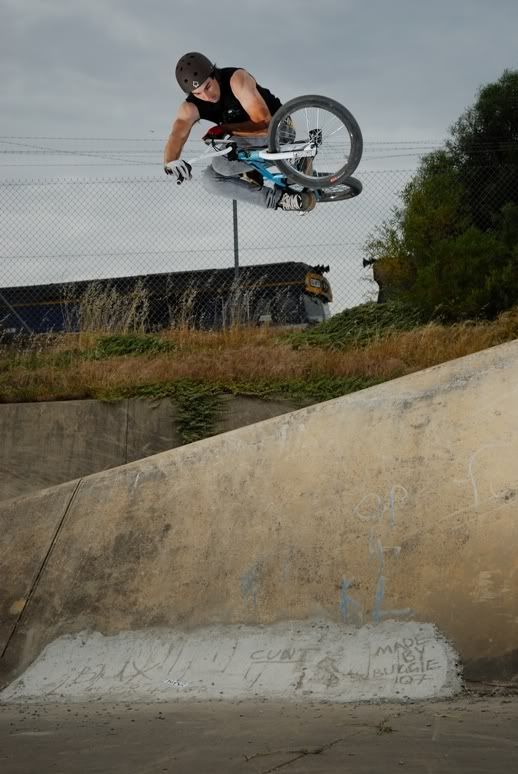
4. tabo
Image
self crit... i really like this one the most. he's really high and tucked up, well above the train. i think this crop works the best, you can see the rubble at the bottom as well as it not being too tight at the top.

PostPosted: Sat Oct 27, 2007 11:29 am
by !~DeViNe~DaRkNeSs~!
i like the last one, really well focused and really jumps out :D

PostPosted: Sat Oct 27, 2007 11:48 am
by jamesw
i might add, all of those shots at 100% are SHARP!

you can read the stickers on his frame in the last 3 shots, in the first shot you can see clearly all the cracks in the tunnel. dope!

PostPosted: Sat Oct 27, 2007 12:42 pm
by glennles
i like the last one also. being able to see the landing adds to the shot and it just looks plain cool with the rider up above the train.

the first one seems to be a very tricky shot to nail. including the tunnel makes you realise what he's doing but then he appears squashed up at the top with a big dark spot underneath. i do like it more than the first try but i really have no idea how to go about that shot.

PostPosted: Sat Oct 27, 2007 2:24 pm
by Antsl
Hi James,
Pleased to see that you did a reshoot on these images and I think that they look stronger. The top tunnel image really does look better now that you can see the guy silhouetted against the sky. My only regret is that you still have not put people into the tunnel... it would add another dimension to the image!

PostPosted: Sat Oct 27, 2007 2:51 pm
by shakey
Like them. #4 best IMO. There is a fairly strong 4 letter word in the graffiti in the last 3 shots. If these are going for publication you may want to clone it out (or not..depending on the publication)

PostPosted: Sat Oct 27, 2007 3:49 pm
by zafra52
Good action photography! I think 3 and 4 are the best, but was the train static or did you do a composite? By the way, your audience might find the four-letter-word distasteful so if it was up to me I would edit it out.

PostPosted: Sat Oct 27, 2007 10:51 pm
by jamesw
hmmm... the 4 letter word wouldn't be seen as distasteful to the audience.

people say it, its a word, its real and like it or not...

and fwiw there would be as many people who think that it adds to the photo as it detracts from it...

personally i'm indifferent; if its there, its there, and if its in the photo it stays...

PostPosted: Sat Oct 27, 2007 10:52 pm
by jamesw
the train must have been static (or moving incredibly slowly). those last 3 photos were taken bam bam bam... he might have done a trick once or twice... it took probably 3 or 4 minutes to shoot him doing half a dozen tricks over that spine.

PostPosted: Sun Oct 28, 2007 3:11 pm
by mickeyjuice
shakey wrote:Like them. #4 best IMO. There is a fairly strong 4 letter word in the graffiti in the last 3 shots. If these are going for publication you may want to clone it out (or not..depending on the publication)

Yeah, that's exactly what I was going to say as well.

PostPosted: Sun Oct 28, 2007 10:35 pm
by team piggy
Nice work (again) I think the train adds some character to it.

The nasty word is not an issue to the audience you are promoting to, but to a lot of others it will be , and could stop your pic from being published elsewhere.
I see your point on it, but say you have to look at the overall picture. Mummy buys bmx mag for little johnny aged 10, see's big bad word, you get the picture. Mum cares but L' Johnny has been smoking since he was 7 and doesnt care.. Make sense?

PostPosted: Mon Oct 29, 2007 9:41 am
by jamesw
team piggy wrote:Nice work (again) I think the train adds some character to it.

The nasty word is not an issue to the audience you are promoting to, but to a lot of others it will be , and could stop your pic from being published elsewhere.
I see your point on it, but say you have to look at the overall picture. Mummy buys bmx mag for little johnny aged 10, see's big bad word, you get the picture. Mum cares but L' Johnny has been smoking since he was 7 and doesnt care.. Make sense?


i really don't think its anywhere near that much of an issue. the mag that this has been sent to has a target audience of somewhere between 16-30...

and heck, if the magazine editor thinks its a problem they have the clone tool too! they tend to run photos based on who the rider is, what the trick is, etc... they all have their own motives... and knowing all the editors personally i know they wouldn't stress over a four letter word :D

but i understand the point that some of you are making; but in the end it's just a word ;)

PostPosted: Mon Oct 29, 2007 9:41 am
by jamesw
ps. the editor preffered the first shot of the bridge gap

PostPosted: Mon Oct 29, 2007 9:43 am
by jamesw
p.p.s thanks for the crit everyone

PostPosted: Mon Oct 29, 2007 12:41 pm
by PiroStitch
The last one is great - there's a lot of tension and action going on in it.

Personally not a huge fan of the first shot as the rider is lost as he's at the very top. Can see what you were trying to achieve and show but maybe different angle or stronger lighting might have improved this.

PostPosted: Wed Oct 31, 2007 2:08 pm
by jamesw
hmmm first shot really bugs me; i dont like it 100%, but i honestly dont know where i can go from here with it either... there are a few angles that pop up in my head but they are all making some compromises in either not being as aesthetically pleasing or taking away from the trick (ie not really portraying how big and scary it is).

and i dont even know if i like this or the first shot (longer lens) i took of it more. the reshoot is better technically, i preserved the sky and the foreground looks reasonably well exposed, flashes are good.. but i still like the first shot....