Page 1 of 1

Mungo National Park for C&C

PostPosted: Wed Oct 31, 2007 1:33 pm
by radar
Hi,

a couple more from the Mungo trip.

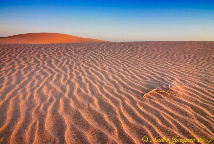
This is a photo of the dunes at Vigars well. There is an interesting story on this area. There is a natural well here. The water seaps to the surface and this has been used for thousands of years by the Aboriginals. When the Mungo area was colonised and the Mungo Station created, it used to be serviced by the Cobb & Co. coach company. The well was made more permanent in that it was walled and then it became a stop on the route of the Cobb & Co. coach company on their way to Mungo Station. You've guess it, the person who made the well had a surname of Vigar :roll:

Let me know if you like or don't like this one. I'm not sure if it is too minimalist or not.
Image

This is at sunset on the Walls of China. One of the nice formations on the Walls of China. It gives a bit more of an idea of the surroundings. There isn't much to give you a perspective of the size on these. The formations would be anywhere from 1 metre to maybe 5 or 6 metres.
Image

The rest of my photos for the trip I'll put in a Photograhic Journey post later on when I get to finish processing.

C&C much appreciated,

Cheers,

André

PostPosted: Wed Oct 31, 2007 2:58 pm
by robert
The first has a really nice tranquility about it. I'm not sure but I think the sticks are a little too far into the picture- not sure if a crop would bring them forward?

The second is how I imagined the place- and I figure its pretty hard to take an image where the eye doesnt wander around the frame. I find it a little busy/distracting, though my eye does keep coming back to the central column. I think the simplicity of the image in your other post is stronger.

Just a few thoughts.
Robert

PostPosted: Wed Oct 31, 2007 3:06 pm
by CraigVTR
I agree with Robert, the simplicity in #1 is great.

PostPosted: Wed Oct 31, 2007 3:07 pm
by dawesy
I really like the first but agree that there is a little too much space at the bottom. I would like to see a crop about half way between the base of the frame and the bottom of the stick to bring it further forward. I reckon that'd be a winner!

PostPosted: Wed Oct 31, 2007 4:59 pm
by Killakoala
The first one could be further improved by increasing contrast a bit. This will add more darkness to the shadows and accentuate the light lines of the top of the ripples. The second could do with a bit more colour, but it is still nice as it is.

PostPosted: Wed Oct 31, 2007 6:22 pm
by radar
Thanks for the comments.

As suggested, here is a version with a bit of the bottom cropped out and I also added some more contrast.

Image

Cheers,

André

PostPosted: Wed Oct 31, 2007 9:13 pm
by Alpha_7
I like the new crop, I'd prefer a more richly saturated look just because that's what I expect from desert style shots.

PostPosted: Thu Nov 01, 2007 8:48 am
by radar
Thanks Craig,

Alpha_7 wrote:I like the new crop, I'd prefer a more richly saturated look just because that's what I expect from desert style shots.


As far as saturation goes, it would take the look of the photo to a level where it is not the way it did look so to me that becomes more art. I've looked at it more saturated and it does look very nice with the sand with more red tones to it but it was not the way it looked at that time in that section of the dunes. Not sure which one I like more.

As an aside, I also brought a film camera with me on this trip. I have it loaded with Velvia 100. It will be interesting to see how the saturation comes out in that one.

Cheers,

André

PostPosted: Thu Nov 01, 2007 8:58 am
by Alpha_7
radar wrote:Thanks Craig,

Alpha_7 wrote:I like the new crop, I'd prefer a more richly saturated look just because that's what I expect from desert style shots.


As far as saturation goes, it would take the look of the photo to a level where it is not the way it did look so to me that becomes more art./quote]

Exactly that I guess is where RedBubble has been rubbing off on me as I not only look at the original capture now, but what it could become in an art sense. But I respect that you would prefer to keep it as a representation of what was really there.

PostPosted: Thu Nov 01, 2007 3:20 pm
by radar
Craig,

I've decided to post a much more saturated version of that dunes photo. I'd be curious as to what people think.

Image

thanks,

André

PostPosted: Fri Nov 02, 2007 5:13 am
by Mr Darcy
I prefer the original. The crop seeems to move the stcks too far in from the right. Maybe crop some there too??? The super-saturated seems o have gone too far. But then I've been there & the colours jar with my memory of the place.

PostPosted: Fri Nov 02, 2007 2:51 pm
by Man Tripod
radar wrote:Craig,

I've decided to post a much more saturated version of that dunes photo. I'd be curious as to what people think.

Image

thanks,

André


I think that works. If you want it to look more like it did to the eye you'll get a better result by desaturating the red a little.

PostPosted: Fri Nov 02, 2007 2:54 pm
by Man Tripod
I had a play:

Image

PostPosted: Fri Nov 02, 2007 4:15 pm
by Mr Darcy
Ahh now we're cooking!

PostPosted: Sat Nov 03, 2007 9:55 am
by radar
That is much nicer, I'll keep playing, thanks for the advice.

Cheers,

André