These are my shortlist. Any recommendations?
Either best image, or how to improve gladly accepted.
D200
28mm Nikkor e Series lens
2xSB800 through umbrella on either side; 1x SB600 overhead.

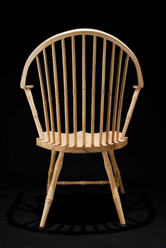
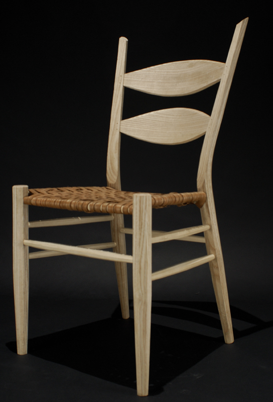
TIA
ChairsModerators: Greg B, Nnnnsic, Geoff, Glen, gstark, Moderators
Forum rules
Please note that image critiquing is a matter of give and take: if you post images for critique, and you then expect to receive criticism, then it is also reasonable, fair and appropriate that, in return, you post your critique of the images of other members here as a matter of courtesy. So please do offer your critique of the images of others; your opinion is important, and will help everyone here enjoy their visit to far greater extent. Also please note that, unless you state something to the contrary, other members might attempt to repost your image with their own post processing applied. We see this as an acceptable form of critique, but should you prefer that others not modify your work, this is perfectly ok, and you should state this, either within your post, or within your signature. Images posted here should conform with the general forum guidelines. Image sizes should not exceed 950 pixels along the largest side (height or width) and typically no more than four images per post or thread. Please also ensure that you have a meaningful location included in your profile. Please refer to the FAQ for details of what "meaningful" is.
Previous topic • Next topic
12 posts
• Page 1 of 1
ChairsI need a single image of my work for a catalogue.
These are my shortlist. Any recommendations? Either best image, or how to improve gladly accepted. D200 28mm Nikkor e Series lens 2xSB800 through umbrella on either side; 1x SB600 overhead. 


TIA Greg
It's easy to be good... when there is nothing else to do
Thanks for that.
I did try lower settings for the overhead light, but I really like the way the chair sits on its shadow. This gets lost with lower O/P from the SB600. The requirement by the publisher that the image not be altered means that I am unable to tone down the seat in PP & still keep the shadow. Greg
It's easy to be good... when there is nothing else to do
I'd like to see #3 but from a slightly higher angle, to help display the weaving on the seat.
#1 looks as complex as the chair obviously is g.
Gary Stark Nikon, Canon, Bronica .... stuff The people who want English to be the official language of the United States are uncomfortable with their leaders being fluent in it - US Pres. Bartlet
Nice work, both the photography and the woodwork. Is it greenwood you use to create the masterpieces? I used to dabble a bit in this a few years ago using a homemade pole lathe, shave horse etc.
Geoff
What sort of catalog is it?
I'm with Gary, I think a higher angle would show the weave better, and also get rid of that moire sort of effect. But they're all pretty kewl.
Mr Darcey
I made a couple of carvers a long time ago and photographed them outdoors with out of focus trees in the background. That looked great! I used a long lens for the pic. Regards
Matt. K
Yes the two chairs are greenwood. The third beastie (#1) is the shave horse I built to work the timber.
The Windsor was done with NO power tools at all. Billets were split with axes and wedges from the log to form the various parts. These were trimmed with a hand saw, then shaped with drawknives and spokeshaves. I used a pole lathe to turn the parts . A brace & bit for drilling holes, and a lot of sweat, some blood and even a few tears went into the making The other chair, also greenwood, was made using power tools for most operations. Drawknives & spokeshaves were still used for the detail work. The catalogue is for my graduation exhibit at the ANU school of Art. The exhibit itself opens on 7th December & runs for till the 17th. You are more than welcome to come along if you are in Canberra. Sadly I am unable to take more photos within my timeframe, as I was able to borrow Photomedia's studio for the shots, mostly for the black backdrop. I have nothing suitable myself. This close to assessments, I have Buckleys of getting in there again. Here is a photo of the seat taken immediately after the weaving was complete. It is still wet in places, hence the colour shifts. 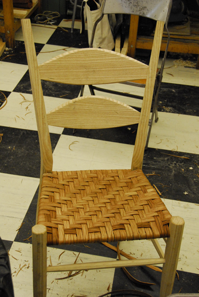
I will keep your advice in mind though and try for a high angle shot after my own assessment. Thank you all for your ideas. I have decided to go with the Windsor. I love the drama in the shot. This is missing in the ladder back photo. The shave horse was a near call, but as Gary pointed out, it is missing a foot. Greg
It's easy to be good... when there is nothing else to do
I did think about this option, but it is a fairly common shot for greenwood chairs. It is usually accompanied by a caption along the lines of " I took it home to meet the folks" I wanted to avoid this stereotype. Also since it is an art school catalogue, I wanted an "Arty" photo. Greg
It's easy to be good... when there is nothing else to do
Perth is a bit far - maybe if I get the job in Melbourne I've applied for
I had a bit of spare time, so I thought I would have a go at #2 in PP. I am by no means an expert at this, but the result is closer to what my mind's eye said the photo should be.
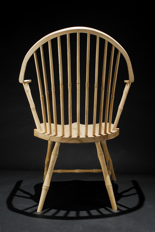
Basically my steps were: (This is probably child's play for most of you, but it is uncharted territory for me) 1. Select the chair using the Magic Wand 2. Invert the selection 3. Create an adjustment layer using the selection 4. Brighten the background using the levels layer 5. Clone out some of the dirt highlighted in Step 4 5. Save and breathe deeply into the paper bag Notes to self: I missed a bit of the chair in the initial selection: double check over the entire image in future Make sure the background is as clean as possible before taking the photo Get another Umbrella, or maybe a diffuser so I can soften the third light Play more with different angles. I suffered from Tripoditis on this shoot Learn more about PhotoShop. Your C&C more than welcome. In particular what could I have done better in PP? EDIT: I also tried to get more detail in the chair itelf, but I just mde it look muddy, so I discarded those changes (Hooray for multilevel Undo!) Greg
It's easy to be good... when there is nothing else to do
Previous topic • Next topic
12 posts
• Page 1 of 1
|