|
Got a thin skin? Then look elsewhere. Post a link to an image that you've made, and invite others to offer their critiques. Honesty is encouraged, but please be positive in your constructive criticism. Flaming and just plain nastiness will not be tolerated. Please note that this is not an area for you to showcase your images, nor is this a place for you to show-off where you have been. This is an area for you to post images so that you may share with us a technique that you have mastered, or are trying to master. Typically, no more than about four images should be posted in any one post or thread, and the maximum size of any side of any image should not exceed 950 px.
Moderators: Greg B, Nnnnsic, Geoff, Glen, gstark, Moderators
Forum rules
Please note that image critiquing is a matter of give and take: if you post images for critique, and you then expect to receive criticism, then it is also reasonable, fair and appropriate that, in return, you post your critique of the images of other members here as a matter of courtesy. So please do offer your critique of the images of others; your opinion is important, and will help everyone here enjoy their visit to far greater extent.
Also please note that, unless you state something to the contrary, other members might attempt to repost your image with their own post processing applied. We see this as an acceptable form of critique, but should you prefer that others not modify your work, this is perfectly ok, and you should state this, either within your post, or within your signature.
Images posted here should conform with the general forum guidelines. Image sizes should not exceed 950 pixels along the largest side (height or width) and typically no more than four images per post or thread.
Please also ensure that you have a meaningful location included in your profile. Please refer to the FAQ for details of what "meaningful" is.
 by bimborocks on Fri Nov 09, 2007 9:59 pm by bimborocks on Fri Nov 09, 2007 9:59 pm
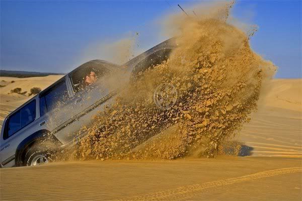
Some friends and in went drive up to Stockton beach sand dunes for a bit of saturday afternoon fun. Bit of 4x4 dune driving and some sandboarding is a great way to pass the afternoon away.
Here is a picture of a friends cruiser after hitting a bump a bit steeper than he thought. He meant to get some air but not take half the dune with him.

or Does it work better with a tighter crop and slight change of angle

Your thoughts
Cheers
James
-
bimborocks
- Member
-
- Posts: 81
- Joined: Wed Feb 02, 2005 10:43 pm
- Location: Newcastle, NSW
 by Bindii on Sat Nov 10, 2007 12:13 am by Bindii on Sat Nov 10, 2007 12:13 am
Oh smashing image... pardon the pun *grins*...
both versions are working for me.. you caught it at just the right moment... well done!...
did he damage the car at all... ?
 The last thing I want to do is hurt you... but it's still on the list... 
-

Bindii
- Senior Member
-
- Posts: 1895
- Joined: Mon Sep 18, 2006 2:28 pm
- Location: Ormeau Hills Queensland
 by Killakoala on Sat Nov 10, 2007 8:52 am by Killakoala on Sat Nov 10, 2007 8:52 am
I think the larger crop works better but could do with a bit of a contrast or curves adjustment. It just feels a bit flat.
Steve. |D700| D2H | F5 | 70-200VR | 85 1.4 | 50 1.4 | 28-70 | 10.5 | 12-24 | SB800 |Website-> http://www.stevekilburn.comLeeds United for promotion in 2014 - Hurrah!!!
-

Killakoala
- Senior Member
-
- Posts: 5398
- Joined: Fri Aug 13, 2004 3:31 pm
- Location: Southland NZ
-
 by bimborocks on Sat Nov 10, 2007 9:18 am by bimborocks on Sat Nov 10, 2007 9:18 am
Bindii wrote:did he damage the car at all... ? 
Not really, shifted the bullbar back a bit and bent the number plate. Apparently it is the end of it being a pampered fourwheel drive
Thanks for the comment Killakoala, still learning how to drive photoshop but will give it a go
-
bimborocks
- Member
-
- Posts: 81
- Joined: Wed Feb 02, 2005 10:43 pm
- Location: Newcastle, NSW
 by bimborocks on Sat Nov 10, 2007 9:38 am by bimborocks on Sat Nov 10, 2007 9:38 am
is this heading in the right direction

For some reason they look much brighter in photoshop than they do when i save it as a jpeg
Cheers
James
-
bimborocks
- Member
-
- Posts: 81
- Joined: Wed Feb 02, 2005 10:43 pm
- Location: Newcastle, NSW
 by Killakoala on Sat Nov 10, 2007 1:34 pm by Killakoala on Sat Nov 10, 2007 1:34 pm
That looks so much better. There is much more definition in the sand.
Steve. |D700| D2H | F5 | 70-200VR | 85 1.4 | 50 1.4 | 28-70 | 10.5 | 12-24 | SB800 |Website-> http://www.stevekilburn.comLeeds United for promotion in 2014 - Hurrah!!!
-

Killakoala
- Senior Member
-
- Posts: 5398
- Joined: Fri Aug 13, 2004 3:31 pm
- Location: Southland NZ
-
 by dawesy on Sat Nov 10, 2007 8:11 pm by dawesy on Sat Nov 10, 2007 8:11 pm
Nice shot, showcases the action nicely. Did much the same thing when I took mine there the first time. That as over three years ago and still find sand working it's way out from behind the dash and other places!
-
dawesy
- Senior Member
-
- Posts: 681
- Joined: Tue Jan 23, 2007 4:44 pm
- Location: Roseville, Sydney
-
Return to Image Reviews and Critiques
|


