|
Got a thin skin? Then look elsewhere. Post a link to an image that you've made, and invite others to offer their critiques. Honesty is encouraged, but please be positive in your constructive criticism. Flaming and just plain nastiness will not be tolerated. Please note that this is not an area for you to showcase your images, nor is this a place for you to show-off where you have been. This is an area for you to post images so that you may share with us a technique that you have mastered, or are trying to master. Typically, no more than about four images should be posted in any one post or thread, and the maximum size of any side of any image should not exceed 950 px.
Moderators: Greg B, Nnnnsic, Geoff, Glen, gstark, Moderators
Forum rules
Please note that image critiquing is a matter of give and take: if you post images for critique, and you then expect to receive criticism, then it is also reasonable, fair and appropriate that, in return, you post your critique of the images of other members here as a matter of courtesy. So please do offer your critique of the images of others; your opinion is important, and will help everyone here enjoy their visit to far greater extent.
Also please note that, unless you state something to the contrary, other members might attempt to repost your image with their own post processing applied. We see this as an acceptable form of critique, but should you prefer that others not modify your work, this is perfectly ok, and you should state this, either within your post, or within your signature.
Images posted here should conform with the general forum guidelines. Image sizes should not exceed 950 pixels along the largest side (height or width) and typically no more than four images per post or thread.
Please also ensure that you have a meaningful location included in your profile. Please refer to the FAQ for details of what "meaningful" is.
 by Dargan on Sun Nov 11, 2007 11:34 pm by Dargan on Sun Nov 11, 2007 11:34 pm

and

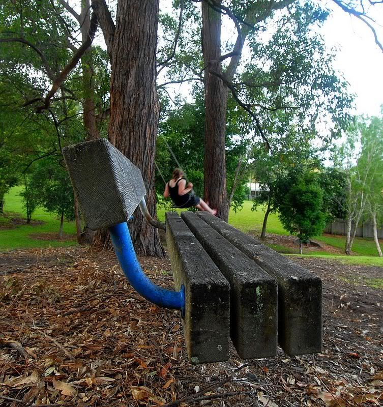
These were both taken with the 12-24 as opposed to my first effort with the 18-200. I only have a laptop at the moment so no Dxo or PS just Irfan basics. Any improvement on the previous post Seat?
Actually the sky does look quite blown on this monitor, any suggestions most welcome, I'm sort of intrigued with this image opportunity in my backyard. In the end we know Nothing, but in the meantime Learn like crazy.
Your Camera Does Matter Nikon D70 D200 D300
PPOK
-

Dargan
- Senior Member
-
- Posts: 702
- Joined: Fri Oct 01, 2004 11:22 pm
- Location: Sunshine Coast
 by Biggzie on Mon Nov 12, 2007 1:52 am by Biggzie on Mon Nov 12, 2007 1:52 am
Interesting #2
You've gone from levitation in your previous post to Escher style in this one.
You have a seat being held in mid air by some ropes attached to the branch of a tree on the other side of the tree to the seat. 
I like it 
They both have blown skys on this monitor too. Nunquam requîrere a aptus occãsiõ ad claudere sûrsum
-

Biggzie
- Member
-
- Posts: 277
- Joined: Thu Oct 19, 2006 12:51 am
- Location: Mt Gambier, SA
-
 by Dargan on Mon Nov 12, 2007 12:59 pm by Dargan on Mon Nov 12, 2007 12:59 pm
Thanks for the comments Biggsie. I thought I would go back with the polariser and see about the sky issue. It needs some space around the seat to create the floating illusion so I cannot really crop it out. I like the Escher reference.  That swing in the background was put up for the children and it took a few tries to get my daughter in just the right position for one of the images I should have seen the rope lines attached to the seat back though in the second image but if it helps the image its OK. In the end we know Nothing, but in the meantime Learn like crazy.
Your Camera Does Matter Nikon D70 D200 D300
PPOK
-

Dargan
- Senior Member
-
- Posts: 702
- Joined: Fri Oct 01, 2004 11:22 pm
- Location: Sunshine Coast
Return to Image Reviews and Critiques
|


