Page 1 of 1

At the beach

PostPosted: Mon Nov 19, 2007 9:55 am
by Geoff
A few from a shoot yesterday afternoon, a few of our members!! Comments/critique welcomed:


Image

Image


Image

PostPosted: Mon Nov 19, 2007 11:27 am
by Bindii
Oooh we have some good looking members... ;)

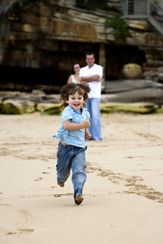
Love that second one of the child running.. thats a magic shot!

PostPosted: Mon Nov 19, 2007 12:02 pm
by PiroStitch
Overall they're nice shots but they don't leap out at me.

#1 - Keep in mind the background as much as the subject. With the conversion to b&w, I think it would have been better if you had taken the shot more with the rocks behind the subjects and with those lighter patches of rocks helping to seperate the guy's dark hair from the dark background. Right now the big patch of white sky is pulling the eye away from the centre of frame towards it.

#2 - Great natural shot and DOF to include the parents in the bkg, but maybe a recomposition of having the child to the left and the parents slightly to the right so that everything isn't clumped all together in the centre of the frame. Alternative here is to crop the frame closer to the child and parents.

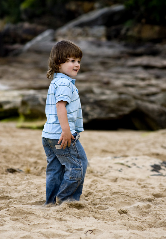
#3 - Probably the best out of these 3 in terms of emotions and composition. Exposure is spot on

Great work Geoff. Just focus a bit more on composition and attention to the details in the background and you'll be spot on :)

PostPosted: Mon Nov 19, 2007 3:56 pm
by Reschsmooth
PiroStitch wrote:...the guy...


Careful what you say there, fella. :lol: :lol: :lol:

PostPosted: Mon Nov 19, 2007 4:13 pm
by shutterbug
Love it :wink:

PostPosted: Mon Nov 19, 2007 4:14 pm
by Geoff
Thanks for the feedback guys.
Piro - working with kids a lot of the time you have to 'go with the flow' so positioning him with the parents more in view was a bit tricky. That little guy was only 3 years old (tall though hey!!!?).

The colour version of the 1st shows the sky as a nice blue, so doesn't detract as much as it appears to in the B&W copy, and as suggested I may burn the sky a bit in the B&W version so as it's not tending to draw the eye out.

Appreciate your honesty - thanks :)

PostPosted: Tue Nov 20, 2007 1:30 am
by Alex
Geoff,

No. 2 is TOP STUFF!

Alex

PostPosted: Tue Nov 20, 2007 8:02 am
by Slider
Yep, that second shot is a ripper. Top stuff :D

PostPosted: Tue Nov 20, 2007 8:41 am
by Wocka
Yes the second picture is the one.

Great shot.
Cheers

PostPosted: Tue Nov 20, 2007 9:22 am
by the foto fanatic
Yep, #2 has it.

Forget subject placement and all that other crap.

Images like this aren't staged or planned. This picture captures perfectly the unrestrained joy of a child running on the beach with proud parents looking on in the background.

Excellent.

PostPosted: Tue Nov 20, 2007 9:54 am
by PiroStitch
Geoff wrote:Piro - working with kids a lot of the time you have to 'go with the flow' so positioning him with the parents more in view was a bit tricky. That little guy was only 3 years old (tall though hey!!!?).


Agree with that completely Geoff but just because you can't move or direct the kid as much as an adult, doesn't mean you can't take two steps to the right...unless it meant you get taken out by the rip out to sea. :)