and yes I wore clothes to it...
Nudes - not work safe!Moderators: Greg B, Nnnnsic, Geoff, Glen, gstark, Moderators
Forum rules
Please note that image critiquing is a matter of give and take: if you post images for critique, and you then expect to receive criticism, then it is also reasonable, fair and appropriate that, in return, you post your critique of the images of other members here as a matter of courtesy. So please do offer your critique of the images of others; your opinion is important, and will help everyone here enjoy their visit to far greater extent. Also please note that, unless you state something to the contrary, other members might attempt to repost your image with their own post processing applied. We see this as an acceptable form of critique, but should you prefer that others not modify your work, this is perfectly ok, and you should state this, either within your post, or within your signature. Images posted here should conform with the general forum guidelines. Image sizes should not exceed 950 pixels along the largest side (height or width) and typically no more than four images per post or thread. Please also ensure that you have a meaningful location included in your profile. Please refer to the FAQ for details of what "meaningful" is.
Previous topic • Next topic
22 posts
• Page 1 of 1
Nudes - not work safe!From a nude workshop..
and yes I wore clothes to it... 


 The last thing I want to do is hurt you... but it's still on the list...
Bindii
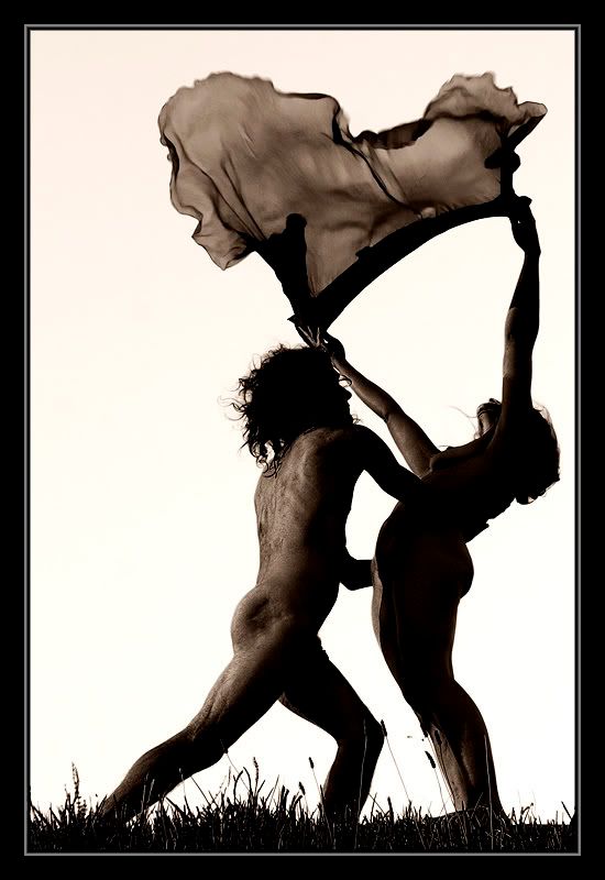
Brilliant photography. I like them all but especially the first photo. In my opinion this photo has movement, serenity, joy and represents a celebration of indentity and gender. Thanks for sharing these Cheers Graham
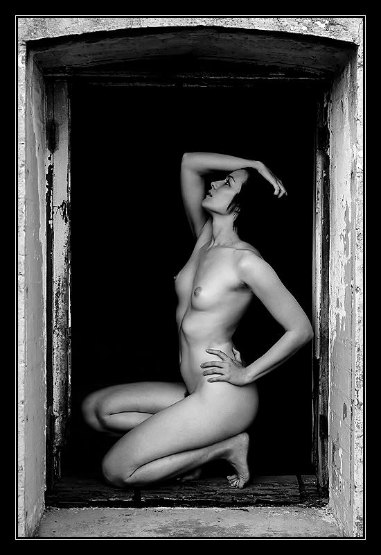
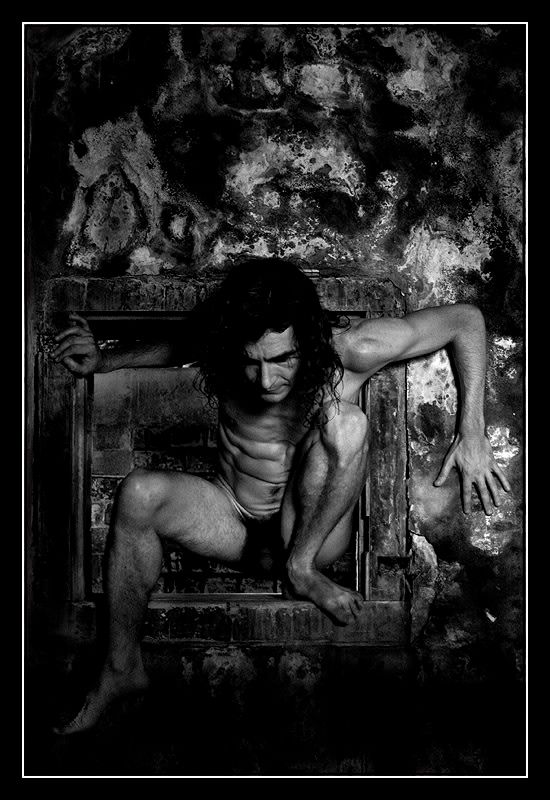
To me #3 is the standout shot, great pose, framing and tonal range. I thought the last shot looked like the bloke was constipated and straining to get it out on some primitive dunny but I'm a bit of a philistine when it comes to creative artistic nude shots. I sure it has some other qualities I'm unable to appreciate..
Love the tones in the last two. The 2nd last is a standout from technical and artistic points, beautiful b&w treatment. Very tasteful.
Alex
All excellent pix. Excellent compositionally and creatively.
I really like #4 because of the originality and the range of tone. There seems to be something not quite right about the male's back in #1. It could be a bit over-sharpened, but the texture doesn't sit right with me, and I think that if it were smoother the image would be stronger. Well done - you are really nailing this B&W stuff! TFF (Trevor)
My History Blog: Your Brisbane: Past & Present My Photo Blog: The Foto Fanatic Nikon stuff!
Sue,
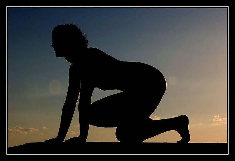
As Trevor has pointed out, the tonal range in #4 is wonderful. There is a scruffiness to the background, and that seems to sit well with the model and enhance this image. To me it feels almost dirty in the sense that everything needs a really good cleanup, and the whole just works as a result. In #2, I'd have preferred to see the model a bit more towards the rh side of the frame; at the moment he seems poised to run out of the image. g.
Gary Stark Nikon, Canon, Bronica .... stuff The people who want English to be the official language of the United States are uncomfortable with their leaders being fluent in it - US Pres. Bartlet
it looks like someone has painted part of her black in #1
#3 & #4 are both brilliantly done Shane
Life's too short to be sad ! http://bigred4x4.blogspot.com/2008/01/welcome.html http://bigred.redbubble.com
The last one is the stand out for me. As has been said before me, the tonal range is perfect for the subject matter. It reminds me of a kind of 'rebirth.'
Steve.
|D700| D2H | F5 | 70-200VR | 85 1.4 | 50 1.4 | 28-70 | 10.5 | 12-24 | SB800 | Website-> http://www.stevekilburn.com Leeds United for promotion in 2014 - Hurrah!!!
Sue
#4 and #1 are superb (and in that order). I generally find nudes quite boring but those two rather than just being some arty shot of a bit of flesh extend the human form to make them a more organic part of the environment they are in. This in turn gives a really powerful and captivating shot. This is the best work I have seen from you and that's a big call given you've done some great work in the past. Peter
Disclaimer: I know nothing about anything. *** smugmug galleries: http://www.stubbsy.smugmug.com ***
Sue No4# looks like something the band Tool (pardon the pun) or Mettalica would add to their album covers. This is great work. As a rule of thumb most of you images are first class.
"I believe you are a bit of a dark horse with you work"! cheers jethro shoot it real.
look! and see. Shoot and feel
Sue these are wow! Really strong, earthy images, top notch stuff. The 3rd would be the weakest, but I like the concept just think recomposing with more space on the left would work well.
Yeah that annoyed me too... but he had lots of scarring and pits on his back and I couldnt be bothered healing them... the pp'ing enhanced it though... I might have another try with this one and see if smoothing it will make it better...
Ummmm ... a variety of lenses.. some of them kit and some not... I don't have any L series lenses though... I am fairly sure that most of these were taken with the 28-135mm Canon lens.. ( http://www.canon.com.au/products/camera ... isUsm.aspx ).. its not expensive about $800 new... And thanks everyone for the crits I always appreciate the time that it takes it view and reply on photo's.. I'm going to try and rework a couple of these on your crits (adding some space to the sillouette etc) thanks for pointing it out to me guys.. sometimes you really need to view a shot through someone elses eye's to really see it.. The last thing I want to do is hurt you... but it's still on the list...
Bindii
#1 - the flow in this pic works extremely well. As to the back of the man - leave it in its natural state - would you take a photo of a leper then clone out all of the pits and scars - an emphatic no. #2 - a good pose for this contre jour type shot, The reflectance of the sun on the right arm and butt adds depth. #3 - The pose, the frame and the model herself are all reminiscent of Man Ray’s work - excellent #4 - again, great framing but the pic would benefit from more of a low key lighting IMO. Chris
-------------------------------- I started my life with nothing and I’ve still got most of it left
Yeah.... I think I might end up redoing that shot as it was only natural lighting..... and very very dark so its a slow exposure hand held on a monopod.. I don't think it would be too hard to darken it a bit more in PP'ing... and thanks again everyone.. your crits are wonderful! The last thing I want to do is hurt you... but it's still on the list...
Lovely work Bindii. The last is incredibly vivid and visually engaging. I agree with Chris here very much Man Ray'ish. If I were a believer in reincarnation Bindii I'd have to rename you Manii in a helluva better form
cheers marco
Previous topic • Next topic
22 posts
• Page 1 of 1
|