
A little critique would also be appreciated.
Regards Colin
What is your preference?Moderators: Greg B, Nnnnsic, Geoff, Glen, gstark, Moderators
Forum rules
Please note that image critiquing is a matter of give and take: if you post images for critique, and you then expect to receive criticism, then it is also reasonable, fair and appropriate that, in return, you post your critique of the images of other members here as a matter of courtesy. So please do offer your critique of the images of others; your opinion is important, and will help everyone here enjoy their visit to far greater extent. Also please note that, unless you state something to the contrary, other members might attempt to repost your image with their own post processing applied. We see this as an acceptable form of critique, but should you prefer that others not modify your work, this is perfectly ok, and you should state this, either within your post, or within your signature. Images posted here should conform with the general forum guidelines. Image sizes should not exceed 950 pixels along the largest side (height or width) and typically no more than four images per post or thread. Please also ensure that you have a meaningful location included in your profile. Please refer to the FAQ for details of what "meaningful" is.
Previous topic • Next topic
8 posts
• Page 1 of 1
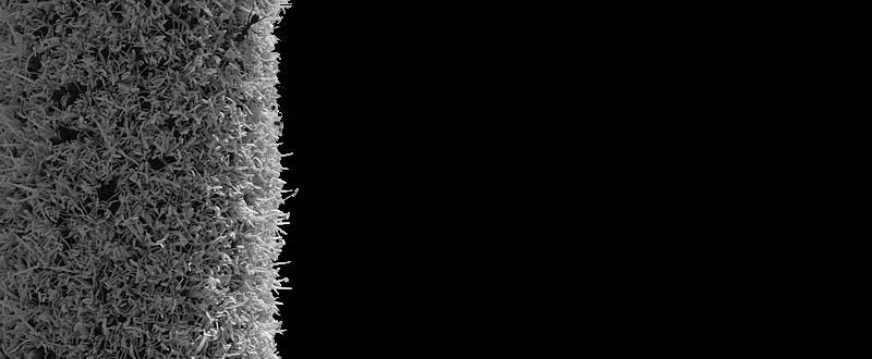
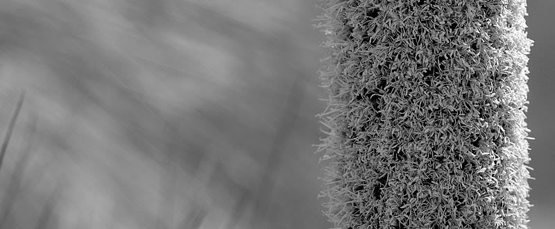
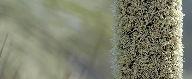
What is your preference?Trying to decide what works best. Trouble is< I like them all.


A little critique would also be appreciated. Regards Colin
As a design element or layout for a magazine I like them. They would need text or some other element in order to come to life. As stand alone single images they don't work for me but would work as a series if they were sympatheically framed. Perhaps as very large fine prints they would exude some power. Thanks for posting them.
Regards
Matt. K
i posted a reply yesterday but it seems to have been deleted for some reason ??
anyway... i prefer the 2nd series. the first 2 there is too much black in the frame and the thing is cropped. the 2nd series has beautiful dreamy bokeh filling the background and the foreground is nice and sharp with great contrasting texture. #3 is my fave. i would have that printed on canvas and hanging on my wall no problem. EM1 l 7.5 l 12-40 l 14 l 17 l 25 l 45 l 60 l 75 l AW1 l V3
Nice to see some differences of opinion. votes for 2,3 and 4 so far.
Matt, I was thinking of an editorial use when I was producing them so it is good to see that this is what you thought of them. Regards Colin
#4
The ant on the first 2 are a bit distracting to me to be honest ... but maybe it's because I look for things like that, so my eye is just drawn to any insect... but I love the muted colours in the last Dodging and burning are steps to take care of mistakes God made in establishing tonal relationships! -Ansel Adams
http://www.redbubble.com/people/blacknstormy
Previous topic • Next topic
8 posts
• Page 1 of 1
|