Page 1 of 1

Photo critique and assistance for a noob ;-)

PostPosted: Fri Jan 04, 2008 10:26 am
by Shorty
Hey Everybody,

I'm very much new to photography(got my 400d in September, yes I'm THAT new!!) and have taken a couple of shots of late that I think are ok, but I feel as though they may need something to make them ummm.... pop!!! Be as critical as you like - go nuts!! ;-)

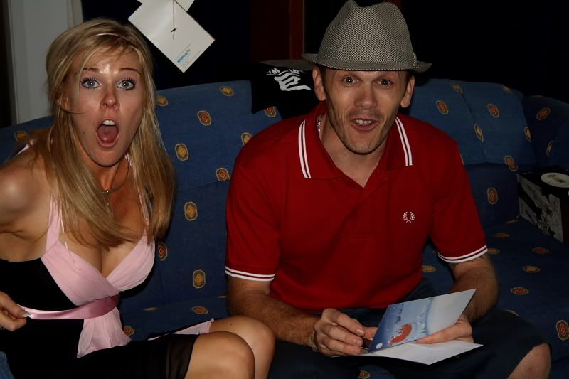
The first image is from xmas day and while I think I got the timing right when they unwrapped my present to them, I think the pic might be a bit dark... is it too dark...??
Image

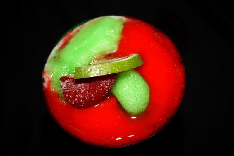
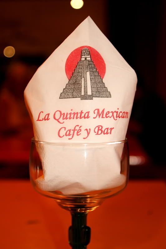
The last 2 pics were taken for a friend when another friend and I went to take some pics for the new website for their restaurant(and to have a great feed as well of course)!! Do these pics work...??? Is there anything I can do to really get both images to stand out...???
Image

Image

Thanks in advance for any\all criticisms and suggestions! ;-)

Shorty

PostPosted: Fri Jan 04, 2008 12:56 pm
by Marvin
I do think the first one is a bit dark. Some levels adjustment in photoshop should fix it up. I like the third, not sure about the second. There are some good colours but it's not really obvious (to me anyway) what it actually it.

PostPosted: Fri Jan 04, 2008 1:04 pm
by dawesy
Yes the first is a tad dark, but adding some brightness in whatever software you have available should get the two subjects looking nice without to much tweaking. When shooting, it could have benefited form some flash bounced of the ceiling to fill in the dark areas. Good timing though!!

The second one I think suffers from a lack of Depth of Field, that is i don't find enough of the subject is in focus. I think that detracts in this case as there isn't a lot of it, and it all needs to be crisp. It has awesome colours and I like the perspective, even if I'm not sure exactly what I'm looking at, so it's definitely half way there.

The last I quite like as it is. It's probably a tad more orange that the actual place it was taken, but it gives a warm feel I think works.

PostPosted: Fri Jan 04, 2008 1:39 pm
by Travy
Well hello shorty :P

Agree with the other comments here.

Not sure what the second pic actually is!

The last one isnt bad, bit too warm for my personal preference but its what the restaurant owners want that counts ;)

Some adjustments in photoshop or whatever program could benefit the first and last pics a bit.

Its all trial and error when learning :)

PostPosted: Fri Jan 04, 2008 2:31 pm
by mickeyjuice
Lightroom is your friend.

Agree that #1 needs a bit of boosting on the levels, and you probably need to look at the White Balance on them (especially #3).

PostPosted: Fri Jan 04, 2008 9:46 pm
by Ladybird
I'm pretty new as well to this whole thing but thought I would give you my 2c worth as well.

#1: Great expression on this one. Next time, if you can help it, try and get all of them in the shot and I find the missing part of the girl's arm detracts from the photo.

As a side, what was the present you gave them to get this reaction?????

#2: I don't know what this is either (although guessing it is some sort of yummy dessert) but I really like this photo. Great use of colour and contrast with the black background. I do find that the highlight on the fruit from the flash is a little distracting. If you don't have a lightsphere or other softening item, you can easily create one using some white cotton fabric or the like.

#3: Okay, I'm being picky here but the napkin is a little bit crooked in this one. Also, some more depth of field to get the stem of the glass more in focus might be handy.

JMHO

PostPosted: Fri Jan 04, 2008 10:02 pm
by Mal
I agree with what Ladybird has said, and would just add that I would like to eat number what ever is in picture number two.
And for number three I would try and make the napkin white, for me white means clean, and everyone like to eat at a clean food joint :)
As some others have said this can be done in Photoshop or even Lightroom

PostPosted: Fri Jan 04, 2008 10:57 pm
by dodge
here you people... 8)

Image


cheers Joe

PostPosted: Fri Jan 04, 2008 11:05 pm
by Ladybird
Ooooooooh, I want one!

No, make that two....

PostPosted: Fri Jan 04, 2008 11:09 pm
by Shorty
Ladybird wrote:I'm pretty new as well to this whole thing but thought I would give you my 2c worth as well.

#1: Great expression on this one. Next time, if you can help it, try and get all of them in the shot and I find the missing part of the girl's arm detracts from the photo.

As a side, what was the present you gave them to get this reaction?????

#2: I don't know what this is either (although guessing it is some sort of yummy dessert) but I really like this photo. Great use of colour and contrast with the black background. I do find that the highlight on the fruit from the flash is a little distracting. If you don't have a lightsphere or other softening item, you can easily create one using some white cotton fabric or the like.

#3: Okay, I'm being picky here but the napkin is a little bit crooked in this one. Also, some more depth of field to get the stem of the glass more in focus might be handy.

JMHO


Tickets to see Phantom of the Opera when it starts showing up here at the end of this month - the tickets are for opening night, which is the first Sunday night they are playing. Both haven't seen Phantom and were keen to go but didn't think they would be able to get there... but now they are!! :D

Ended up getting tickets for mum and dad and myself as well - so we are all going together and while the rest of us have seen it, I could watch it and listen to that music all day long!! Everyone is keen for it - should be a cracker of a night! :D

PostPosted: Fri Jan 04, 2008 11:09 pm
by dodge
Ladybird wrote:Ooooooooh, I want one!

No, make that two....
pics start becoming blurry after you taste test all of the subjects :lol:

PostPosted: Fri Jan 04, 2008 11:23 pm
by Shorty
Thank you to everyone who replied, I really appreciate it. Even got some more ideas on how to shoot subjects like that tonight when I was out at dinner with a group of really good friends so that was fantastic and certainly helps with getting different ideas when speaking with more experienced people!!

Thanks to Brett, Rob and of course Joe for all of the help, assistance and of course (unending) patience when I tag along with them and pester them with a million and one questions, when I bump into their tripods as they are in the middle of taking pics and as I *somehow* end up with all of their expensive gear in my camera bag... I *really* dunno how it gets there....

....honest!!!

:D

PostPosted: Fri Jan 04, 2008 11:31 pm
by Shorty
dodge wrote:
Ladybird wrote:Ooooooooh, I want one!

No, make that two....
pics start becoming blurry after you taste test all of the subjects :lol:

*sulks*
Doesn't make any difference to the pics I take though...


... DOH!!!

:(

Shorty

PostPosted: Fri Jan 04, 2008 11:43 pm
by Travy
dodge wrote:here you people... 8)

Image


cheers Joe


still have no idea what it is :oops:

:P

PostPosted: Fri Jan 04, 2008 11:57 pm
by dodge
its actually a cocktail travis..has tequila in it from memory :D