Page 1 of 1

The Next Level? Kassie in the Jungle

PostPosted: Fri Jan 04, 2008 12:21 pm
by MattyO
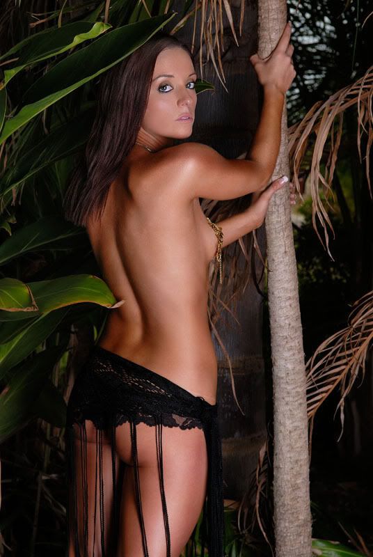
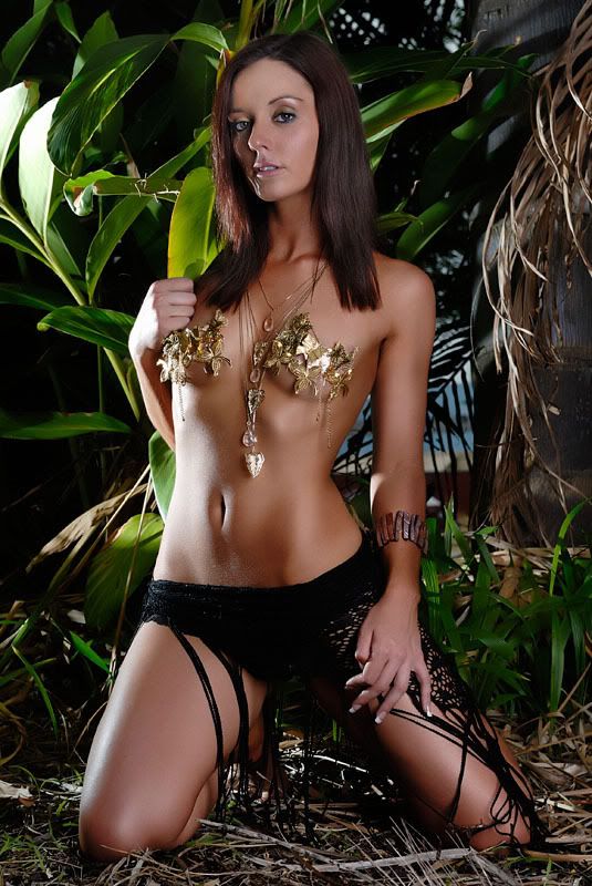
I have had MattK say a few times its time to take my stuff to the next level. Got the honor of working with the gorgeous Kassie again and this shoot was shot with that in mind.

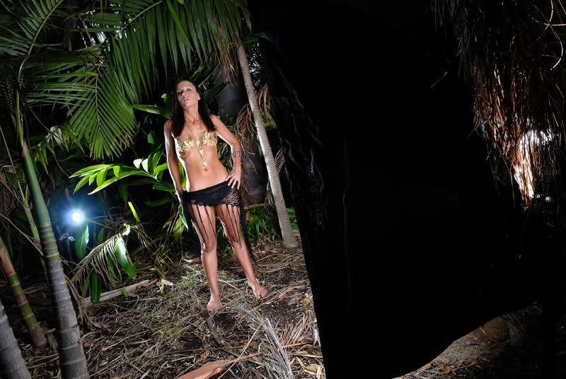
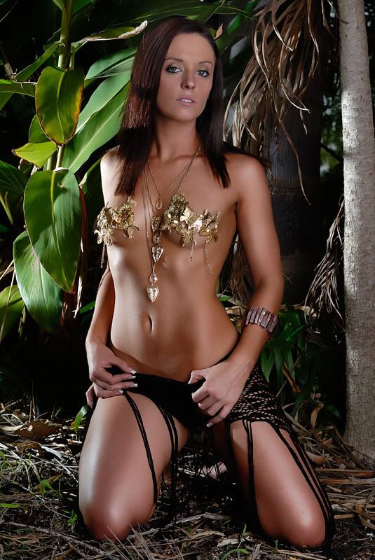
We shot in this jungle looking location, and i tried something different and used a kicker light as i knew it was going to be hard to seperate her from the background.

Still a lot of work went into the pp of this to try and make sure skin tones were good as well as keeping her out of the background so to speak.

ANwyays, enough talk and more pics...

Comments and Criticisms are always welcome!
Image
Image
Image

and a bit of a setup shot

Image

PostPosted: Fri Jan 04, 2008 1:42 pm
by Travy
I dont like the gold stuff on her breasts.. it should be removed :P

But seriously, the gold stuff isn't my cup of tea, i dont think it suits the location etc (but thats just my personal preference), i like the location and she is obviously a great looking model :)

Nice shots

PostPosted: Fri Jan 04, 2008 3:17 pm
by GK
very interesting light. using just one flash to provide separation and fill in the shadows with such good end result is amazing!

Good job!

GK

PostPosted: Fri Jan 04, 2008 4:28 pm
by Big Red
#1 and #2 are both great 8)

#3 is a bit bright on her side and gives her a hairy belly

PostPosted: Fri Jan 04, 2008 7:06 pm
by Oz_Beachside
hi matty, i hesitate to comment, as I dont have enough success outdoors to base my feedback on. But from the few shots i've been happy with, have been where I have mixed ambient and flash.

in these the lighting on the subject is very good (as with surfie chick) but your settings dont show us the surrounding backdrop. I can see it in one, and its blue water. you have your exposure at iso 100, 1/250th, around 5.6-6.3. aperture is good for DOF, but assuming the backdrop looks nice, I'd like to see a bit more of it. this will also add light to your subject. maybe ISO 200, 1/60th?

styling of the jewelry and gold leaf, and black tassles. each of these work individually, but very busy together. I think Dan has a few nice shots with gold foil top but simple bikini bottom. this one is a mix of evning and beach.

I have three outdoor shoots in january and hope to share some pics soon!

:D

PostPosted: Mon Jan 07, 2008 4:14 pm
by MattyO
im gunna bump this thread....

we will probably reshoot this idea, so i'd like some advice as to what would make it a better shoot.

any comments and criticisms are encouraged

PostPosted: Mon Jan 07, 2008 4:18 pm
by Alpha_7
She seems a little clean for the jungle, just a thought but a little mud or dirt might not go astray.

PostPosted: Mon Jan 07, 2008 4:56 pm
by Oz_Beachside
bring out the animal in your subject!

funk up the hair like she has had the time of her life. neutral colored bikini (beige crocheted bikini would work a treat, or simple plain white/beige/black) non underwire top.

accessorise but no jewel looking jewelery, maybe some beaded "hand made" looking necklace and braclet. maybe an anklet?

arm band is tribal like, and works. more moisturiser (to get some shine, perhaps not all the way to baby oil and spray bottle though).

consider a prop??? diving knife straped to her leg? old army backpack?

PostPosted: Mon Jan 07, 2008 5:06 pm
by Reschsmooth
I don't know how to explain this properly, but the lighting on her face seems flat and almost with a blueish colour cast compared to the rest of the lighting which generates great texture on her torso. This could be a function of viewing on uncalibrated monitors, but her head looks like it has been lit with a fluro light source.

PostPosted: Mon Jan 07, 2008 7:02 pm
by Kyle
Reschsmooth wrote:I don't know how to explain this properly, but the lighting on her face seems flat and almost with a blueish colour cast compared to the rest of the lighting which generates great texture on her torso. This could be a function of viewing on uncalibrated monitors, but her head looks like it has been lit with a fluro light source.


I see it also Pat.

I'm with the dirty look too, good suggestions guys!

PostPosted: Tue Jan 08, 2008 9:25 pm
by W00DY
Hi Mate,

A lot has been said about these photos already... I agree that the dirty look would work well here.

The only thing that I don't think has been picked up is her fake tan. I noticed that the colour of her arm is VERY different to the colour of her hands (really noticeable in #1 & #2).

I asked my wife about this and she said you always have to wash your hands after applying fake tan :shock:


:lol:

PostPosted: Wed Jan 09, 2008 2:12 pm
by Matt. K
That background has something you can use...colour, and something you don't need....detail. I'd bring the model well forward of the jungle and then throw it out of focus. Some of the other comments also have some good ideas that you could probably experiment with. She's a good model and photographs well so keep at it and the magic will work.