Page 1 of 1
I wanted to try something different...

Posted:
Mon Jan 07, 2008 9:41 amby Bindii

Posted:
Mon Jan 07, 2008 9:53 amby iposiniditos
yes.... the #1 and #2 are sharp and beautiful.
1st one is a great capture.
Very well done!
As for your question, yes they work


Posted:
Mon Jan 07, 2008 9:54 amby sirhc55
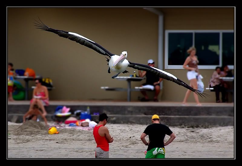
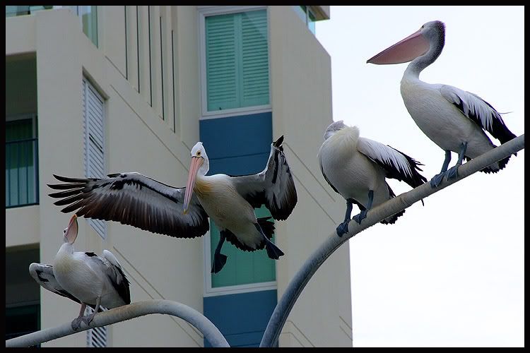
#1 is an amazing shot in that the humanoids are taking absolutely no interest in the bloody great birdie that could dump an amazing amount of poo on them, judging by its size


Posted:
Mon Jan 07, 2008 10:30 amby NeoN
sirhc55 wrote:#1 is an amazing shot in that the humanoids are taking absolutely no interest in the bloody great birdie that could dump an amazing amount of poo on them, judging by its size

Typical of you Chris,but really as Theo said, they are Nicely done,and blend very well,good job
Bindii 
Cheers NeoN
http://www.redbubble.com/people/neophytos

Posted:
Mon Jan 07, 2008 10:30 amby phillipb
They definitely work for me.
The last two are good, but you sort of look at them, think to yourself "They're nice shots" and move on.
The first two however, you look at the bird, then your eye goes around taking in the rest of the photo, then you come back to the bird again. At least that's what it does to me.
Well done Bindii

Posted:
Mon Jan 07, 2008 10:36 amby Handlebars
Wow! love them all again!

Posted:
Mon Jan 07, 2008 12:22 pmby PiroStitch
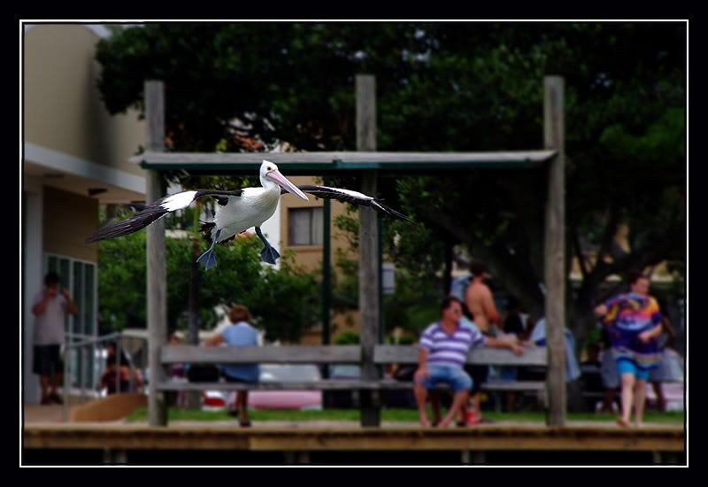
love the DOF in the 2nd one! Great stuff Bindii!

Posted:
Mon Jan 07, 2008 12:30 pmby Travy
phillipb wrote:They definitely work for me.
The last two are good, but you sort of look at them, think to yourself "They're nice shots" and move on.
The first two however, you look at the bird, then your eye goes around taking in the rest of the photo, then you come back to the bird again. At least that's what it does to me.
Well done Bindii
I agree with you there

They are all great shots though


Posted:
Mon Jan 07, 2008 12:33 pmby dawesy
I think #1 is a cracker. The background gives context and adds to the image, yet the Pelican is mostly on the plain wall so it still remains seperated from an essentially 'busy' background. I think you achieved exactly what you set out for with that one!
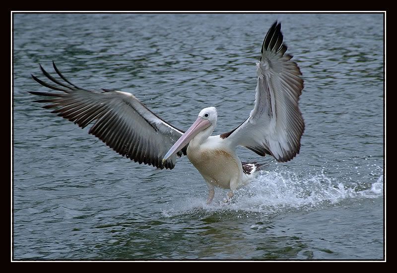
I also like #3, always loved watching pelicans land when we had a house by the lake as a kid!

Posted:
Mon Jan 07, 2008 1:00 pmby Mal
phillipb wrote:They definitely work for me.
The last two are good, but you sort of look at them, think to yourself "They're nice shots" and move on.
The first two however, you look at the bird, then your eye goes around taking in the rest of the photo, then you come back to the bird again. At least that's what it does to me.
Well done Bindii
I agree the first two work for me and the other ones are ho um.....

Posted:
Mon Jan 07, 2008 1:15 pmby BullcreekBob
Have you though of more blurr for the bg in #1 and #2?
All good shots though. I imagine it won't be long before we see you advertising all your Canon gear for sale? You are certainly making the S5 sing.

Posted:
Mon Jan 07, 2008 1:20 pmby johnd
Sue, these are crackers. Just fantastic.
Cheers
John

Posted:
Mon Jan 07, 2008 2:23 pmby Big Red
great shots with the different perspective


Posted:
Mon Jan 07, 2008 3:29 pmby sunnylass
Wow, these are stunning! All I can say is thank goodness there is no audio commentary to go with this.
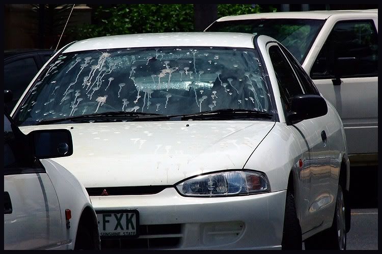
Oh oh, put up the one of the windscreen


Posted:
Mon Jan 07, 2008 9:17 pmby matt-chops
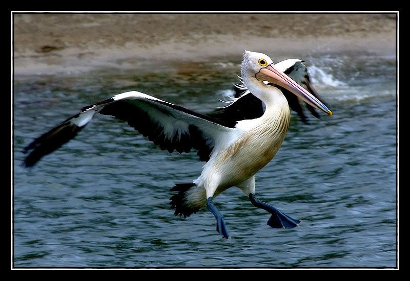
I have to say I'm a big fan of #4. IMO having the head and body perfectly sharp and the wings and feet ever so slightly blurred provides a perfect balance between still life and motion. It seems to breath just enough life into the photo. Nice work.


Posted:
Mon Jan 07, 2008 9:30 pmby blacknstormy
I love #1 - fantastic !!!!!!

Posted:
Mon Jan 07, 2008 9:37 pmby Bindii
sunnylass wrote:Oh oh, put up the one of the windscreen

Lol... you mean the 'where
not to park your car ones?'...


Posted:
Mon Jan 07, 2008 9:43 pmby drifter
The birds may have misinterpreted PP ok on your images.....
Great shots
btw .The first one works well as an opposite to what the norm would be.

Posted:
Mon Jan 07, 2008 10:34 pmby Mj
Sue... certainly the shots with something other than straight water etc are far more interesting... some of these are just plain good fun!!! A bird in the water is... well... yawn

However... as you've put these up for critique... your PP treatment of the birds is somewhat over sharpened. Might I suggest backing off a tad on the sharpening ??? Also the top right pelican in the last pic seems to have acquired some chroma (unless it's head really is purple?).
Apologies for being a killjoy

Michael.

Posted:
Mon Jan 07, 2008 10:51 pmby Bindii
Mj wrote:Sue... certainly the shots with something other than straight water etc are far more interesting... some of these are just plain good fun!!! A bird in the water is... well... yawn

However... as you've put these up for critique... your PP treatment of the birds is somewhat over sharpened. Might I suggest backing off a tad on the sharpening ??? Also the top right pelican in the last pic seems to have acquired some chroma (unless it's head really is purple?).
Apologies for being a killjoy

Michael.
No crit away.. all is good..

Point taken on the sharpening.. I didn't sharpen in the original proccessing only once I resized and more than likely I forgot to reduce the opacity of it once done..
funny that you mentioned the chroma.. (lost on the top right pelican thing though as there is only one pelican in the last pic)..cause when I viewed these pics on my work monitor today the chroma was terrible... but I can't see it at all on this monitor at home.. I'd be interested to hear if anyone else can see it (maybe my montior needs calibrating/trashing etc??)..
thanks for the crit.. much appreciated..


Posted:
Mon Jan 07, 2008 11:05 pmby Mj
Was referring to the one labelled 'where not to park your car ones?'... with the second shot of the cars below.... definitely four pelicans in that shot (at least that what I hope I'm seeing)... none of the others appear to have any appreciable chroma that I noticed. The chroma displayed is pretty much classic... lotsa contrast with the white feathered bird against a bright sky.

Posted:
Mon Jan 07, 2008 11:08 pmby Bindii
Mj wrote:Was referring to the one labelled 'where not to park your car ones?'... with the second shot of the cars below.... definitely four pelicans in that shot (at least that what I hope I'm seeing)... none of the others appear to have any appreciable chroma that I noticed. The chroma displayed is pretty much classic... lotsa contrast with the white feathered bird against a bright sky.
Ah.. thats almost a relief.. I hadn't thought that you meant those pics.. they havent been edited cept for a resize which is hopefully why it looks like that.. thanks heaps for your inputt...


Posted:
Tue Jan 08, 2008 6:34 pmby Finch
No. 4 by a country mile, IMHO
Great work

Cheers
Michael

