Page 1 of 1
Of course it poured with rain...

Posted:
Sun Jan 13, 2008 9:55 pmby Bindii
Re: Of course it poured with rain...

Posted:
Sun Jan 13, 2008 10:17 pmby Mj
Glad for your photos that it was overcast !!!
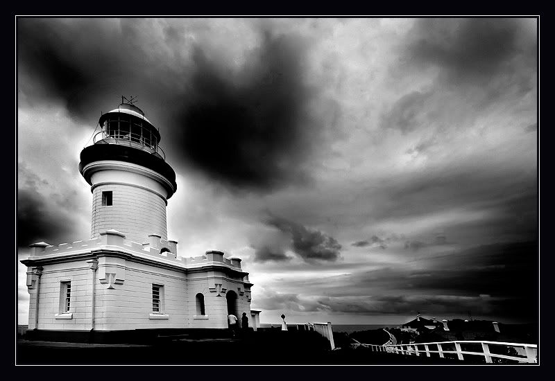
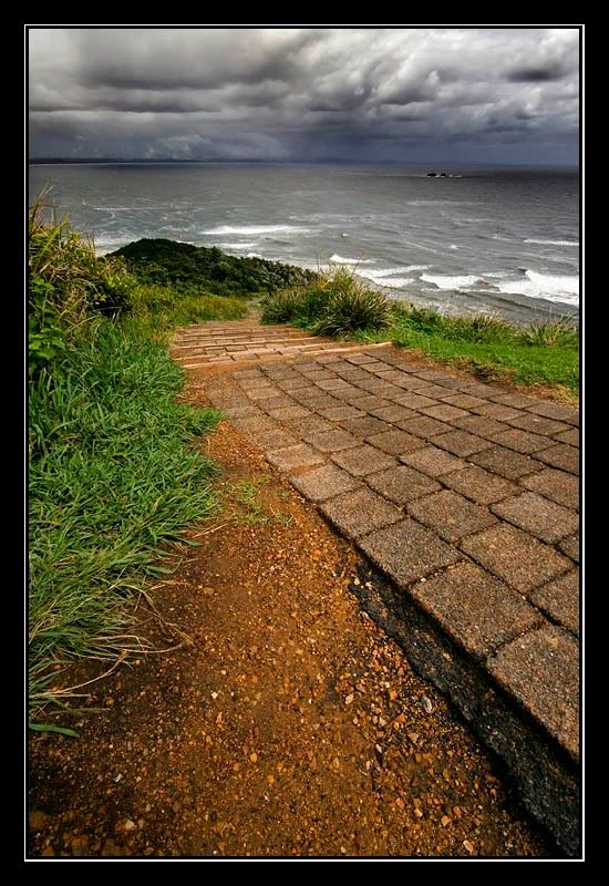
#1 and #3 work well and mostly because of the lovely texture in the sky.
#1 might work better with a little aspect adjustment but is a perfect subject in b&w.
Michael.
Re: Of course it poured with rain...

Posted:
Mon Jan 14, 2008 6:49 amby Killakoala
Same thing happened to me when I went there a few years ago. But it's not all doom and gloom as I think the lighthouse looks great with all that dramatic cloud behind it.
Re: Of course it poured with rain...

Posted:
Mon Jan 14, 2008 8:29 amby GK
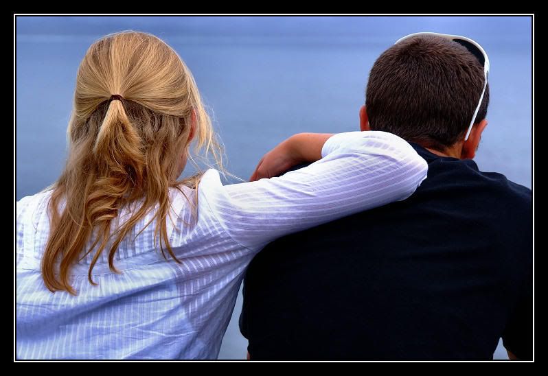
very good shots there! The second image has this interesting calming effect for some reason.

GK
Re: Of course it poured with rain...

Posted:
Mon Jan 14, 2008 9:31 amby devilla101
Really cool shot of the 1st image. However depending on the time you had processing the image, I would remove the 'halo' around the building and try to make it seamless. I think it will add more to the image.
Re: Of course it poured with rain...

Posted:
Mon Jan 14, 2008 2:28 pmby ozimax
First one is excellently dramatic. Guess what, it's raining in Coffs, it's always raining in Coffs!
Re: Of course it poured with rain...

Posted:
Mon Jan 14, 2008 2:53 pmby virgal_tracy
#1 for me. Great moody effect. Waiting for some dramatic music to be playing in the background.
Re: Of course it poured with rain...

Posted:
Mon Jan 14, 2008 6:48 pmby Big Red
love the effect you got with #1 
Re: Of course it poured with rain...

Posted:
Mon Jan 14, 2008 7:17 pmby johnd
Hi Sue,
I really like #1 and #3.
Dramatic sky, great contrast.
I'd be interested to know what PP you used to get this result.
I think in #1, you've done some dodging/burning to get the effect.
And in #3 it looks like you've used some tone mapping software.
How ever you did it, it worked well.
#2 is nice as well. Very peacful in comparison to the others.
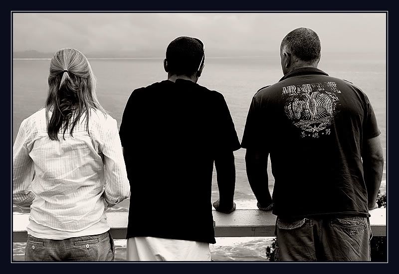
Not so sure about #4. I think it's a bit over sharpened: crunchy hair and halos around the 2 darker shirts.
Cheers
John

