Page 1 of 1

MMM01 Entry - PJS

PostPosted: Sun Sep 14, 2008 10:32 pm
by pjs
My Entries
Mauve
Image

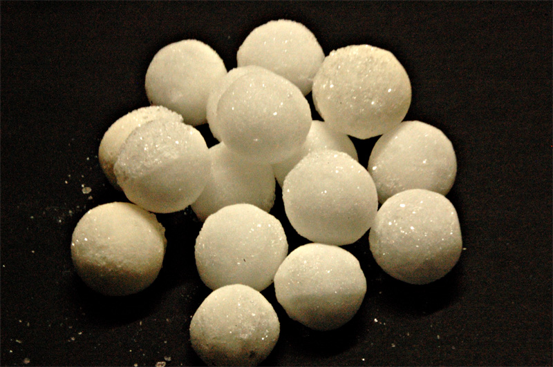
Moth... Balls :P
Image

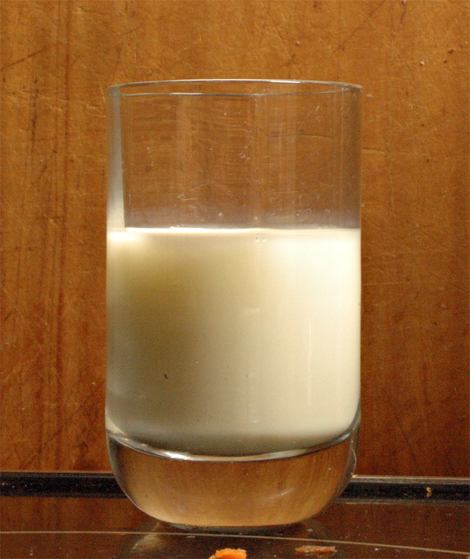
Milk
Image

Re: MMM01 Entry - PJS

PostPosted: Mon Sep 15, 2008 1:48 am
by Geoff
Hi there PJ,

I think the best image from these 3 is the first one. It's vibrant colour and pattern appeal
The 2nd shot of the moth balls is kinda noisey/grainy and lacks contrast.
The 3rd shot I think you could improve easily by;

a. cloning out the carrot/foot at the base of the glass
b choosing a better background than a cut up bread board hehe.

Hats off to you though for having a go! (more than I did). Don't let this discourage you....take my advise with a grain of salt, or sugar and discard or heed it! PS - What camera/lens setup did you use for this bunch of shots?

Re: MMM01 Entry - PJS

PostPosted: Mon Sep 15, 2008 10:17 am
by ATJ
I pretty much agree with Geoff's comments.

With the last one, I think you needed to have your background further away and choose a narrower depth of field to throw the background out of focus.

Re: MMM01 Entry - PJS

PostPosted: Mon Sep 15, 2008 11:42 am
by Mr Darcy
PS - What camera/lens setup did you use for this bunch of shots?


She has a D70s with an 18-200 VR
She is very new to it, and is still having technical difficulties. Her old camera is an OM-1 so there is a huge leap forward in bells and whistles. ATM they are interfering with her vision, not aiding it. This is shame as her vision is far better than mine.
She was using flash, but there was a lot of detectable movement, particularly in her mayhem shot which she ended up not posting. It also had lots of grain and WB issues. It should have had none of these as the flash (my SB800) was working and she was set to ISO200. I'm not sure what is going on. I am not allowed to watch the photo making, but I do the PP (under direction) and uploading of the images.