|
Got a thin skin? Then look elsewhere. Post a link to an image that you've made, and invite others to offer their critiques. Honesty is encouraged, but please be positive in your constructive criticism. Flaming and just plain nastiness will not be tolerated. Please note that this is not an area for you to showcase your images, nor is this a place for you to show-off where you have been. This is an area for you to post images so that you may share with us a technique that you have mastered, or are trying to master. Typically, no more than about four images should be posted in any one post or thread, and the maximum size of any side of any image should not exceed 950 px.
Moderators: Greg B, Nnnnsic, Geoff, Glen, gstark, Moderators
Forum rules
Please note that image critiquing is a matter of give and take: if you post images for critique, and you then expect to receive criticism, then it is also reasonable, fair and appropriate that, in return, you post your critique of the images of other members here as a matter of courtesy. So please do offer your critique of the images of others; your opinion is important, and will help everyone here enjoy their visit to far greater extent.
Also please note that, unless you state something to the contrary, other members might attempt to repost your image with their own post processing applied. We see this as an acceptable form of critique, but should you prefer that others not modify your work, this is perfectly ok, and you should state this, either within your post, or within your signature.
Images posted here should conform with the general forum guidelines. Image sizes should not exceed 950 pixels along the largest side (height or width) and typically no more than four images per post or thread.
Please also ensure that you have a meaningful location included in your profile. Please refer to the FAQ for details of what "meaningful" is.
 by colin_12 on Fri Dec 05, 2008 8:42 pm by colin_12 on Fri Dec 05, 2008 8:42 pm
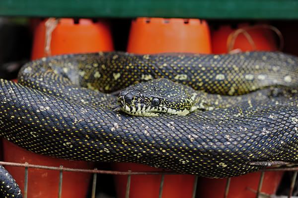
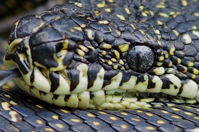
This fellow was in my yard this morning as my daughter and I went down to water my plants. She is now two and knew what it was but could not drag herself away from all the temping sticks to look at a diamond python for too long. Anyway I would like some coment on these, all are the same image, so I want some crit on crops and the like. Regards Colin    Regards Colin
Cameras, lenses and a lust for life
-

colin_12
- Senior Member
-
- Posts: 1853
- Joined: Thu Jan 04, 2007 7:10 pm
- Location: Hazelbrook
 by Marvin on Fri Dec 05, 2008 10:17 pm by Marvin on Fri Dec 05, 2008 10:17 pm
I like the second one the best. The first is too distracting with the red stuff and the third is just too close for me, I would like to see the whole head including the tongue.
Nikon D7000
-

Marvin
- Senior Member
-
- Posts: 1486
- Joined: Tue Aug 10, 2004 9:33 pm
- Location: Back in the hot Riverland, SA.
 by rflower on Sat Dec 06, 2008 12:07 am by rflower on Sat Dec 06, 2008 12:07 am
Marvin wrote:I like the second one the best. The first is too distracting with the red stuff and the third is just too close for me, I would like to see the whole head including the tongue.
 Just what I was thinking Marvin. Russell Nikon D700 // 50 1.4 // 70-200 2.8 VRII // 24-120 f4// Tamron 90 // SB-800 // 70-300G I'm on Redbubble too ... http://www.redbubble.com/people/rflowerIf you can make one of my photos look better and you have the inclination ... please do so.
-

rflower
- Member
-
- Posts: 441
- Joined: Fri Oct 06, 2006 11:01 am
- Location: Hoppers Crossing, Melbourne
-
 by biggerry on Sat Dec 06, 2008 12:51 am by biggerry on Sat Dec 06, 2008 12:51 am
I reckon the tight crop would work well if you had all the tongue in the frame, maybe just back the crop off a little? could be a frog inside? 
-

biggerry
- Senior Member
-
- Posts: 5930
- Joined: Tue May 13, 2008 12:40 am
- Location: Under the flight path, Newtown, Sydney
-
 by ATJ on Sat Dec 06, 2008 10:35 am by ATJ on Sat Dec 06, 2008 10:35 am
Colin,
I would like the tight crop if the head was a little sharper and you included the whole tongue. Otherwise, #2 is the best.
-

ATJ
- Senior Member
-
- Posts: 3982
- Joined: Fri Feb 18, 2005 10:44 am
- Location: Blue Mountains, NSW
-
 by colin_12 on Sat Dec 06, 2008 1:16 pm by colin_12 on Sat Dec 06, 2008 1:16 pm
Thankyou all,
That makes perfect sense.
I orriginally had the head crop a little bigger but it was past our size allowance.
I was wondering if the head being so central in #2 was working for everyone?
Regards Colin
Regards Colin
Cameras, lenses and a lust for life
-

colin_12
- Senior Member
-
- Posts: 1853
- Joined: Thu Jan 04, 2007 7:10 pm
- Location: Hazelbrook
Return to Image Reviews and Critiques
|


 Just what I was thinking Marvin.