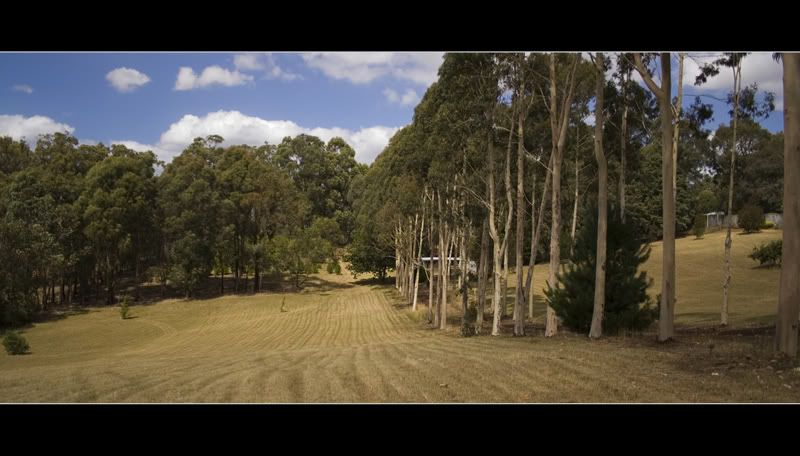
Taken with 350D and EF-S 18-55, definately looking forward to picking up a 50mm 1.4!

Regards,
Josh
First landscapeModerators: Greg B, Nnnnsic, Geoff, Glen, gstark, Moderators
Forum rules
Please note that image critiquing is a matter of give and take: if you post images for critique, and you then expect to receive criticism, then it is also reasonable, fair and appropriate that, in return, you post your critique of the images of other members here as a matter of courtesy. So please do offer your critique of the images of others; your opinion is important, and will help everyone here enjoy their visit to far greater extent. Also please note that, unless you state something to the contrary, other members might attempt to repost your image with their own post processing applied. We see this as an acceptable form of critique, but should you prefer that others not modify your work, this is perfectly ok, and you should state this, either within your post, or within your signature. Images posted here should conform with the general forum guidelines. Image sizes should not exceed 950 pixels along the largest side (height or width) and typically no more than four images per post or thread. Please also ensure that you have a meaningful location included in your profile. Please refer to the FAQ for details of what "meaningful" is.
Previous topic • Next topic
6 posts
• Page 1 of 1
First landscapeWas up in Hoddles Creek last week and took this one, I'm quite happy with it, but I'm quite new to landscapes so I would like some feedback!
Taken with 350D and EF-S 18-55, definately looking forward to picking up a 50mm 1.4!  Regards, Josh
Re: First landscapeFor your first landscape this is doing well.
From a technical aspect, I would suggest f8 or f9 range with a slower shutter. Put the camera on a tripod if need be. This should get rid of the softness of the image that I can see. Also if you can learn about the hyperfocal distance...that may be useful as well to extend your depth of field. Check http://www.vividlight.com/articles/3513.htm From the subject viewpoint, I think you can improve. I see some leading lines on the ground and trees but you maybe able to accentuate these with a lower angle of view perhaps... All the best and keep em coming.
Re: First landscapeThanks very much! I'll read up on that, and have another go next time I'm up there. I normally do shoot at that sought of aperature with landscapes, but obviously forgot to change it for this one! I will learn...
Re: First landscapeAs commented already, this is a good start!
The view through the trees on the right seems like a distinctly separate scene. If you cropped it off (or pointed your lens more to the left) I think the composition would be stronger. Combine this with lower viewpoints as suggested, and you have a few options to experiment with next time. The black top/bottom of the image seems out of place to me. On the web if you're going to put a frame around your image, make it proportional. For screen/slideshow display, the program should put an appropriate (e.g. black) background in place for you.
Re: First landscapeThe only other thing I would add is that the trees seem to be leaning to the right. Perhaps they were, or perhaps you need to adjust the horizon a little.
HTH Greg
It's easy to be good... when there is nothing else to do
Re: First landscapeSome interesting lines and a nice sense of space...the only thing missing is a visual hook. This is a point of interest somewhere in the image, preferably in the foreground in this case. Could be a dog running or a child or a cow or something red or yellow. Every image needs a hook to catch the eye. If you can go back to that spot and rework it using some of the advice you've received from the forum members then that would be a positive lesson.
Regards
Matt. K
Previous topic • Next topic
6 posts
• Page 1 of 1
|