Page 1 of 1

My month in review

PostPosted: Mon Mar 09, 2009 9:40 am
by JED
Going through and processing what I've been aiming my camera at for the last month or so.

C&c welcome, as always.
Image

Image

Image

Image

Cheers, John

Re: My month in review

PostPosted: Mon Mar 09, 2009 10:25 am
by Alex
John,

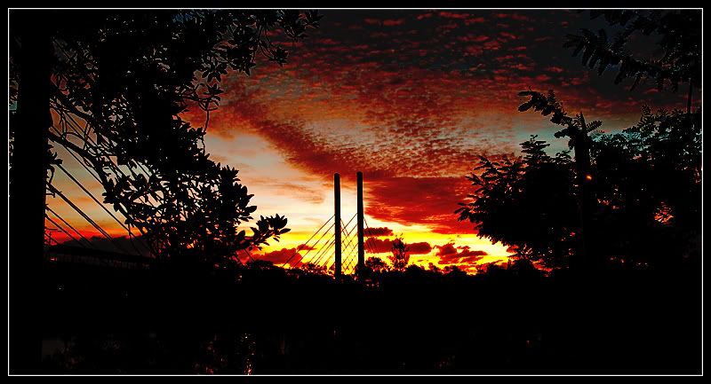
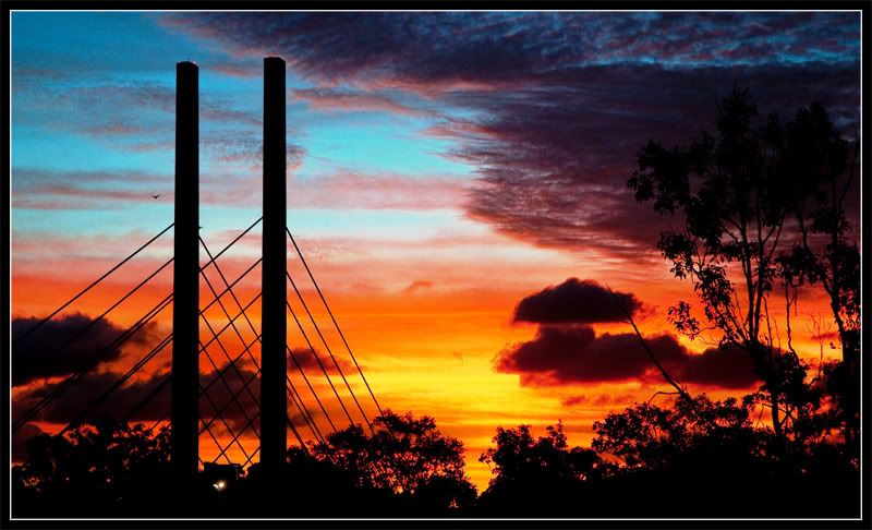
I really like the simplicity of No. 2 and the colours in the last one although I feel the last one has a bit too much detail lost in shadow. I know it's a silhouette, but I feel the bottom of the image can be cropped off more. I love No. 1 also.

Cheers
Alex

Re: My month in review

PostPosted: Mon Mar 09, 2009 2:00 pm
by biggerry
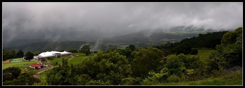
#1 I really like this one, the pano style crop works well, the only suggestion would be the level of detail in the trees and hill on the right hands side, if you could wrangle out some more light/detail it may help?

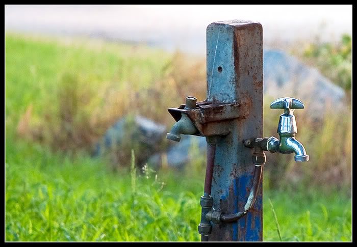
#2 I am sure there is some story behind these taps! they look like taps in a park or something! As alex said, the simplicity is good here.

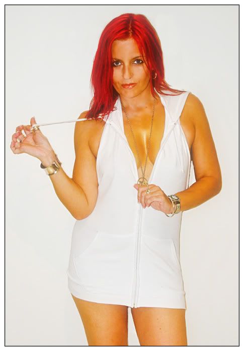
#3 Thats a short skirt/top :shock: :lol:

#4 As Alex said, I would also like to see the bottom removed or detail shown, it looks like a bridge or something, maybe the inclusion of more of the left hand side might give more of it away. The silhouette with the sunset is a great idea though and I like the blood red of the sunset!

all with a grain of salt as usual 8)

Re: My month in review

PostPosted: Tue Mar 10, 2009 11:32 am
by JED
Thanks for your thoughts, Alex & biggery. More playing to be done. :D

The taps is my favourite pic at the moment. It struck me as odd to instal a new tap but keep the old one there for no reason. A bit like life in many ways.

Here is another shot of the bridge that has less of the dark area at the bottom.

Image

Will have to revisit the area for a better vantage point to get the whole bridge in. These shots were spur of the moment while driving past & seeing the fabulous sunset. Had to try and capture it.

I'm not sure whether its supposed to be a dress or a top, biggery. Whatever it is, I like it :D

Cheers, John

Re: My month in review

PostPosted: Tue Mar 10, 2009 1:37 pm
by biggerry
its supposed to be a dress or a top, biggery. Whatever it is, I like it


:D I bet you do! :D

I like the crop and rework on the bridge one also...the colours are great! well done.

Re: My month in review

PostPosted: Tue Mar 10, 2009 2:02 pm
by Marvin
I really like numbers 1 and 2 and your second shot of the bridge. The one of the lady looks strangely coloured on my monitor. It almost looks like she has had some of that yellow stuff that they put on you when you have an operation on her boobs and left arm (I can't think of the name of it for the life of me!).

Re: My month in review

PostPosted: Mon Mar 16, 2009 9:12 pm
by surenj
Marvin wrote:... yellow stuff that they put on you when you have an operation on her boobs and left arm (I can't think of the name of it for the life of me!).


Iodine you mean?

I think the portrait is meant to have some funky colouring scheme... I wonder whether the skin tone has been compromised though