time to put up
I have been a bit slack, not posting much here although I visit fairly often... can we all say "lurker"
so without further ado
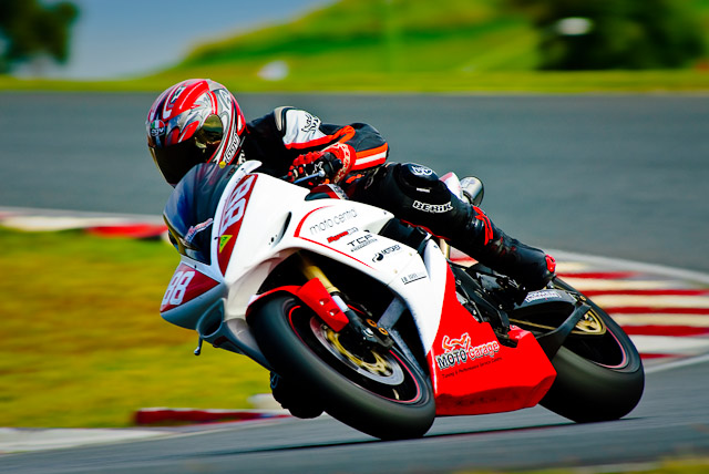
was out at eastern creek a few weeks ago taking shots of the bikes when I remembers some saying on this forum that "motor sport images are suppose to be over saturated and vibrant"
Have I gone to far

I think yes
then for something different
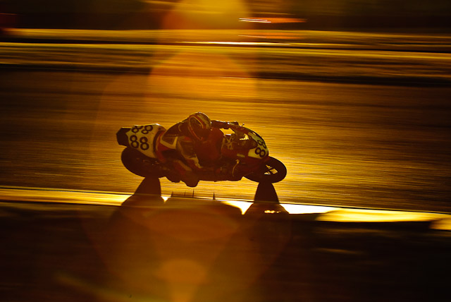
it was a cloudy day, but the cloud bank stopped short of the horizon and during the last race of the sun dropped below the clouds just before it set and from where I was shooting I was looking straight into the sun and it was reflecting off the track... aahh moment... back lit near silhouette
metering of the track reflection to stop any blown highlights I started panning... black frame, black frame, black frame, front wheel in the glow, back wheel in the glow, black frame
it took about 10 panning burst before I caught a full bike in the glow and only managed two full images in about 100 frames before the race was over

definitely something I will have to try again.
all comment and suggestions on ways to improve both these images is most appreciated
so without further ado
was out at eastern creek a few weeks ago taking shots of the bikes when I remembers some saying on this forum that "motor sport images are suppose to be over saturated and vibrant"
Have I gone to far

I think yes
then for something different
it was a cloudy day, but the cloud bank stopped short of the horizon and during the last race of the sun dropped below the clouds just before it set and from where I was shooting I was looking straight into the sun and it was reflecting off the track... aahh moment... back lit near silhouette
metering of the track reflection to stop any blown highlights I started panning... black frame, black frame, black frame, front wheel in the glow, back wheel in the glow, black frame
it took about 10 panning burst before I caught a full bike in the glow and only managed two full images in about 100 frames before the race was over

definitely something I will have to try again.
all comment and suggestions on ways to improve both these images is most appreciated

 top work.