Page 1 of 1

East Pylon, Anzac Bridge

PostPosted: Sun Aug 09, 2009 11:21 am
by ATJ
Here are some shots from the harbour walk and something different for me. I'd appreciate some comments as I don't know if any of these work at all.

All taken with a D300 and Tokina 12-24mm 4/4.0. All at ISO 200 and f/16 with varying shutter speeds. Only post processing was slight whit balance adjustments and a bump on the vibrance and saturation to try to get the sky to look like it actually looked.
Image

Image

Image

Image

Re: East Pylon, Anzac Bridge

PostPosted: Sun Aug 09, 2009 2:27 pm
by Mr Darcy
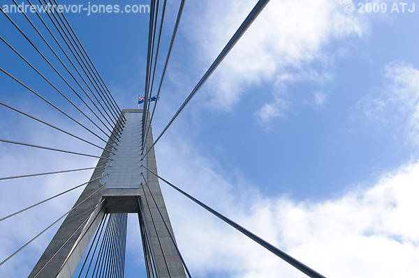
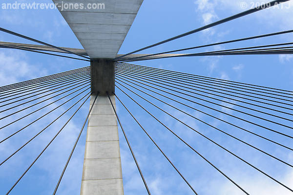
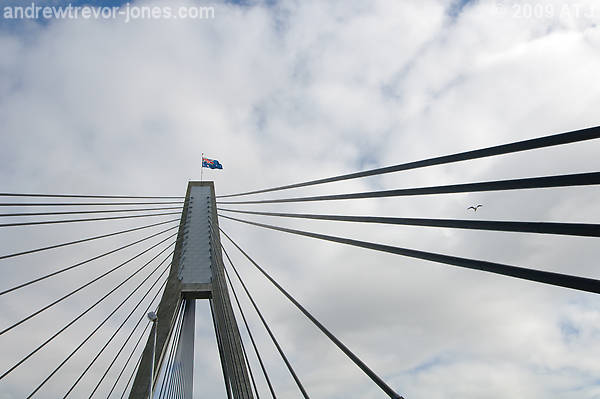
Of these #1 works for me, and possibly #2. The others look like you've attempted to capture the symmetry and missed. I have one similar to you #4 which I feel works better. I will post it in a day or two. Don't have time to do it at the moment.

Re: East Pylon, Anzac Bridge

PostPosted: Sun Aug 09, 2009 3:52 pm
by CraigVTR
Andrew
I agree with Greg but think there is too much unused sky at the top of the first two images. I like the positioning of the light and the flag in #1, well spotted.

Re: East Pylon, Anzac Bridge

PostPosted: Sun Aug 09, 2009 4:52 pm
by ATJ
Thanks for the comments. I guess I just don't have an eye for these sorts of photographs. I thought the 4th was the strongest of the lot. Seems I was wrong. I was not trying to capture any symmetry at all in any of the shots. Quite the contrary, I was going after asymmetry and leading lines.

Re: East Pylon, Anzac Bridge

PostPosted: Sun Aug 09, 2009 5:30 pm
by biggerry
capture the symmetry and missed.


trying to capture any symmetry


symmetry was hard to capture since the walkway is never in the middle, the only really good spot for that, in my opinion, is in the middle of the road, which has it's difficulties....

the final image i think is the strongest and appeals to me, the placement of the pylon and the leading lines works, the only thing i find as an issue is teh colour of teh sky, this however could be my end, it seems alittle too 'light blue' maybe a little darker with contrast on the clouds would suit?

Re: East Pylon, Anzac Bridge

PostPosted: Sun Aug 09, 2009 6:23 pm
by aim54x
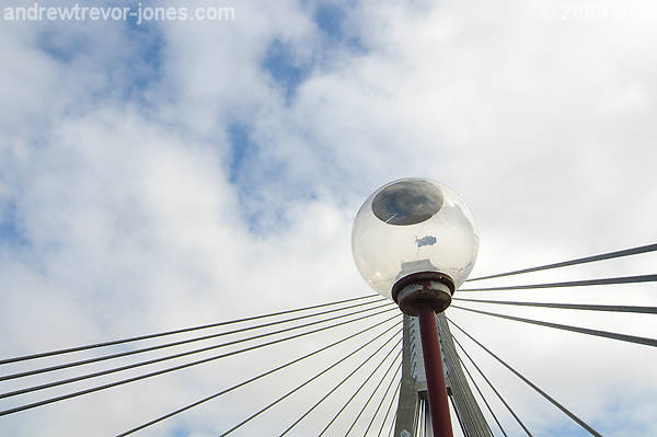
I have to be different on this one. #3 nails it for me. The colours and composition just work for me. I have to say that #1 and #4 do little for me with the light and and the concrete arms doing little to improve the image in my opinon.

Great to see pics from the walk.

Re: East Pylon, Anzac Bridge

PostPosted: Sun Aug 09, 2009 11:04 pm
by Mr Darcy
ATJ wrote:I was going after asymmetry and leading lines.

Well I guess you achieved it. The photos still don't work for me though.

Re: East Pylon, Anzac Bridge

PostPosted: Sun Aug 16, 2009 12:30 pm
by stubbsy
ANdrew. I agree with Cameron. #3 is the one :wink: