|
Got a thin skin? Then look elsewhere. Post a link to an image that you've made, and invite others to offer their critiques. Honesty is encouraged, but please be positive in your constructive criticism. Flaming and just plain nastiness will not be tolerated. Please note that this is not an area for you to showcase your images, nor is this a place for you to show-off where you have been. This is an area for you to post images so that you may share with us a technique that you have mastered, or are trying to master. Typically, no more than about four images should be posted in any one post or thread, and the maximum size of any side of any image should not exceed 950 px.
Moderators: Greg B, Nnnnsic, Geoff, Glen, gstark, Moderators
Forum rules
Please note that image critiquing is a matter of give and take: if you post images for critique, and you then expect to receive criticism, then it is also reasonable, fair and appropriate that, in return, you post your critique of the images of other members here as a matter of courtesy. So please do offer your critique of the images of others; your opinion is important, and will help everyone here enjoy their visit to far greater extent.
Also please note that, unless you state something to the contrary, other members might attempt to repost your image with their own post processing applied. We see this as an acceptable form of critique, but should you prefer that others not modify your work, this is perfectly ok, and you should state this, either within your post, or within your signature.
Images posted here should conform with the general forum guidelines. Image sizes should not exceed 950 pixels along the largest side (height or width) and typically no more than four images per post or thread.
Please also ensure that you have a meaningful location included in your profile. Please refer to the FAQ for details of what "meaningful" is.
 by Mr Darcy on Sat Oct 10, 2009 10:45 pm by Mr Darcy on Sat Oct 10, 2009 10:45 pm
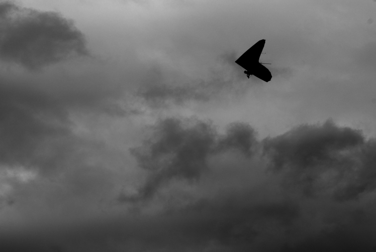
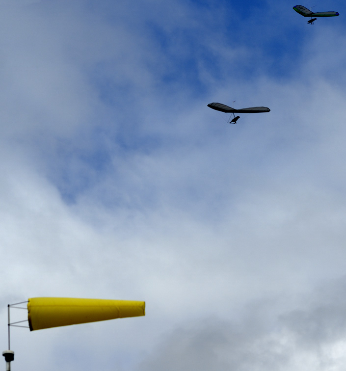
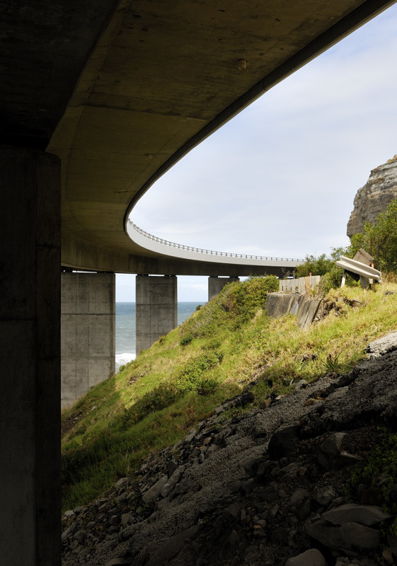
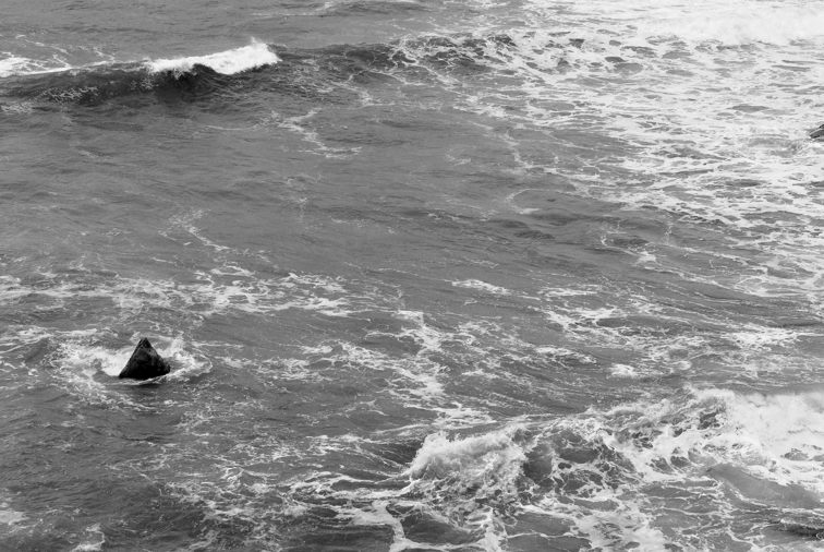
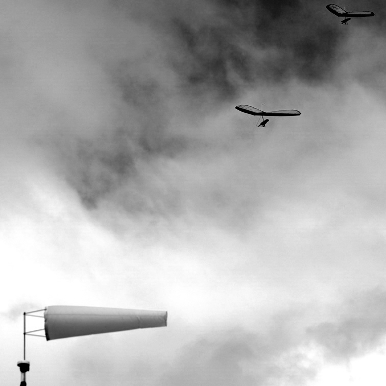
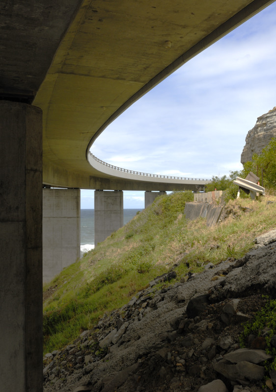
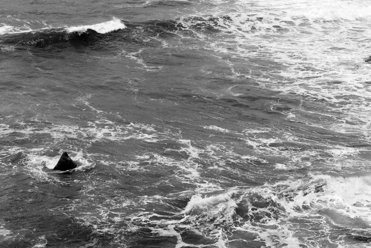
Compared to Gerry's masterpieces, I am almost ashamed to put these up but... Dare I admit that Jonathon Livingstone Seagull came to mind here. The original (picture, not the movie  ) was very bland. I have darkened the skies, possibly too far. I would like to have kept the colour in the Hang Glider, but my PP skills are simply not up to it.  No comment  The best of my bridge shots. Like Gerry, I found it better to tackle away from the Bridge. I liked the remnants of the old road just hinting at its existence  When I was looking at this scene, I saw one of those Zen raked gardens in the water. I didn't capture my vision. but this was the closest I came  I invite comments, critique Greg
It's easy to be good... when there is nothing else to do
-

Mr Darcy
- Senior Member
-
- Posts: 3414
- Joined: Thu Oct 26, 2006 11:35 pm
- Location: The somewhat singed and blackened Blue Mountains
 by aim54x on Sat Oct 10, 2009 11:10 pm by aim54x on Sat Oct 10, 2009 11:10 pm
I'll admit that Gerry has set the bar pretty high, but you have done some good work here as well.
I quite like the first, it gives off a sense of eerie-ness..the hang-glider looks to be headed into a storm, it may not be what you were after but it is a strong images with plenty of 'feel'
The second image i quite liked until I scrolled down to reveal the windsock...it is soft and i think that it detracts from the image, I would like to see a crop where the clouds start to part (where the end of the blue is)...it may work but then again it may not.
The bridge is a nice touch, shame about the bright sky, any detail hiding in there? but the hint of the old road next to the new bridge is great.
Cameron Nikon F/Nikon 1 | Hasselblad V/XPAN| Leica M/LTM |Sony α/FE/E/Maxxum/M42Wishlist Nikkor 24/85 f/1.4| Fuji Natura BlackScout-Images | Flickr | 365Project
-

aim54x
- Senior Member
-
- Posts: 7305
- Joined: Fri Feb 01, 2008 10:13 pm
- Location: Penshurst, Sydney
-
 by surenj on Sat Oct 10, 2009 11:17 pm by surenj on Sat Oct 10, 2009 11:17 pm
I agreee with Cameron, the first is great for giving a gloomy feel. It is by far the strongest of the bunch. If you had included the colours of the glider this mood may have changed significantly.
-

surenj
- Senior Member
-
- Posts: 7197
- Joined: Fri Sep 15, 2006 8:21 pm
- Location: Artarmon NSW
 by Mr Darcy on Sun Oct 11, 2009 7:35 am by Mr Darcy on Sun Oct 11, 2009 7:35 am
Thank you for comments. #1. This was exactly the feel I was after. The line in JLS was "Lonely looking sky..." I was afraid I had gone too far. #2 I like the windsock & left it there deliberately. Maybe its because my old eyes are soft  It is a reminder of the conditions they were flying in. #3 I agree. Will rework, but probably not till tomorrow. I will see if I can lighten the underside of the bridge without blowing the sky completely. #4 Any comments? Greg
It's easy to be good... when there is nothing else to do
-

Mr Darcy
- Senior Member
-
- Posts: 3414
- Joined: Thu Oct 26, 2006 11:35 pm
- Location: The somewhat singed and blackened Blue Mountains
 by gstark on Sun Oct 11, 2009 9:01 am by gstark on Sun Oct 11, 2009 9:01 am
Mr Darcy wrote:Dare I admit that Jonathon Livingstone Seagull came to mind here. The original (picture, not the movie  )
Actually, that would be the book.  I'd like to see a little more contrast pushed into this one. On the second, I like the inclusion of the windsock, and I'd like to suggest a square crop here. Too bad about the second hang-glider, but he won't make this cut. In the fourth, again I would like you to push some more contrast into the image. In both of the B&Ws, there is no solid black, nor any really solid whites. I'm not sure that you can push the first image to get to that point, but I do think that you can with the last. g.
Gary Stark
Nikon, Canon, Bronica .... stuff
The people who want English to be the official language of the United States are uncomfortable with their leaders being fluent in it - US Pres. Bartlet
-

gstark
- Site Admin
-
- Posts: 22926
- Joined: Thu Aug 05, 2004 11:41 pm
- Location: Bondi, NSW
 by Mr Darcy on Sun Oct 11, 2009 11:07 am by Mr Darcy on Sun Oct 11, 2009 11:07 am
gstark wrote:Actually, that would be the book.
The book. The movie. who cares. Just so long as I don't have to admit that I like Neil Diamond's early work. Ah HAN what an album  Our city visit got cancelled today. That blows Urban, but I may get a chance to rework these. Thanks for the ideas. I was going for a square crop, but didn't want to lose the second flier. I'll try again. Greg
It's easy to be good... when there is nothing else to do
-

Mr Darcy
- Senior Member
-
- Posts: 3414
- Joined: Thu Oct 26, 2006 11:35 pm
- Location: The somewhat singed and blackened Blue Mountains
 by gstark on Sun Oct 11, 2009 11:12 am by gstark on Sun Oct 11, 2009 11:12 am
Mr Darcy wrote:Just so long as I don't have to admit that I like Neil Diamond's early work. Ah HAN what an album 
It could be worse: you could be saying that you like Barry Manilow's music. Just last Sunday evening I was telling Sycamore #1 that I have a virgin copy of this. Still in its sealed plastic. I won't mention that I was at the Hordern Pavlova to see him during the HAN tour. March 1974, IIRC. I was going for a square crop, but didn't want to lose the second flier. I'll try again.
Do it. The second flier will never know that he's been grounded. g.
Gary Stark
Nikon, Canon, Bronica .... stuff
The people who want English to be the official language of the United States are uncomfortable with their leaders being fluent in it - US Pres. Bartlet
-

gstark
- Site Admin
-
- Posts: 22926
- Joined: Thu Aug 05, 2004 11:41 pm
- Location: Bondi, NSW
 by biggerry on Sun Oct 11, 2009 9:20 pm by biggerry on Sun Oct 11, 2009 9:20 pm
I liked the remnants of the old road just hinting at its existence
this is a good shot greg, did you have a landscape version, the idea of the new bridge and old road did not even enter into my mind. I think a shot from where your image was taken in the landscape mode would show this very well. I like the windsock & left it there deliberately. Maybe its because my old eyes are soft
did you consider a BW conversion of this one? It's a nicely compsoed shot, probably very hard to get all of it in focus, at f8 your probably in the right territory... That fourth image looks like it has a sharks fin in it! The first image is very nicely converted in my opinion, really conveys the loneliness and ominous feel Compared to Gerry's masterpieces
rubbish.... i had one unfair advantage....and one should never be ashamed to post images up! you like Barry Manilow's music
who the f is barry manilow????????????
-

biggerry
- Senior Member
-
- Posts: 5930
- Joined: Tue May 13, 2008 12:40 am
- Location: Under the flight path, Newtown, Sydney
-
 by Mr Darcy on Tue Oct 13, 2009 6:39 am by Mr Darcy on Tue Oct 13, 2009 6:39 am
I have reworked these as per the suggestions above. Photo #1 I have had several goes at. Also I received requests for others to have a go, So I am starting its own threadPhoto #2 I had two goes at this. First another go at my vision converted to BW as per Gerry's suggestion, & second the crop suggested by Gary:   Photo #3. An attempt to tease out more detail under the bridge as per Cam's suggestion. I can't say I am really happy with this one. The cliff on the RHS looks quite fake now.  Photo #4. Increasing the contrast has worked wonders here.  Oh and Gerry, be grateful you don't know  Comments more than welcome Greg
It's easy to be good... when there is nothing else to do
-

Mr Darcy
- Senior Member
-
- Posts: 3414
- Joined: Thu Oct 26, 2006 11:35 pm
- Location: The somewhat singed and blackened Blue Mountains
 by aim54x on Thu Oct 15, 2009 9:26 am by aim54x on Thu Oct 15, 2009 9:26 am
Greg, that rework of the bridge and the old road does start to look a bit fake, esp the cliff, but you did manage to find more blue in the sky which is a great.
I have to admit that the other images show some promise as well.
Gerry's suggestion on B&W is looking good, but you are starting to lose the upper hang glider to the dark sky, Gary's square crop works well!
Lastly the increased contrast in the last image has done wonders.
Cameron Nikon F/Nikon 1 | Hasselblad V/XPAN| Leica M/LTM |Sony α/FE/E/Maxxum/M42Wishlist Nikkor 24/85 f/1.4| Fuji Natura BlackScout-Images | Flickr | 365Project
-

aim54x
- Senior Member
-
- Posts: 7305
- Joined: Fri Feb 01, 2008 10:13 pm
- Location: Penshurst, Sydney
-
 by surenj on Thu Oct 15, 2009 11:31 am by surenj on Thu Oct 15, 2009 11:31 am
I quite like the BW without the square crop. Having two gliders makes it more interesting. One glider makes it feel quite Interesting how a crop can change the mood completely.
Greg, I have posted a re-work on your other thread.
-

surenj
- Senior Member
-
- Posts: 7197
- Joined: Fri Sep 15, 2006 8:21 pm
- Location: Artarmon NSW
 by Mr Darcy on Thu Oct 15, 2009 8:26 pm by Mr Darcy on Thu Oct 15, 2009 8:26 pm
Thank you all. For me #1 I prefer the BW rework (photo #2 in the other thread ) #2 My favourite remains the original. Perhaps square cropping as per the BW, but no other change #3 Not really happy with either. May try again #4 the rework by far. Not a lot of change but Wow! Suren Sorry I didn't get back to you. For some reason, I didn't get the email notification on the update (either thread) I just noticed this one in recent posts & checked. I think your original comment was right. Keeping the colour in the kite is a retrograde step. Neither your, nor my rework comes up to the ominous mood of the B/W. Still I think you did a better job of the rework than me. Just as well you are not coming up for the sunrise, or I would chain you to the snake pit err computer until you showed me how to do it.  Greg
It's easy to be good... when there is nothing else to do
-

Mr Darcy
- Senior Member
-
- Posts: 3414
- Joined: Thu Oct 26, 2006 11:35 pm
- Location: The somewhat singed and blackened Blue Mountains
 by surenj on Thu Oct 15, 2009 9:24 pm by surenj on Thu Oct 15, 2009 9:24 pm
No probs Greg, I can't remember what exactly I did. It did take at least 30 mins. I had to mask the kite using the channel mixer. Multiple curves and levels adjustments. Colour changes and some hue changes. multiple blending as well. I was tempted to add some lightning but resisted. 
-

surenj
- Senior Member
-
- Posts: 7197
- Joined: Fri Sep 15, 2006 8:21 pm
- Location: Artarmon NSW
Return to Image Reviews and Critiques
|
