

MELBOURNE ZOOModerators: Greg B, Nnnnsic, Geoff, Glen, gstark, Moderators
Forum rules
Please note that image critiquing is a matter of give and take: if you post images for critique, and you then expect to receive criticism, then it is also reasonable, fair and appropriate that, in return, you post your critique of the images of other members here as a matter of courtesy. So please do offer your critique of the images of others; your opinion is important, and will help everyone here enjoy their visit to far greater extent. Also please note that, unless you state something to the contrary, other members might attempt to repost your image with their own post processing applied. We see this as an acceptable form of critique, but should you prefer that others not modify your work, this is perfectly ok, and you should state this, either within your post, or within your signature. Images posted here should conform with the general forum guidelines. Image sizes should not exceed 950 pixels along the largest side (height or width) and typically no more than four images per post or thread. Please also ensure that you have a meaningful location included in your profile. Please refer to the FAQ for details of what "meaningful" is.
Previous topic • Next topic
3 posts
• Page 1 of 1
MELBOURNE ZOO       nikon 200- lenses- 18-70 / tamron 90 micro/ tokina 12-24 / sigma 70-200 / nikon 85 1.8 / SB600..
Re: MELBOURNE ZOOHi Carlos,
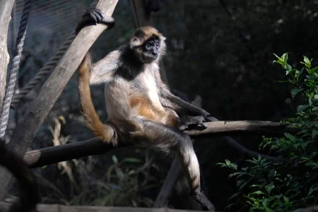
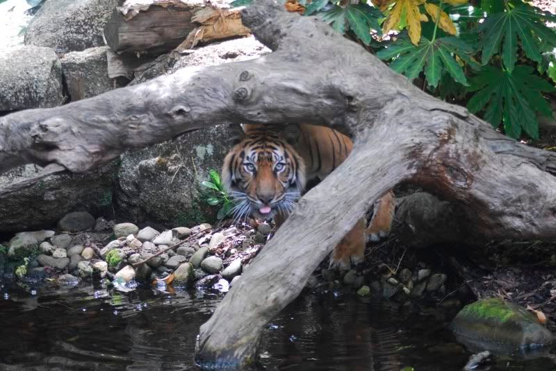
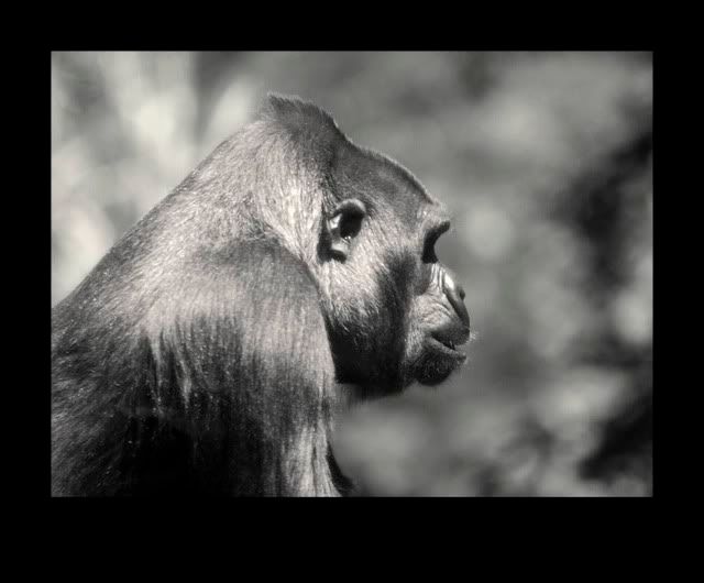
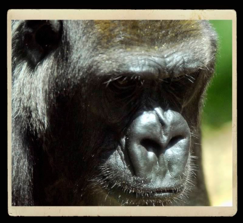
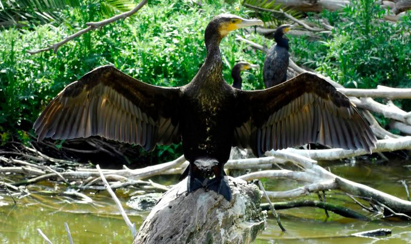
1. There are a few too many photos here. There's supposed to be a limit of 4 per post. 2. Why are you SHOUTING? #2 seems to have missed focus. #4 I would like to see if you can pull some detail out of the dark around the eyes. I particularly like #1 & #6 Greg
It's easy to be good... when there is nothing else to do
Re: MELBOURNE ZOOI prefer 2 and 5. 4 is not as sharp or in focus and 1 and 2 could do with a little bit more contrast, I think. You got a good eye for composition. By the way, I am glad you are back from Argentina safe and sound.
Previous topic • Next topic
3 posts
• Page 1 of 1
|