An interesting night as always, This is about the best I took I think.
Anything I could do to improve this people?
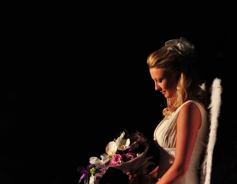
One for Mr DarcyModerators: Greg B, Nnnnsic, Geoff, Glen, gstark, Moderators
Forum rules
Please note that image critiquing is a matter of give and take: if you post images for critique, and you then expect to receive criticism, then it is also reasonable, fair and appropriate that, in return, you post your critique of the images of other members here as a matter of courtesy. So please do offer your critique of the images of others; your opinion is important, and will help everyone here enjoy their visit to far greater extent. Also please note that, unless you state something to the contrary, other members might attempt to repost your image with their own post processing applied. We see this as an acceptable form of critique, but should you prefer that others not modify your work, this is perfectly ok, and you should state this, either within your post, or within your signature. Images posted here should conform with the general forum guidelines. Image sizes should not exceed 950 pixels along the largest side (height or width) and typically no more than four images per post or thread. Please also ensure that you have a meaningful location included in your profile. Please refer to the FAQ for details of what "meaningful" is.
Previous topic • Next topic
20 posts
• Page 1 of 1
One for Mr DarcyThis pic is thanks to Mr Darcy as it was taken with his lens.
An interesting night as always, This is about the best I took I think. Anything I could do to improve this people?  Regards Colin
Cameras, lenses and a lust for life
Re: One for Mr DarcyNice lighting Colin,
I would try a vertical crop just ahead of the flowers and maybe a touch behind the chair and top. __________
Phillip **Nikon D7000**
Re: One for Mr DarcyNice Colin, I would keep the black space on the left but trim abit off the top
Are you gonna tell us where, when and why   gerry's photography journey
No amount of processing will fix bad composition - trust me i have tried.
Re: One for Mr DarcySorry Gerry, that would be good wouldn't it.
This was one of the models from our florists wearable art fashion parade. It is a part of their graduation night. This lass was part of a group who were dressed for a wedding theme. The "chair back" is actually a pair of furry wings. I would also have liked to have more below where I have croped, but there was someone who stood up to get a pic. I will put up some more when I have gone through them. Regards Colin
Cameras, lenses and a lust for life
Re: One for Mr DarcyConsider a square crop on this image with equal margins around your subject and see if it improves the overall image.
It might not work, but you loose nothing for trying. I like the soft light and the black background, but as is I belives it steals the viewer's attention.
Re: One for Mr DarcyHere we go.
I think I have been able to satisfy most thiughts on this....... 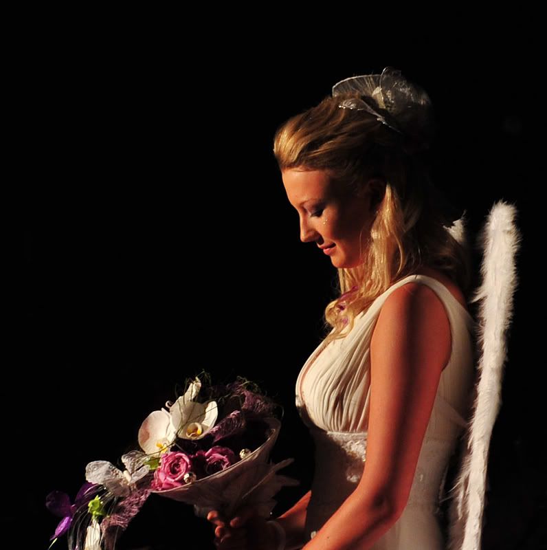 Regards Colin
Cameras, lenses and a lust for life
Re: One for Mr DarcyA great image there Colin....I have to admit that the crop works very well!
Cameron
Nikon F/Nikon 1 | Hasselblad V/XPAN| Leica M/LTM |Sony α/FE/E/Maxxum/M42 Wishlist Nikkor 24/85 f/1.4| Fuji Natura Black Scout-Images | Flickr | 365Project
Re: One for Mr DarcyPersonally, I think it works better providing there is enough resolution in the image. But it is more important that you like it.
Re: One for Mr DarcyHere are a couple more from the night. The theme was Metamorphosis.
These are the ones that the boss wanted a couple more of. I really need to set up a studio or something at these events. I don't know what this lass was but her costume started as a closed structure and then she let it open down around her. 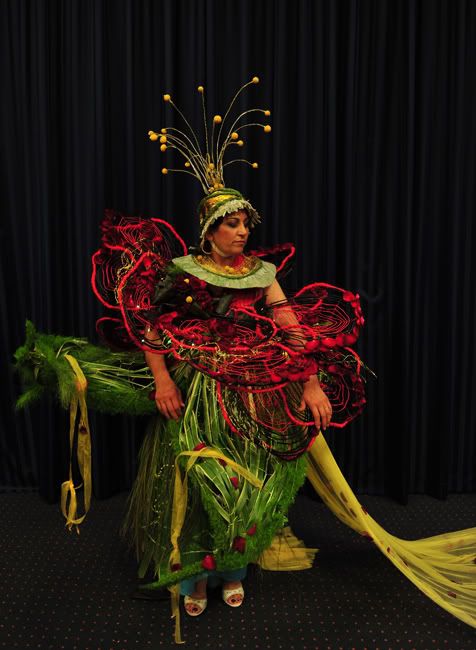 A peacock 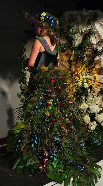 The egg as it is about to hatch 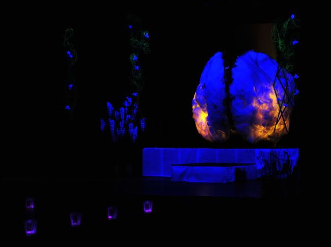 This gent was a real crowd pleaser 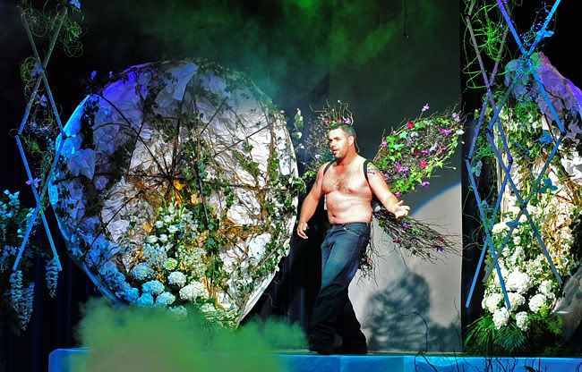 ...and yes please critique these...... Regards Colin
Cameras, lenses and a lust for life
Re: One for Mr Darcythanks for the story update colin! Looks like it was a good night!
I think the first image in teh second set needs a bit of brightening, there are great colours here that need to sing!  I like the last two, the egg hatching is very surreal, great light there! The final one, lol, he looks manly there! my only suggestion would be a crop, basically get in tighter on him gerry's photography journey
No amount of processing will fix bad composition - trust me i have tried.
Re: One for Mr Darcywell done Col
Not a fungi to be seen Like them all Would suggest that on the first one, possibly reduce the red as the skin is a bit distracting in colour (but may be correct) On the opening flower, between yours and Buggery's. I prefer the darker one, colours are more vibrant whizzzz, there goes life again.....
But now captured on a Canon 40D with bits http://www.flickr.com/photos/wazonthehill/
Re: One for Mr DarcyI agree with the others that the first one of the second set is the best. However, I suggest you play with with the white balance, the curves or adjust the aperture (if you can) to get more natural colours, if you can.
I believe you missed the second with the model moving perhaps too quickly with that tight framing. The third one, I think needs a human element to put into context for I wouldn' have know it was meant to be a fire egg. The last one has too many elements in it. I suggest you concentrate on the torso of the male model leaving his twiggy wings visible as much as you can cutting out the rest. This would mean perhaps a loss of resolution or a smaller image. I hope you I am not being too hard. I know these kind of events are not that easy to photographs. Just out of curiosity what ISO did you use. Even with a monopod It would have to be as high as you can to avoid using flash.
Re: One for Mr DarcyThanks all,
There are some interesting suggestions here. I will have a bash at these when time allows and pop them up. Zafra, I was iso 1000 - 2000 and between 2.8 and 3.5 apature with speeds of between 1/50th to 1/250th of a second. No mono pod just a very short step ladder to balance on. I do try to make it as difficult as I can for myself. The whole parade went for about 3/4 to 1 hour.  Regards Colin
Cameras, lenses and a lust for life
Re: One for Mr Darcy
lol, your lucky the 'u' key is next to the 'i' key, otherwise I might get the wrong idea.. gerry's photography journey
No amount of processing will fix bad composition - trust me i have tried.
Re: One for Mr Darcy
Hmm. Now you mention it.... Greg
It's easy to be good... when there is nothing else to do
Re: One for Mr DarcyI think that the issue I have with these is not your treatment of the images and subjects, Colin, but how the people have approached their tasks.
The first image and its derivative, as well as the third one from the second set work very well, and to a lesser extent, the final image in that set. But the question is "why?" For me, that comes down to the simplicity within the subject matter itself; in each of those images the subject is quite simple. Easy to comprehend and view, somewhat easy to compose a photo around, and quite pleasant and enjoyable subjects to look at. With the other images, the designs presented by the students -you did say they were student, didn't you? - are very complex. Overly so in my humble opinion. They have seriously failed to observe the KISS principle. There is way too much to look at, and to try to understand within what they are proposing. That is not Colin's issue: he is there as an observer. But that does detract from the images in that the content appears complex, messy, and overdone. g.
Gary Stark Nikon, Canon, Bronica .... stuff The people who want English to be the official language of the United States are uncomfortable with their leaders being fluent in it - US Pres. Bartlet
Re: One for Mr Darcyvery nice use of negative space although the square crop does do it justice
i think maybe for improvement tone down the red hues or turn this into a black and white image for maximum impact i find the warm tungsten redish tone to be jaring for such a soft and gentle moment shown in the image Wendell Levi Teodoro
My Agents Press - Getty Images Creative Rep - T.I.D. FashionID, DBP Productions & The Nest Agency My Book - Zeduce
Re: One for Mr DarcyNow that you mention it Wendell the tone is a bit on the red side.
Here we are...... 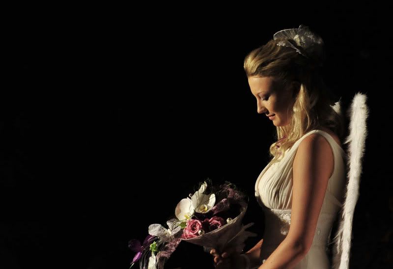 I don't know that I can get a decent B&W out of it though, more practice I think....... 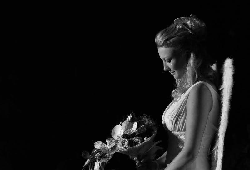 Thankyou all for the constructive comments. Regards Colin
Cameras, lenses and a lust for life
Re: One for Mr DarcyBoth a great improvement, now I see them on my good monitor - I looked at them earlier on my notebook & the BW looked distinctly blue. I really am going to have to calibrate it.
Perhaps try the BW with the square crop. Greg
It's easy to be good... when there is nothing else to do
Previous topic • Next topic
20 posts
• Page 1 of 1
|