Crane through windowsModerators: Greg B, Nnnnsic, Geoff, Glen, gstark, Moderators
Forum rules
Please note that image critiquing is a matter of give and take: if you post images for critique, and you then expect to receive criticism, then it is also reasonable, fair and appropriate that, in return, you post your critique of the images of other members here as a matter of courtesy. So please do offer your critique of the images of others; your opinion is important, and will help everyone here enjoy their visit to far greater extent. Also please note that, unless you state something to the contrary, other members might attempt to repost your image with their own post processing applied. We see this as an acceptable form of critique, but should you prefer that others not modify your work, this is perfectly ok, and you should state this, either within your post, or within your signature. Images posted here should conform with the general forum guidelines. Image sizes should not exceed 950 pixels along the largest side (height or width) and typically no more than four images per post or thread. Please also ensure that you have a meaningful location included in your profile. Please refer to the FAQ for details of what "meaningful" is.
Previous topic • Next topic
12 posts
• Page 1 of 1
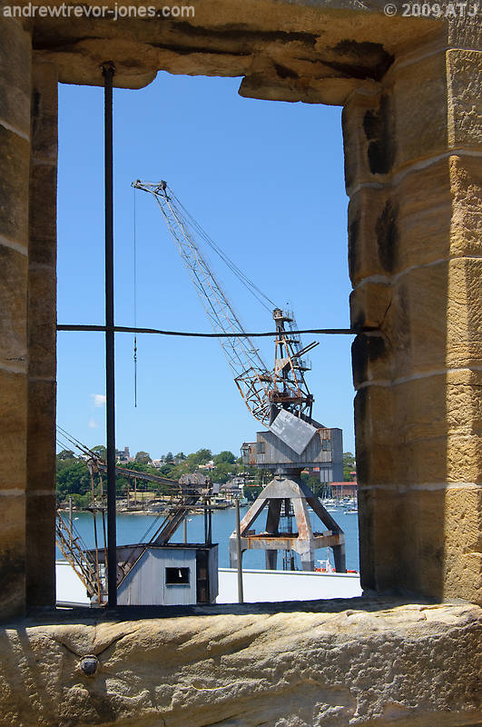
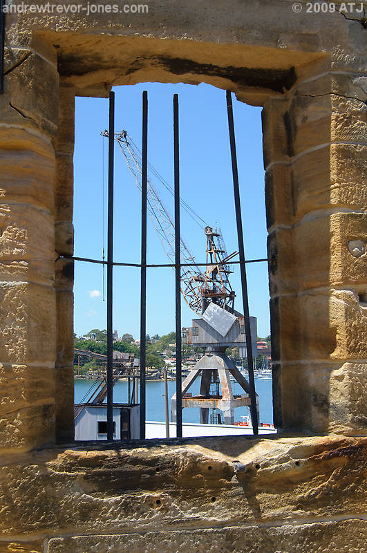
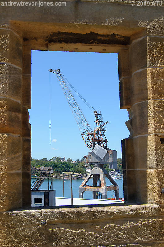
Crane through windowsHere are shots of the same crane shot through three different windows in the guardhouse on Cockatoo.
  
Re: Crane through windowsNice framing here Andrew. I prefer the one without the bars.
Did you consider BW? 
Re: Crane through windowsI also prefer the last colour one. The B&W has lost quite a lot of details.
Re: Crane through windowsnice one
the black and white one really shows the delicate composition i like how you have included the little shed bottom left in the frame Wendell Levi Teodoro
My Agents Press - Getty Images Creative Rep - T.I.D. FashionID, DBP Productions & The Nest Agency My Book - Zeduce
Re: Crane through windows+1 for the BW version, great composition but the colour just does not do it justice!
gerry's photography journey
No amount of processing will fix bad composition - trust me i have tried.
Re: Crane through windowsOnly the black and white version isn't mine - well it was my image but not my conversion. I don't particularly like black and white and wouldn't have chosen it - even though it appears more other people (2:1) prefer it.
Re: Crane through windowsI like the colour version more....as already said there is too much detail lost in the conversion.
Cameron
Nikon F/Nikon 1 | Hasselblad V/XPAN| Leica M/LTM |Sony α/FE/E/Maxxum/M42 Wishlist Nikkor 24/85 f/1.4| Fuji Natura Black Scout-Images | Flickr | 365Project
Re: Crane through windows
well at the end of the day it really comes down to what you like and if that is the coloour version then thats OK   lookign at the votes, it now 2 for 2 with cams addition : gerry's photography journey
No amount of processing will fix bad composition - trust me i have tried.
Re: Crane through windowsLove the divide between BW and colour. I like them both but tried to differentiate between the actual subject of the photo versus the pseudo frame...
[Andrew I hope you don't mind me converting your image? I didn't ask for permission intially!, Let me know]
Re: Crane through windowsThat's a very good point surenj on a sensitive issue. They are people that do mind having their babies altered. I am not sure if there is a protocol/rule to deal with it. I know there is/was a member with a caption saying "do not alter my pictures".
Re: Crane through windows
Several people explicitly mention in their sig if they do not want their image altered, if you have a real issue with it, be explicit and put it there - in my opinion if someone takes the time out to critique and even re-edit your image its all good, especially given they are giving their time and effort for...free.  gerry's photography journey
No amount of processing will fix bad composition - trust me i have tried.
Re: Crane through windowsI agree with you, Biggerry. Perhaps, we should encourage this as the general practice. All images can be edited; unless otherwise signed. But perhaps the edited image should be accompanied by a disclosure like "Edited by ..." to avoid embarrasing confusions like above. An Smily with a sign Do not edit could be a help here, if there is such a thing. It is only a suggestion.
 Personally, if some takes the time and trouble to show me how to improve my picture I would take it as a favour. PS Perhaps I read between the lines what it wasn't there and we should forget the issue.
Previous topic • Next topic
12 posts
• Page 1 of 1
|