

Mixed BagModerators: Greg B, Nnnnsic, Geoff, Glen, gstark, Moderators
Forum rules
Please note that image critiquing is a matter of give and take: if you post images for critique, and you then expect to receive criticism, then it is also reasonable, fair and appropriate that, in return, you post your critique of the images of other members here as a matter of courtesy. So please do offer your critique of the images of others; your opinion is important, and will help everyone here enjoy their visit to far greater extent. Also please note that, unless you state something to the contrary, other members might attempt to repost your image with their own post processing applied. We see this as an acceptable form of critique, but should you prefer that others not modify your work, this is perfectly ok, and you should state this, either within your post, or within your signature. Images posted here should conform with the general forum guidelines. Image sizes should not exceed 950 pixels along the largest side (height or width) and typically no more than four images per post or thread. Please also ensure that you have a meaningful location included in your profile. Please refer to the FAQ for details of what "meaningful" is.
Previous topic • Next topic
8 posts
• Page 1 of 1
Mixed BagA few recent ones from me.
   Fuji X-Pro1 | X-E1 | X-T1 | XF14 | XF23 | XF27 | XF35 | XF56 | XF60 | XF10-24 | XF18-55 | XF55-200 | MCEX-11
http://gmarshall.zenfolio.com http://xtographer.weebly.com
Re: Mixed BagI am just loving the yellow on yellow in that first shot! Its something that I would probably walk right past without a second glance but you've not only managed to make an ordinary subject look extraordinary but to make me kick myself for not noticing stuff like that when I'm out and about.. *sigh*..
Oh and I also like the other two.. specially the contrasts in the second.. The last thing I want to do is hurt you... but it's still on the list...
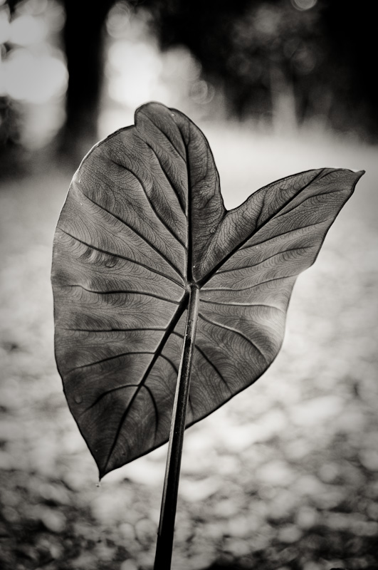
Re: Mixed BagThe 2nd shot is my favourite.
The detail in the leaf is great!
Re: Mixed BagI agree with Sue. The first is a good example of the mundane becoming more interesting because of your composition and color scheme.
The second has very nice BW contrast but is awkward compositionally... I am not sure how to improve but just feels "not right". Hmm...maybe a crop to include only part of the leaf?
Re: Mixed BagImage #2 is a fine art print....providing you have not cropped a tiny part of an image, IE, it has enough pixels to make a large print. Masterful.
Regards
Matt. K
Re: Mixed BagThankyou all.
Matt - no crop on the B&W full image presented here, just done some cloning to remove a stray blade of grass and a 'growth' on the underside of the leaf itself, and of course the obvious conversion. Fuji X-Pro1 | X-E1 | X-T1 | XF14 | XF23 | XF27 | XF35 | XF56 | XF60 | XF10-24 | XF18-55 | XF55-200 | MCEX-11
http://gmarshall.zenfolio.com http://xtographer.weebly.com
Re: Mixed BagYes, have to agree here Geoff, the second is striking, must be the sheer simplicity of the image. Less is usually more I suppose and you have done exceptionally well here.
President, A.A.A.A.A (Australian Association Against Acronym Abuse)
Canon EOS R6, RF 24-105 F4, RF 70-200 F4, RF 35mm F1.8, RF 16mm F2.8 "And ye shall know the truth, and the truth shall make you free." (John 8:32)
Re: Mixed Bagwow, i love the detail in the leaf, well done, although i would have loved a bit more focus on the lower end but then again, i can't say i could do any better, or even as good as that!! lol well done!!
2 x Fuji xt1,vg-xt1 grip, Fujinon xf 18-55mm 2.8-4, Fujinon xf 14mm, Fujinon 56mm 1.2.
Previous topic • Next topic
8 posts
• Page 1 of 1
|