Page 1 of 1

More model meet images....

PostPosted: Sun Feb 21, 2010 7:46 pm
by Ladybird
Here are a few more photos from yesterday's Brisbane meet.

I'm a complete amateur at model portraiture (and portraiture of any kind) so constructive criticism is highly sought.


Image

Image

Image

Thanks!
L

Re: More model meet images....

PostPosted: Sun Feb 21, 2010 8:28 pm
by Big Red
well, as i'm not into Portrait either i'll try and comment ...
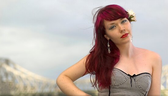
1 I like
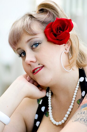
2 I think needs some light from above to give her chin some shadow
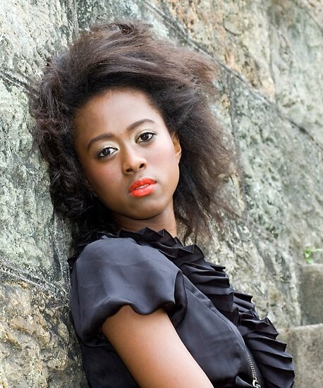
3 I like

Re: More model meet images....

PostPosted: Sun Feb 21, 2010 9:11 pm
by Bindii
I'm still looking for your first thread of images from the meet lol.. (hint.. where's a link cause I must be blind as a bat).. :)

Actually I think you've done really well.. the first one has a real fashion feel to it due to the way you've framed Kat on the right hand side (I probably would have put her on the left hand side more out of habit but this is quite effective).. and its a lovely photo of Sheri in the middle.. her eye's are sparkling!.. and I also like the perspective of Lani that you've used (you looking up).. they are all good! :)

Re: More model meet images....

PostPosted: Sun Feb 21, 2010 9:53 pm
by Bob G
Well done with these.

I like #3 the best of them.

Re: More model meet images....

PostPosted: Sun Feb 21, 2010 11:39 pm
by biggerry
#2 is the pick of the bunch for me, my only suggestion would be either go a bit tighter or wider, with the tat and arm chopped off it feels too wide, hence maybe a slightly tighter crop would work, on the flip side, a bit wider capturing that tat would have balanced the face out nicely in a wider portrait...

Re: More model meet images....

PostPosted: Mon Feb 22, 2010 11:57 am
by Geoff M
I would be happy if I had shot any of these, good work.

Re: More model meet images....

PostPosted: Mon Feb 22, 2010 1:52 pm
by Ladybird
Thanks for the comments everyone! Much appreciated!

Big Red wrote:2 I think needs some light from above to give her chin some shadow


Good idea Shane, I'll keep that in mind for future.

Bindii wrote:I'm still looking for your first thread of images from the meet


This is my only thread Sue....I simply meant that MY photos were adding to the multitude of threads from the meet by other people. Not sure if you were serious or I didn't get the sarcasm! :P

Bindii wrote:... due to the way you've framed Kat on the right hand side (I probably would have put her on the left hand side more out of habit but this is quite effective)..

and its a lovely photo of Sheri in the middle.. her eye's are sparkling


Kat on the right was a shot of opportunity - I don't have the confidence to butt in on other togs who know more about what they are doing than me! And Sheri's eyes were what caught me the most about her, and I tried to capture them in so many ways but this was the best I got.

biggerry wrote:my only suggestion would be either go a bit tighter or wider, with the tat and arm chopped off it feels too wide, hence maybe a slightly tighter crop would work, on the flip side, a bit wider capturing that tat would have balanced the face out nicely in a wider portrait...


Definitely makes a lot of sense now that I look at it again, another point for the memory bank. Thanks!
Re: More model meet images....

PostPosted: Mon Feb 22, 2010 6:04 pm
by Bindii
Ladybird wrote:
Bindii wrote:I'm still looking for your first thread of images from the meet


This is my only thread Sue....I simply meant that MY photos were adding to the multitude of threads from the meet by other people. Not sure if you were serious or I didn't get the sarcasm! :P


Oh no I wasn't being sarcastic at all.. I was really looking for another thread lol.. :)

Re: More model meet images....

PostPosted: Mon Feb 22, 2010 9:41 pm
by biggerry
Definitely makes a lot of sense now that I look at it again, another point for the memory bank. Thanks!


its easy in hindsight :roll: even easier from the sidelines!

Re: More model meet images....

PostPosted: Mon Feb 22, 2010 11:17 pm
by zafra52
I like them all. I would have added more
contrast, but that is only personal taste.