Thirds revisitedModerators: Greg B, Nnnnsic, Geoff, Glen, gstark, Moderators
Forum rules
Please note that image critiquing is a matter of give and take: if you post images for critique, and you then expect to receive criticism, then it is also reasonable, fair and appropriate that, in return, you post your critique of the images of other members here as a matter of courtesy. So please do offer your critique of the images of others; your opinion is important, and will help everyone here enjoy their visit to far greater extent. Also please note that, unless you state something to the contrary, other members might attempt to repost your image with their own post processing applied. We see this as an acceptable form of critique, but should you prefer that others not modify your work, this is perfectly ok, and you should state this, either within your post, or within your signature. Images posted here should conform with the general forum guidelines. Image sizes should not exceed 950 pixels along the largest side (height or width) and typically no more than four images per post or thread. Please also ensure that you have a meaningful location included in your profile. Please refer to the FAQ for details of what "meaningful" is.
Previous topic • Next topic
3 posts
• Page 1 of 1
Thirds revisitedI posted an image in the Bimonthly competition "Thirds"
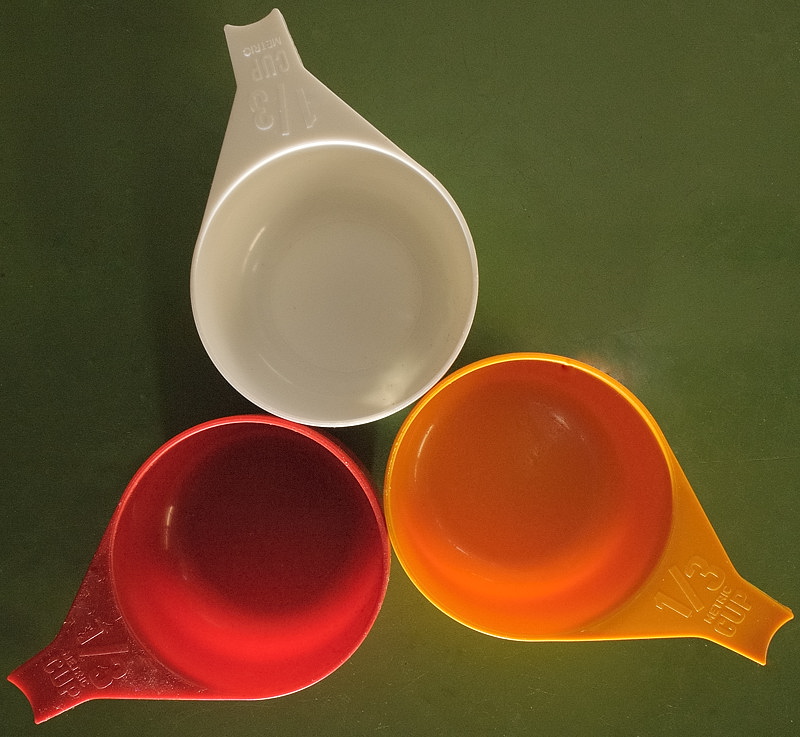
here but I wasn't entirely happy with it. I had another go, changing the levels, exposure compensation, adjusted the crop and being more assiduous at removing dust & other blemishes. Photo is of three measuring cups on a green enamelled table (c.a. 1930). I wiped down both the cups and table (though I wonder if I missed the Red cup ) Lighting was surprisingly tricky as it was difficult to avoid reflections from the enamelled table top. Final was a snooted flash (TTL BL -1.0EV) providing a raking light from image bottom to bring out the lettering, and another SB800 (M1/8), Image top, through an umbrella to provide general illumination. This was a bit over a meter away to avoid reflections. Lens was the Sigma 10-20mm @14mm f8. As usual, I forgot WB & left it at cloudy. Changed in Post to Flash I would appreciate comments and further suggestions at improving it. Greg
It's easy to be good... when there is nothing else to do
Re: Thirds revisitedOkay its a good idea.. and the image is technically perfect.. but it just doesn't 'grab' - if you know what I mean.. I'm not sure what exactly you could do to improve it but I think I would have been more inclined to shoot them on a mirror a a white surface instead of the green.. and perhaps play with the pp'ing a little more..
but thats just me.. The last thing I want to do is hurt you... but it's still on the list...
Re: Thirds revisitedThanks for the reply Sue.
This was done quickly in response to the Thirds competition so I doubt I will revisit it. but I will keep your suggestions in mind. The white background is a good idea. They were kitchen cups, so I used the kitchen table as a backdrop. I rarely think far outside the square. I tend to solve 'problems' rather than come up with new ideas. "Technically perfect but doesn't grab" is a good summary of much that I do. It's nice to have a creative person around to spark me with the ideas. I can usually then make them happen which the creative one can have trouble doing. I can't see how to make the mirror work. I had the camera directly overhead on a boom (I like my Gitzo!), It WOULD be in shot with a mirror backdrop. Maybe if I tilted the mirror one way and the cups the other... Hmm. Maybe I will play with it. Greg
It's easy to be good... when there is nothing else to do
Previous topic • Next topic
3 posts
• Page 1 of 1
|