Page 1 of 1

Potentials for exhibition late entry. Votes please

PostPosted: Wed Mar 03, 2010 1:41 pm
by Mr Darcy
Potentials for exhibition

Pam
Image

Goodbye
Image

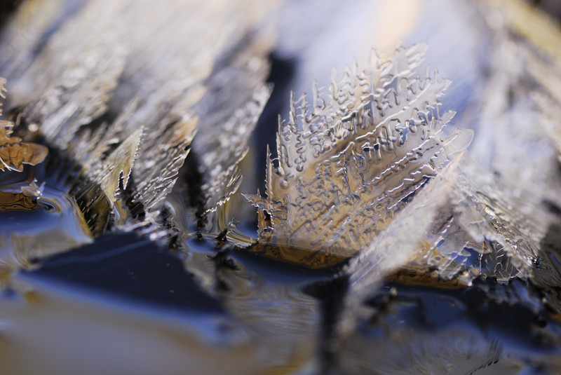
Ice 1
Image

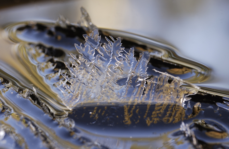
Ice 2
Image

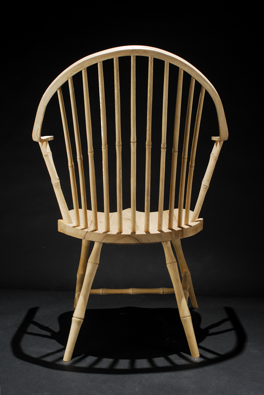
Chair
Image

Coathanger or possibly without the tower if my PP is up to it
Image

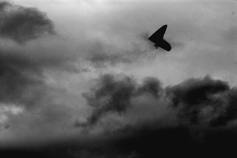
HangGlider
Image

Re: Potentials for exhibition late entry. Votes please

PostPosted: Wed Mar 03, 2010 2:00 pm
by Ladybird
Ice 1 for me.

I do like the hang-glider as well though.

Re: Potentials for exhibition late entry. Votes please

PostPosted: Wed Mar 03, 2010 2:04 pm
by wendellt
i would normally choose the pepole shot but ice 2 is fascinating

Re: Potentials for exhibition late entry. Votes please

PostPosted: Wed Mar 03, 2010 7:59 pm
by Bindii
Ice two for me also.. :)

Re: Potentials for exhibition late entry. Votes please

PostPosted: Thu Mar 04, 2010 7:02 am
by Gadgit
Ice 2 and the chair. I find the oof bit in the foreground very distracting.

Re: Potentials for exhibition late entry. Votes please

PostPosted: Thu Mar 04, 2010 8:05 am
by mozzie
i personally love the chair one. Somehow very theatrical.

Re: Potentials for exhibition late entry. Votes please

PostPosted: Thu Mar 04, 2010 4:13 pm
by pucara
I agree with Mozzie the chair,

Re: Potentials for exhibition late entry. Votes please

PostPosted: Thu Mar 04, 2010 5:00 pm
by Wink
Ice 1 for me.

Re: Potentials for exhibition late entry. Votes please

PostPosted: Thu Mar 04, 2010 5:41 pm
by aim54x
ice two!

Re: Potentials for exhibition late entry. Votes please

PostPosted: Thu Mar 04, 2010 6:40 pm
by ATJ
Ice 2

Re: Potentials for exhibition late entry. Votes please

PostPosted: Thu Mar 04, 2010 8:23 pm
by sirhc55
Ice #2

Re: Potentials for exhibition late entry. Votes please

PostPosted: Thu Mar 04, 2010 11:33 pm
by natskis
If it's for an exhibition...

I'd choose the old man.

Why?
Because it's the one I'd look at the longest.
It's a fantastic and feel good shot.

Shot 1. Great shot. Thought provoking.
I'd look at that and think... "I wonder wtf he's thinking and what he's so worried about?"
However, My eye wanders to the left door frame that's not straight...
Good? Bad? Inconcequetial? No Idea, it's totally subjective and just me thinking that it might have been a border to the pic... feel free to correct me if I"m wrong or on the wrong track... It's just what I'm thinking

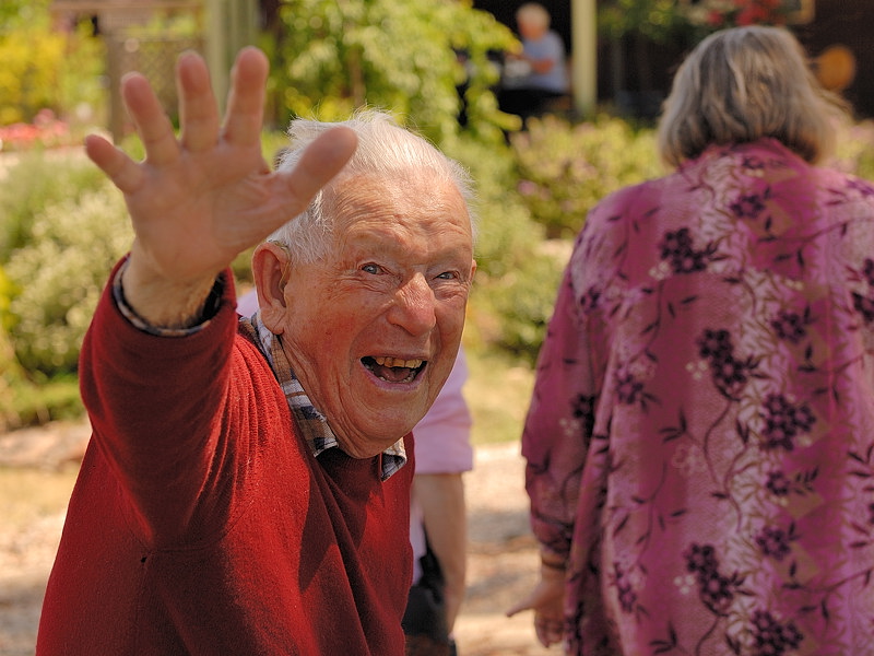
Shot 2: The old gentleman. Wow this is a cracker of a shot.
Great expression, just makes me feel good looking at it... Starts me thinking what's going on? Is he leaving? Where are they going? Man he looks happy!
Just a great feeling coming from this pic... again all subjective :)

Pic 3: Ice 1. Too much going on here for me.
I look at it and my eyes wander quickly and then focus on the OOF part jutting out at the front.
Personally I'd move on.

Pic 4: Good shot of the ice... interesting patterns on the ice crystals. If you were going to choose out of the ice crystals, I'd personally choose this shot.

Pic 5: Great shot, nice lighting and nice shadows.

Pic 6: Doesn't do it for me. There are 3 major points of interest in this photo. My eyes wander from one to the other, the bridge, the building and that stack on the left. Because I can't see the top of it, makes the image almost feel incomplete. (subjective again from me :) )

Pic 7: Good pic. Nice composition. However if I saw it in an exhibition. I'd think "nice pic... nice composition..." then move to the next one. Nothing that really draws me into it.

IMHO, I'd choose no 2 :)

Re: Potentials for exhibition late entry. Votes please

PostPosted: Fri Mar 05, 2010 8:56 am
by Mr Darcy
natskis wrote:If it's for an exhibition...


It's for this exhibition. It's not too late to join in if you want.

Thanks for the detailed feedback.
SOme Points
#1 SHE might get upset at your comment :) I am aware of the door frame, and have tried straightening it, but if you check the background, you will see the vertical supporting the shelves on the right side slopes the other way. This is an issue of perspective, not a tilted view. when you straighten the post, the shelves slope and detract from the image even more. I know there are ways of straightening the perspective, but they are beyond my PP skills.

#2. My favourite too, but as it is for potential sale, I am concerned that people will not buy a portrait of someone they do not know. I't's my father in law.

#6 I know. I would take out the tower if my PP skills were up to it. If consensus were on this photo I would try real hard to remove it. It then becomes a very 1930s photo which I like. But did you notice the gas burner in the foreground that echoes the shape of the tower?

Re: Potentials for exhibition late entry. Votes please

PostPosted: Fri Mar 05, 2010 12:47 pm
by Glen
Greg, big fan of Ice 2 and the chair, which as you suggest are both saleable. Like Natskis I would prefer to see the top of the tower and top of the bridge, but I imagine that was the limitation of the lens used

Re: Potentials for exhibition late entry. Votes please

PostPosted: Fri Mar 05, 2010 3:39 pm
by natskis
#1 SHE might get upset at your comment :)


Ohhh-errrr... apologies. it was 11pm at night... :)

I am aware of the door frame, and have tried straightening it, but if you check the background, you will see the vertical supporting the shelves on the right side slopes the other way. This is an issue of perspective, not a tilted view. when you straighten the post, the shelves slope and detract from the image even more. I know there are ways of straightening the perspective, but they are beyond my PP skills.

Fair call, didn't notice the shelves... bet I would have if you did however change that doorway :)

If you did want to fix this pic, I'd:
- create a layer
- copy the doorway ONLY into that layer
- Freeform adjust that doorway
- push it out a bit so that it's stright.
- flatten image.

I think that'd work.
Always worth a try if you want to give it a crack :)

#2. My favourite too, but as it is for potential sale, I am concerned that people will not buy a portrait of someone they do not know. I't's my father in law.

Fair point. Still a great shot :)