Page 1 of 1

Juicy pork belly

PostPosted: Thu May 27, 2010 11:18 pm
by Willy wombat
Hi guys

I broke out the light tent for another session of food photography last week. It was to help out a friend of mine with some images for a website (she is a chef). I havent done a lot of work in the light tent before. I was using two SB 800's for the light here and a 105mm macro lens. Im starting to get a better handle on using off camera flash (I hope).

Here is one that I though i would open up for critique
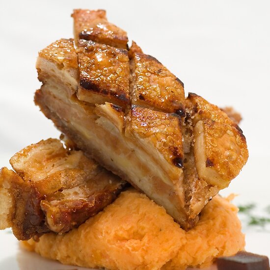
Image

Please let me know what you think. Good/mediocre/crap/something else.

The best thing was that I got to eat the exhibits after the session. :up:

Re: Juicy pork belly

PostPosted: Thu May 27, 2010 11:36 pm
by biggerry
striaght up, the first thing that hit me was the two OOF cubes in the foreground, I reckon either crop 'em (not really an option here..) or get more dof for next time!

the chopped off bit on teh left is a bit distracting also - the lighting, imo is spot on, exposure is perfect!

I would like to see some more of the plate edge in teh frame also, from what I have seen it gives a nice curve and line to a food image even if it leads nowhere..

The best thing was that I got to eat the exhibits after the session.

*drools*


hth.

Re: Juicy pork belly

PostPosted: Fri May 28, 2010 12:13 am
by photomarcs
Nice crop =D fan of that! plus the food there.. yum!

My critique on this would be to remove the cubes completely, and crop a bit more white off the bottom when you've done so to disregard an negative space. Theyre too distracting in my opinion, even with them in focus, I'd still find them to be distracting me from the main element of the pork belly, that being said, you're tones turned out really nice on these =) maybe up the contrast a smidget?


Great work! :up:

Re: Juicy pork belly

PostPosted: Fri May 28, 2010 7:55 am
by gstark
Steve,

Great work, but why a portrait orientation here? The left edge of the pork would have been retained had you used a landscape orientation.

Others have commented on the DoF. I think that the cubes are a part of the meal's presentation, and thus exclusding them from the image is not really an option.

A good way to try to handle that is to shoot from above, looking down onto the plate. That works provided that there's not too much depth (height) in the food on the plate. Push the light source's power up and modify the exposure using the aperture to help increase the DoF as well.

Re: Juicy pork belly

PostPosted: Fri May 28, 2010 3:06 pm
by surenj
Another vote for landscape. The pork has been chopped on the left.

Re: Juicy pork belly

PostPosted: Fri May 28, 2010 4:33 pm
by photomarcs
Willy wombat wrote:
The best thing was that I got to eat the exhibits after the session. :up:
 LOL WIN :up:

Re: Juicy pork belly

PostPosted: Fri May 28, 2010 5:21 pm
by zafra52
My guess is that a landscape orientation would be
better suited and the cubes removed. You need a
closer zoom. But why don't you try a shot looking
down on the food?

Re: Juicy pork belly

PostPosted: Sat May 29, 2010 10:51 pm
by Willy wombat
Hey gang

Thanks for the comments. Interesting to read about the DOF issue with the cubes. This DOF is always a problem when shooting with such a focal plain (i.e. eye level), but I have noticed that some magazines tend to use this DOF technique to build depth into an image. I will need to watch it though.

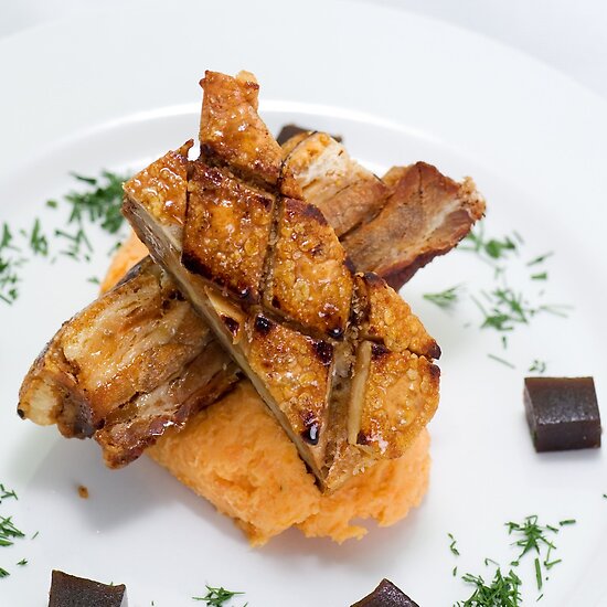
Anyhow, I did take some more images of this dish from the traditional overhead angle

Image

This was so good to eat.

Re: Juicy pork belly

PostPosted: Sun May 30, 2010 12:12 am
by surenj
This view is better IMO. Would be nice to do this on a square crop.

Re: Juicy pork belly

PostPosted: Sun May 30, 2010 6:35 pm
by zafra52
I think this view allows you to include
the cubes and I agree that a square
crop is better suited. I guess what it
matters is what your client likes best.

Re: Juicy pork belly

PostPosted: Mon May 31, 2010 3:00 pm
by biggerry
zafra52 wrote:I guess what it
matters is what your client likes best.


:agree:

Willy wombat wrote:Anyhow, I did take some more images of this dish from the traditional overhead angle


solves the dof issue and now looks liek a run-of-the-mill cook book shot. A couple of points, I agree with suren on the square crop, that would work well, however the chopped off parlsey on the left distracts me, alittle more room on this side and gettign the pork in teh middle would be spot on imo.

hth

This was so good to eat.


i bet it was...but thats a good hour on the bike to burn that off :|

Re: Juicy pork belly

PostPosted: Mon May 31, 2010 5:33 pm
by surenj
biggerry wrote:zafra52 wrote:
I guess what it
matters is what your client likes best.

:agree:
All our hard work critiquing this will be useless/moot if the client is satisfied. Our critique is useful if you want to hear a different point of view.

Re: Juicy pork belly

PostPosted: Mon May 31, 2010 5:43 pm
by Willy wombat
The client will probably be very happy considering I was doing this as a favour to her and was paid only in left over food and a glass or two of red.

It was also a learning opportunity for me which is why I posted the pics. I appreciate the crtique - thanks guys :up:

Re: Juicy pork belly

PostPosted: Mon May 31, 2010 10:00 pm
by Matt. K
Food photography is a very specialised branch of photography and you wouldn't believe the tricks they use to make food look good. One suggestion I would make is to brush the pork with olive oil to give it a shiny look...and maybe use a bit of dry ice hidden behind the dish to give the appearance of steam coming off the food.