Page 1 of 1

Flounder

PostPosted: Mon Jun 14, 2010 3:58 pm
by Willy wombat
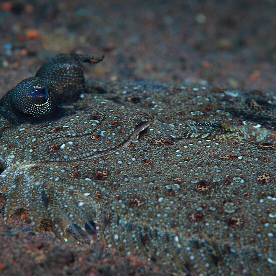
Im considering entering this one into a local competition and was hoping for a critique on how it is presented here. Quite a dark exposure because im trying to portray the animals natural blending in behaviour with the dark substrate. But Is it too dark?

Cheers Steve

Image

Re: Flounder

PostPosted: Mon Jun 14, 2010 4:59 pm
by ATJ
I like it, Steve, but I do think it is a bit dark.

Re: Flounder

PostPosted: Mon Jun 14, 2010 11:33 pm
by biggerry
Is it going to be printed for the comp? if so I, think it may look better printed than on the monitor, especially if its A3 or greater.

In terms of brightness, maybe a shade too dark, but not by much, maybe play with brightening a little and adding a fraction more contrast? all in all I think it would only need minor tweaks in the PP to get a printed version looking good.

Compositionally I think its quite good, it definitely conveys the blending with the surrounding environment and one does not have to look at it for 5 mins to work wtf it is. The line of the body in the foreground is a nice touch to lead teh eyes to the eyes of teh fish! I cannot think of a different crop that would improve the image.

Re: Flounder

PostPosted: Tue Jun 15, 2010 11:19 am
by Willy wombat
ATJ wrote:I like it, Steve, but I do think it is a bit dark.


Thanks for letting me know!


biggerry wrote:Is it going to be printed for the comp? if so I, think it may look better printed than on the monitor, especially if its A3 or greater.

In terms of brightness, maybe a shade too dark, but not by much, maybe play with brightening a little and adding a fraction more contrast? all in all I think it would only need minor tweaks in the PP to get a printed version looking good.

Compositionally I think its quite good, it definitely conveys the blending with the surrounding environment and one does not have to look at it for 5 mins to work wtf it is. The line of the body in the foreground is a nice touch to lead teh eyes to the eyes of teh fish! I cannot think of a different crop that would improve the image.


Its an online comp, so i will have to have a think about reprocessing it.

Thanks also for the critique. Because they pop out of the back of the fish, the eyes really stand out at you once you figure out what you atre looking at
Re: Flounder

PostPosted: Tue Jun 15, 2010 1:27 pm
by CraigVTR
Very tasty little creatures. :)

Re: Flounder

PostPosted: Tue Jun 15, 2010 2:02 pm
by Willy wombat
CraigVTR wrote:Very tasty little creatures. :)


I agree, although this one was a bit on the small side.

Re: Flounder

PostPosted: Tue Jun 15, 2010 3:00 pm
by surenj
I've looked using two screens. I agree it's a little dark. If you print this, it will be even darker (unless your printer is perfectly calibrated with your screen).

Perhaps lift the midtone a little without affecting shadows? It's a tough one as the tones are relatively even overall.