|
Got a thin skin? Then look elsewhere. Post a link to an image that you've made, and invite others to offer their critiques. Honesty is encouraged, but please be positive in your constructive criticism. Flaming and just plain nastiness will not be tolerated. Please note that this is not an area for you to showcase your images, nor is this a place for you to show-off where you have been. This is an area for you to post images so that you may share with us a technique that you have mastered, or are trying to master. Typically, no more than about four images should be posted in any one post or thread, and the maximum size of any side of any image should not exceed 950 px.
Moderators: Greg B, Nnnnsic, Geoff, Glen, gstark, Moderators
Forum rules
Please note that image critiquing is a matter of give and take: if you post images for critique, and you then expect to receive criticism, then it is also reasonable, fair and appropriate that, in return, you post your critique of the images of other members here as a matter of courtesy. So please do offer your critique of the images of others; your opinion is important, and will help everyone here enjoy their visit to far greater extent.
Also please note that, unless you state something to the contrary, other members might attempt to repost your image with their own post processing applied. We see this as an acceptable form of critique, but should you prefer that others not modify your work, this is perfectly ok, and you should state this, either within your post, or within your signature.
Images posted here should conform with the general forum guidelines. Image sizes should not exceed 950 pixels along the largest side (height or width) and typically no more than four images per post or thread.
Please also ensure that you have a meaningful location included in your profile. Please refer to the FAQ for details of what "meaningful" is.
 by ozimax on Thu Aug 12, 2010 8:41 pm by ozimax on Thu Aug 12, 2010 8:41 pm
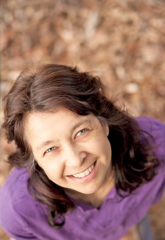
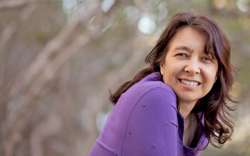
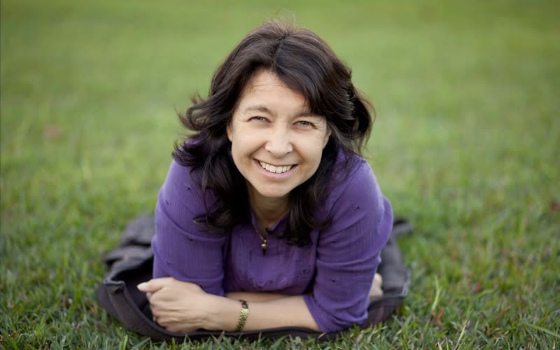
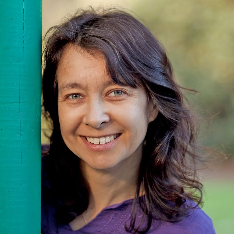
Hello all in DSLRusers land. I shot some photos today with a spectacular model (the missus, who incidentally but unsurprisingly hates having her photo taken), and these are some of the results. I would be interested to hear some opinions on the use of the "shadows/highlights" adjustment tool in Photoshop, which I used with these. All the images were processed in camera raw, then PS CS5, then run through Portrait Professional.   I couldn't quite get the colour right here. Any suggestions?  Not sure about the green post here.  President, A.A.A.A.A (Australian Association Against Acronym Abuse)
Canon EOS R6, RF 24-105 F4, RF 70-200 F4, RF 35mm F1.8, RF 16mm F2.8
"And ye shall know the truth, and the truth shall make you free." (John 8:32)
-

ozimax
- Senior Member
-
- Posts: 5289
- Joined: Wed Jan 05, 2005 11:58 am
- Location: Coffs Harbour, NSW
 by photomarcs on Thu Aug 12, 2010 9:26 pm by photomarcs on Thu Aug 12, 2010 9:26 pm
Nice! With the colors, I use color balance, or niks color efex to correct color cast. Great images  love the eyes in all your images, you've certainly captured the eyes beautifully 
-

photomarcs
- Member
-
- Posts: 417
- Joined: Tue Nov 03, 2009 10:47 pm
- Location: Liverpool, Sydney Australia
-
 by ozimax on Thu Aug 12, 2010 9:33 pm by ozimax on Thu Aug 12, 2010 9:33 pm
photomarcs wrote:niks color efex to correct color cast.
Thanks, Can I ask where we might find this fx? Last edited by ozimax on Fri Aug 13, 2010 7:24 am, edited 1 time in total.
President, A.A.A.A.A (Australian Association Against Acronym Abuse)
Canon EOS R6, RF 24-105 F4, RF 70-200 F4, RF 35mm F1.8, RF 16mm F2.8
"And ye shall know the truth, and the truth shall make you free." (John 8:32)
-

ozimax
- Senior Member
-
- Posts: 5289
- Joined: Wed Jan 05, 2005 11:58 am
- Location: Coffs Harbour, NSW
 by sirhc55 on Thu Aug 12, 2010 9:43 pm by sirhc55 on Thu Aug 12, 2010 9:43 pm
Ozi - just love the last shot and the green post justs adds to the overall feel of the shot.
Chris
--------------------------------
I started my life with nothing and I’ve still got most of it left
-

sirhc55
- Key Member
-
- Posts: 12930
- Joined: Fri Sep 17, 2004 6:57 pm
- Location: Port Macquarie - Olympus EM-10
 by aim54x on Thu Aug 12, 2010 10:33 pm by aim54x on Thu Aug 12, 2010 10:33 pm
I like what you have done. Which camera was this?
i agree that the green post actually works well
Cameron Nikon F/Nikon 1 | Hasselblad V/XPAN| Leica M/LTM |Sony α/FE/E/Maxxum/M42Wishlist Nikkor 24/85 f/1.4| Fuji Natura BlackScout-Images | Flickr | 365Project
-

aim54x
- Senior Member
-
- Posts: 7305
- Joined: Fri Feb 01, 2008 10:13 pm
- Location: Penshurst, Sydney
-
 by surenj on Fri Aug 13, 2010 12:27 am by surenj on Fri Aug 13, 2010 12:27 am
Hey Ozi, these are great. Looks like a 5D 85 bokeh...  #1 it would have been great to see the arms in the bokeh areas to tie it all together. That particular pose with the arms by the side (and out of the frame) doesn't quite feel right to me. I prefer the last one as the expression is very relaxed.
-

surenj
- Senior Member
-
- Posts: 7197
- Joined: Fri Sep 15, 2006 8:21 pm
- Location: Artarmon NSW
 by surenj on Fri Aug 13, 2010 12:35 am by surenj on Fri Aug 13, 2010 12:35 am
ozimax wrote:(the missus, who incidentally but unsurprisingly hates having her photo taken)
This seems to be a common symptom. The only temporary cure is alcohol according to what I've heard. 
-

surenj
- Senior Member
-
- Posts: 7197
- Joined: Fri Sep 15, 2006 8:21 pm
- Location: Artarmon NSW
 by ozimax on Fri Aug 13, 2010 7:28 am by ozimax on Fri Aug 13, 2010 7:28 am
surenj wrote:Looks like a 5D 85 bokeh... 
Spot on! surenj wrote:#1 it would have been great to see the arms in the bokeh areas to tie it all together. That particular pose with the arms by the side (and out of the frame) doesn't quite feel right to me.
Yeah, this one is cropped. By this stage of the afternoon, I was perched up a tree to get the shot, and Robyn had had enough. She was kneeling on some very sharp bark and wasn't too happy so I took a quick snap and there we ended things! President, A.A.A.A.A (Australian Association Against Acronym Abuse)
Canon EOS R6, RF 24-105 F4, RF 70-200 F4, RF 35mm F1.8, RF 16mm F2.8
"And ye shall know the truth, and the truth shall make you free." (John 8:32)
-

ozimax
- Senior Member
-
- Posts: 5289
- Joined: Wed Jan 05, 2005 11:58 am
- Location: Coffs Harbour, NSW
 by petermmc on Fri Aug 13, 2010 9:09 am by petermmc on Fri Aug 13, 2010 9:09 am
Hi
I like them all. I like the last one the best. She is very 'photographic' and the eyes say it all. My wife treats me like the papparazzi and I am constantly being heard saying...just one more photo.
Well done.
Peter Mc
Nikon & Olympus
-

petermmc
- Senior Member
-
- Posts: 504
- Joined: Wed Feb 23, 2005 5:24 pm
- Location: Figtree, Wollongong
 by ozimax on Fri Aug 13, 2010 9:16 am by ozimax on Fri Aug 13, 2010 9:16 am
petermmc wrote:My wife treats me like the papparazzi...
She breaks your camera over your head?  President, A.A.A.A.A (Australian Association Against Acronym Abuse)
Canon EOS R6, RF 24-105 F4, RF 70-200 F4, RF 35mm F1.8, RF 16mm F2.8
"And ye shall know the truth, and the truth shall make you free." (John 8:32)
-

ozimax
- Senior Member
-
- Posts: 5289
- Joined: Wed Jan 05, 2005 11:58 am
- Location: Coffs Harbour, NSW
 by gstark on Fri Aug 13, 2010 9:41 am by gstark on Fri Aug 13, 2010 9:41 am
Hi Oz,
The first one here looks a little over exposed to me. I'd like to see the exposure pulled back about 2/3 stop; Look at Robyn's right cheek and forehead an you will see where you seem to have blown highlights, or are very colse to blowing them.
You're querying the colour in #3. How was this one shot? With AWB? I'm suspecting AWB, but with the large expanse of green here, the camera is going to try to compensate for this. Go back to your RAW file, and see what happens as you change the WB settings.
Cheers
g.
Gary Stark
Nikon, Canon, Bronica .... stuff
The people who want English to be the official language of the United States are uncomfortable with their leaders being fluent in it - US Pres. Bartlet
-

gstark
- Site Admin
-
- Posts: 22926
- Joined: Thu Aug 05, 2004 11:41 pm
- Location: Bondi, NSW
 by ozimax on Fri Aug 13, 2010 9:54 am by ozimax on Fri Aug 13, 2010 9:54 am
gstark wrote:The first one here looks a little over exposed to me. I'd like to see the exposure pulled back about 2/3 stop; Look at Robyn's right cheek and forehead an you will see where you seem to have blown highlights, or are very colse to blowing them.
I just checked the raw file, and it's not overexposed. However, I have overdone the facial highlights in Portrait Professional. I will try and re-do the photo again and see how it goes. gstark wrote:You're querying the colour in #3. How was this one shot? With AWB? I'm suspecting AWB, but with the large expanse of green here, the camera is going to try to compensate for this. Go back to your RAW file, and see what happens as you change the WB settings.
Yes it was in AWB (the light constantly changing) and I did warm the WB initially in processing. I actually don't mind the greenish tinge here, but each to their own. I will muck around with the photo and see how a warmer WB looks. Many thanks for the feedback. President, A.A.A.A.A (Australian Association Against Acronym Abuse)
Canon EOS R6, RF 24-105 F4, RF 70-200 F4, RF 35mm F1.8, RF 16mm F2.8
"And ye shall know the truth, and the truth shall make you free." (John 8:32)
-

ozimax
- Senior Member
-
- Posts: 5289
- Joined: Wed Jan 05, 2005 11:58 am
- Location: Coffs Harbour, NSW
 by the foto fanatic on Fri Aug 13, 2010 10:21 am by the foto fanatic on Fri Aug 13, 2010 10:21 am
ozimax wrote: She was kneeling on some very sharp bark and wasn't too happy so I took a quick snap and there we ended things!
Gee - hope it isn't permanent!  Nice work here - well done.
-

the foto fanatic
- Moderator
-
- Posts: 4212
- Joined: Tue Aug 24, 2004 7:53 pm
- Location: Teneriffe, Brisbane
-
 by ozimax on Fri Aug 13, 2010 11:19 am by ozimax on Fri Aug 13, 2010 11:19 am
the foto fanatic wrote:ozimax wrote: Gee - hope it isn't permanent!  .
thankfully not permanent, but kneeling on bark chips is now on the prohibited list  President, A.A.A.A.A (Australian Association Against Acronym Abuse)
Canon EOS R6, RF 24-105 F4, RF 70-200 F4, RF 35mm F1.8, RF 16mm F2.8
"And ye shall know the truth, and the truth shall make you free." (John 8:32)
-

ozimax
- Senior Member
-
- Posts: 5289
- Joined: Wed Jan 05, 2005 11:58 am
- Location: Coffs Harbour, NSW
 by barry on Fri Aug 13, 2010 1:16 pm by barry on Fri Aug 13, 2010 1:16 pm
My pick is #4 - nice colour and lighting
I also like #1 however I think it would be better if you cropped all the bark above the head, it not doing anthing for the shot. A square crop would suit this shot.
D700, 50 1.8, 14-24 2.8, 24-70 2.8, 70-200VR, 80-400VR, SB800 plus a lot of gadgets
-

barry
- Member
-
- Posts: 475
- Joined: Fri Apr 15, 2005 9:25 am
- Location: Emu Plains NSW
 by Aussie Dave on Sun Aug 15, 2010 1:20 am by Aussie Dave on Sun Aug 15, 2010 1:20 am
Ozi,
For photo 3, you could try:
- creating two layers in photoshop
- pasting the photo into both layers
- goto layer two and select the area of her face, left arm and right hand (perhaps with the polygonal tool, depending on how quickly you want to do this ?)
- invert selection (Ctrl+Shift+i) then erase the entire background from layer 2
- open the color balance tool and move the first two sliders more towards the reds (until you are happy with the colour in the face and arm)
- select layer 1 and add some saturation (which will enhance the grass), and maybe even a touch of contrast...
This should make the grass pop a bit more and bring back some red in the skin tones.
Nice photos by the way. I can appreciate how hard it is to coax the other half in front of a camera...so you have done very well !
Is she happy with the pics ?
Cheers,
Dave
Dave
Nikon D7000 | 18-105 VR Lens | Nikon 50 1.8G | Sigma 70-300 APO II Super Macro | Tokina 11-16 AT-X | Nikon SB-800 | Lowepro Mini Trekker AWII
Photography = Compromise
-

Aussie Dave
- Senior Member
-
- Posts: 1427
- Joined: Sun Nov 21, 2004 1:40 pm
- Location: West. Suburbs, Melbourne [Nikon D7000]
 by wendellt on Sun Aug 15, 2010 4:23 am by wendellt on Sun Aug 15, 2010 4:23 am
i think the 2nd one is the most interesting shot because it shows an incidental moment
which looks natural to me and the composition is good as well as the use of shallow focus with the extreme bokeh
the 1st one is a good idea but it has a little too much space at the top, for a portrait it's a bit odd in that way
and in the last she great
some look overexposed a little but it's easily fixable
when yiur shooting portaits try to match the colour tones as neautral as possible
contrasting colours detract from the subject
well done
-

wendellt
- Outstanding Member of the year (Don't try this at home.)
-
- Posts: 4078
- Joined: Sun Feb 20, 2005 10:04 am
- Location: Dilettante Outside the City Walls, Sydney
-
Return to Image Reviews and Critiques
|
