|
Got a thin skin? Then look elsewhere. Post a link to an image that you've made, and invite others to offer their critiques. Honesty is encouraged, but please be positive in your constructive criticism. Flaming and just plain nastiness will not be tolerated. Please note that this is not an area for you to showcase your images, nor is this a place for you to show-off where you have been. This is an area for you to post images so that you may share with us a technique that you have mastered, or are trying to master. Typically, no more than about four images should be posted in any one post or thread, and the maximum size of any side of any image should not exceed 950 px.
Moderators: Greg B, Nnnnsic, Geoff, Glen, gstark, Moderators
Forum rules
Please note that image critiquing is a matter of give and take: if you post images for critique, and you then expect to receive criticism, then it is also reasonable, fair and appropriate that, in return, you post your critique of the images of other members here as a matter of courtesy. So please do offer your critique of the images of others; your opinion is important, and will help everyone here enjoy their visit to far greater extent.
Also please note that, unless you state something to the contrary, other members might attempt to repost your image with their own post processing applied. We see this as an acceptable form of critique, but should you prefer that others not modify your work, this is perfectly ok, and you should state this, either within your post, or within your signature.
Images posted here should conform with the general forum guidelines. Image sizes should not exceed 950 pixels along the largest side (height or width) and typically no more than four images per post or thread.
Please also ensure that you have a meaningful location included in your profile. Please refer to the FAQ for details of what "meaningful" is.
 by DJM on Sun Sep 05, 2010 1:08 am by DJM on Sun Sep 05, 2010 1:08 am
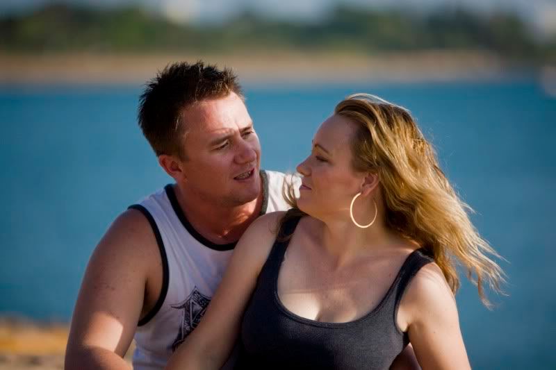
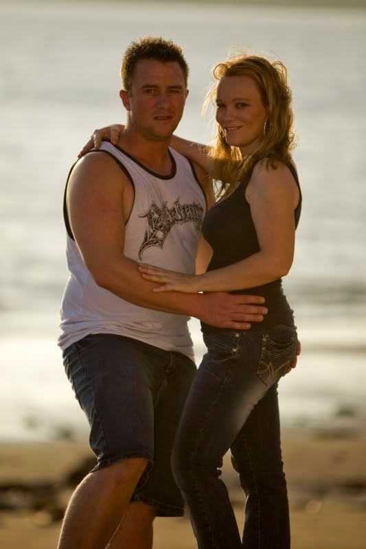
A friend of mine is getting some professional studio shots done of himself and his partner and asked me to take some relaxed casual shots down at the beach to go with the others. I was offered some compensation for my time and as this was my first time doing this kind of thing I told him to wait til he had seen the finished product before offering anything. I provided a CD and a single print. Anyway, both he and his partner were extremely pleased with what I gave them and I did receive payment making this my first paid shoot. Overall I'm happy that they are happy with the result, but I know I could do better. So I'm after comments particularly with composition, background and posing (although is was relaxed/casual). 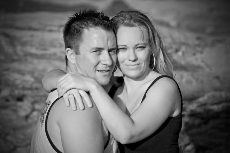 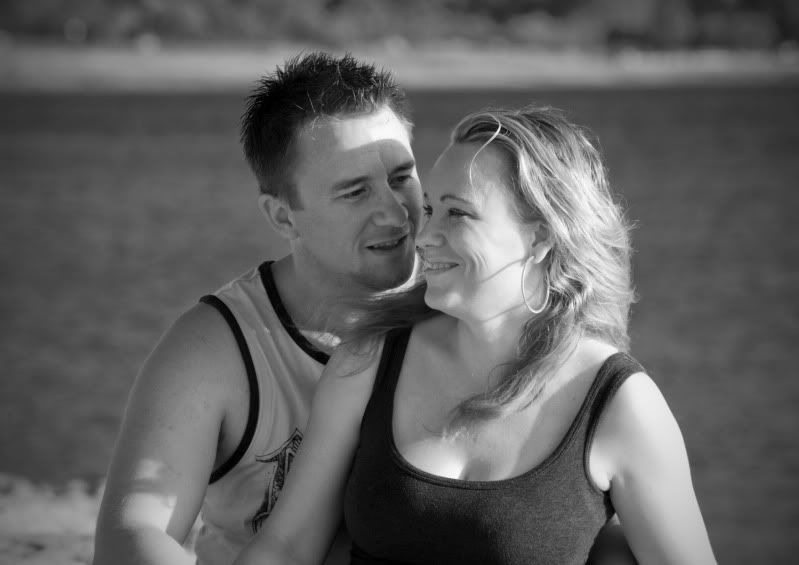 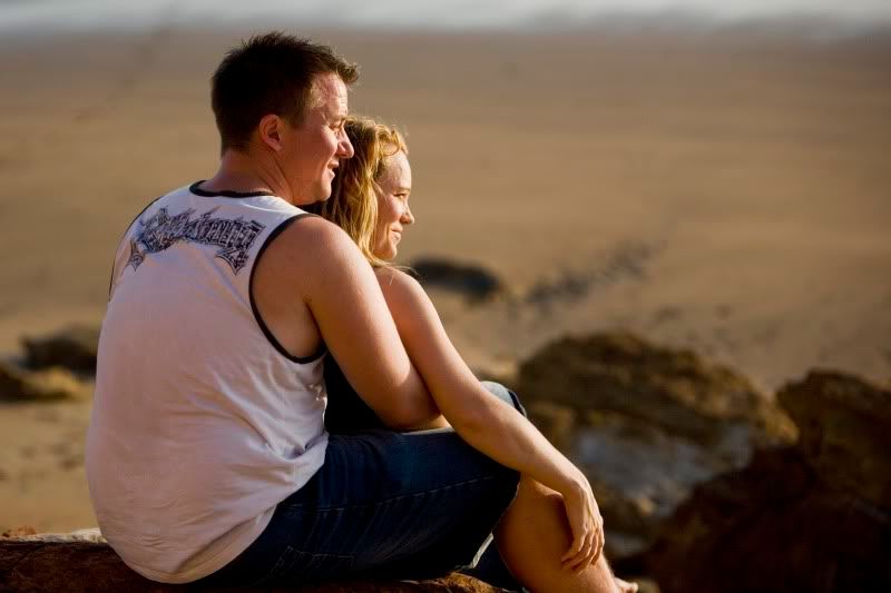 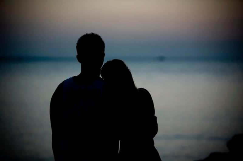
-

DJM
- Newbie
-
- Posts: 5
- Joined: Fri Apr 02, 2010 8:54 am
- Location: Darwin
 by surenj on Sun Sep 05, 2010 1:14 am by surenj on Sun Sep 05, 2010 1:14 am
I can see why you got paid... #1 I would suggest keeping the sun away from their eyes. People tend to squint and IMHO it's not suitable for romantic portraits. #2 is very good. The only improvement that I can suggest is to see whether you got any while they are looking into each others eyes. Here the boy is looking but the girl is looking past him.  #3 and #4 are excellent for the composition and use of the available light! 
-

surenj
- Senior Member
-
- Posts: 7197
- Joined: Fri Sep 15, 2006 8:21 pm
- Location: Artarmon NSW
 by zafra52 on Sun Sep 05, 2010 2:42 pm by zafra52 on Sun Sep 05, 2010 2:42 pm
I like them. They are very good and I also I gree
with Surenj's comments. However, it is unlikely
you will shoot your friends again in the short
future, so we shoot and learn...
-

zafra52
- Senior Member
-
- Posts: 4896
- Joined: Thu Dec 01, 2005 10:22 pm
- Location: Brisbane
 by biggerry on Mon Sep 06, 2010 1:31 am by biggerry on Mon Sep 06, 2010 1:31 am
The first two come across very soft, this may be delibrate but does not rock my world. The main thing I notice about the first two is the eye contact seems disjointed, I think with this kinda photography you can get away with less than perfect images from a technical standpoint as long as the couple/subject have good eye contact with each other or the camera - basically concentrating on getting the pose and composition right and the rest is academic. The first one, I feel the guys expression is one of about to jump thru the screen and have a crack at me for looking at the picture  and as Suren mentioned the squinking is one aspect to avoid where ever possible. The second image is the example of disjointed eye contact, she is looking off into the distance and he is looking at her, the third image shows a much better example of having focused and consistent eye contact, both are lookign off into teh distance and you have given them space in the RHS of teh image to do so, well done on that image imo! The only issue is, it's not particulary flattering for the bloke and his love handles. The final image is a good idea, but for me has no sense of personal connection, basically a silhouette of two people, that said, its still nice, I would however get them in teh centre and back off teh vignetting about 50%. hth
-

biggerry
- Senior Member
-
- Posts: 5930
- Joined: Tue May 13, 2008 12:40 am
- Location: Under the flight path, Newtown, Sydney
-
 by DJM on Sat Sep 11, 2010 8:16 am by DJM on Sat Sep 11, 2010 8:16 am
As mentioned, the sun was the biggest issue for me with the squinting, it was hard to get a range of images with the given time and place.
The eye contact between them is a very good point and something I'll focus more on if I get to do something similar.
Thanks for the comments, always appreciated.
-

DJM
- Newbie
-
- Posts: 5
- Joined: Fri Apr 02, 2010 8:54 am
- Location: Darwin
 by gstark on Sat Sep 11, 2010 11:20 am by gstark on Sat Sep 11, 2010 11:20 am
DJM wrote:As mentioned, the sun was the biggest issue for me with the squinting, it was hard to get a range of images with the given time and place.
Actually, no.  Without wishing to be over critical or attacking you, that is something that should be easily manageable by you. Just change how you are shooting these people: where you're shooting from, and where they're facing. Have the sun mostly behind the subjects, and the squinting problem just goes away. Now your subjects' faces will be within their own shadows, but don't be scared to use fill flash. Pull the flash power down to just push some extra light back into the image and you will be getting even better images than what you already have. Obviously, you don't want the sun directly behind them, otherwise flare will start to take over. Mind you, a little bit of controlled flare might not hurt either. g.
Gary Stark
Nikon, Canon, Bronica .... stuff
The people who want English to be the official language of the United States are uncomfortable with their leaders being fluent in it - US Pres. Bartlet
-

gstark
- Site Admin
-
- Posts: 22926
- Joined: Thu Aug 05, 2004 11:41 pm
- Location: Bondi, NSW
 by DJM on Sun Sep 12, 2010 9:12 am by DJM on Sun Sep 12, 2010 9:12 am
gstark wrote:DJM wrote:As mentioned, the sun was the biggest issue for me with the squinting, it was hard to get a range of images with the given time and place.
Actually, no.  Without wishing to be over critical or attacking you, that is something that should be easily manageable by you. Just change how you are shooting these people: where you're shooting from, and where they're facing. Have the sun mostly behind the subjects, and the squinting problem just goes away. Now your subjects' faces will be within their own shadows, but don't be scared to use fill flash. Pull the flash power down to just push some extra light back into the image and you will be getting even better images than what you already have. Obviously, you don't want the sun directly behind them, otherwise flare will start to take over. Mind you, a little bit of controlled flare might not hurt either.
That's OK, I don't take things too personally, the main reason to post here is to get constructive criticism and to improve, but perhaps I didn't explain myself properly. The location they chose was on a west facing beach in late afternoon. To get the sun behind them or slightly off either side would have the water in the background on all shots. I was trying to get different backgrounds to get some variety in the shots. As you can see above, I was trying to break it up a little by shooting from above and sides to get sand and rocks instead of just water. I guess the lesson here is to have more input in the location to give them what they want? Or what else could you do to break the background? Here's a few more from the day.  
-

DJM
- Newbie
-
- Posts: 5
- Joined: Fri Apr 02, 2010 8:54 am
- Location: Darwin
Return to Image Reviews and Critiques
|


 and as Suren mentioned the squinking is one aspect to avoid where ever possible.