1/
2/
3/
4/
FloriadeModerators: Greg B, Nnnnsic, Geoff, Glen, gstark, Moderators
Forum rules
Please note that image critiquing is a matter of give and take: if you post images for critique, and you then expect to receive criticism, then it is also reasonable, fair and appropriate that, in return, you post your critique of the images of other members here as a matter of courtesy. So please do offer your critique of the images of others; your opinion is important, and will help everyone here enjoy their visit to far greater extent. Also please note that, unless you state something to the contrary, other members might attempt to repost your image with their own post processing applied. We see this as an acceptable form of critique, but should you prefer that others not modify your work, this is perfectly ok, and you should state this, either within your post, or within your signature. Images posted here should conform with the general forum guidelines. Image sizes should not exceed 950 pixels along the largest side (height or width) and typically no more than four images per post or thread. Please also ensure that you have a meaningful location included in your profile. Please refer to the FAQ for details of what "meaningful" is.
Previous topic • Next topic
3 posts
• Page 1 of 1
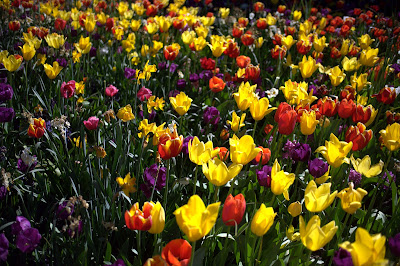
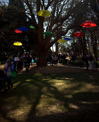
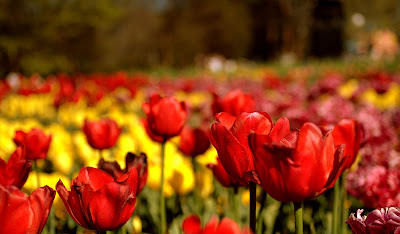
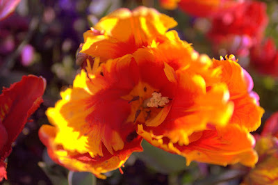
FloriadeHi all, yet again long time no post. However - got out last weekend to Floriade and had a very enjoyable time - i perhaps should have gotten there a week earlier as some of the flowers were starting to turn, but here is a selection:
1/  2/  3/  4/  D3 | 18-200VR | 50:1.4 | 28:2.8 | 35-70 2.8 | 12-24 f4
picasaweb.google.com/JustinPhotoGallery "We don't know and we don't care"
Re: Floriade#3 is pretty good IMO. I like the DOF. You could tone down the saturation a touch. In terms of composition, I guess the wilting left lower flower and the partial on the right bottom tends to be a little distracting.
#1 and #2 appear a little dark. I guess it could be personal preference but I prefer the flowers in this setting relatively high key... #4 is hard to see the details and hence critique properly. Perhaps a slightly larger picture (800pix or so) would be helpful. Looks like an interesting event. Would like to see some more pics.  HTH.
Previous topic • Next topic
3 posts
• Page 1 of 1
|