Page 1 of 1

Bryce Canyon - editing help appreciated

PostPosted: Wed Oct 20, 2010 6:34 pm
by Chica
Hi everyone

Tom and I are back in Australia after a wonderful holiday and now we are trawling through photos and working out which ones work well!

This photo is bugging me... I cant seem to quite get the colours right - the front of the hoodoo seems too bright but if I reduce the contrast the rest of the image seems too dull. I cant seem to get it 'just right'.... and I guess my lack of Photoshop skills aren't really helping!

Does anyone have any suggestions? I really like this shot (in theory!!) and I'd like to get it right.
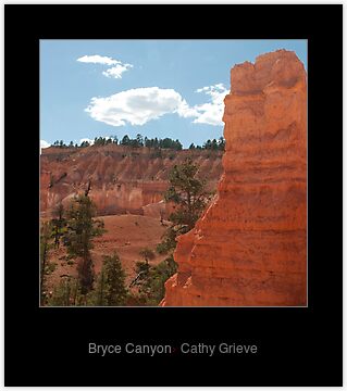
Image

Re: Bryce Canyon - editing help appreciated

PostPosted: Wed Oct 20, 2010 6:45 pm
by chrisk
cathy the image is too small to try and see or edit what you are talking about. what software are you using ?

Re: Bryce Canyon - editing help appreciated

PostPosted: Wed Oct 20, 2010 6:47 pm
by Chica
I uploaded it from Red Bubble.... umm, I'll try another versio and see if I can get it bigger. Link to the photo in Red Bubble is http://www.redbubble.com/people/cathyco ... yce-canyon but I will upload again.

Re: Bryce Canyon - editing help appreciated

PostPosted: Wed Oct 20, 2010 6:50 pm
by Chica
Take 2....

Image

Re: Bryce Canyon - editing help appreciated

PostPosted: Wed Oct 20, 2010 6:56 pm
by -=Monty=-
Image

Depends on the look you're going for.

Re: Bryce Canyon - editing help appreciated

PostPosted: Wed Oct 20, 2010 6:59 pm
by Chica
I already like it more!!!!! .... what did you do?

Re: Bryce Canyon - editing help appreciated

PostPosted: Wed Oct 20, 2010 7:06 pm
by -=Monty=-
Bumped up the highlights and mids a little, added some contrast. Changed the red hue.

There still isn't enough separation between the foreground and background for me though.

Did you shoot raw?

Re: Bryce Canyon - editing help appreciated

PostPosted: Wed Oct 20, 2010 7:12 pm
by Chica
Yep, I shot it in raw. I got that bit right :-) The image I posted was fiddled with, I can post the origianl if you think that would be useful. Appreciate the help :-)

Re: Bryce Canyon - editing help appreciated

PostPosted: Wed Oct 20, 2010 7:24 pm
by surenj
Chica wrote:I can post the origianl

Would like to see the original (or TIFF) if you don't mind.

Also what look are you looking for?

Is your monitor calibrated? Otherwise you might be seeing what others are not.

Re: Bryce Canyon - editing help appreciated

PostPosted: Wed Oct 20, 2010 7:33 pm
by Chica
Heres the original, just converted so I could upload it.

Image

Re: Bryce Canyon - editing help appreciated

PostPosted: Wed Oct 20, 2010 7:34 pm
by -=Monty=-
We can get a lot more out of post processing a RAW than a JPG. Not so much you can do to a JPG, not enough information in them.

Re: Bryce Canyon - editing help appreciated

PostPosted: Wed Oct 20, 2010 7:35 pm
by Chica
If you like I could email the RAW file? Not sure if I can upload it.

Re: Bryce Canyon - editing help appreciated

PostPosted: Wed Oct 20, 2010 7:41 pm
by -=Monty=-
You can upload them here http://rapidshare.com/

Just click on 'upload files here'

Re: Bryce Canyon - editing help appreciated

PostPosted: Wed Oct 20, 2010 7:44 pm
by surenj
I tried with your jpg but it's so small. If you are worried about uploading the RAW file (since someone can steal it etc) post up a LARGE jpeg somewhere like mediafire and send us (or other interested parties) the link in PM. Delete the mediafire file after everyone concerned has downloaded a copy.

One has to be careful throwing RAW files around in the web... :wink:

Re: Bryce Canyon - editing help appreciated

PostPosted: Wed Oct 20, 2010 10:33 pm
by aim54x
Can i say that i dont like the change in the colours in Monty's version? Too yellow/orange for me.

if i have time I may have a crack at a RAW/TIFF

Re: Bryce Canyon - editing help appreciated

PostPosted: Thu Oct 21, 2010 10:34 pm
by aim54x
Image

I dont have colour calibration set up so my colours may be off....*ducks*

Re: Bryce Canyon - editing help appreciated

PostPosted: Thu Oct 21, 2010 11:16 pm
by surenj
:ot: Cameron you are in desperate need of calibration. Your contrast is quite off. :wink:

Re: Bryce Canyon - editing help appreciated

PostPosted: Thu Oct 21, 2010 11:37 pm
by aim54x
surenj wrote::ot: Cameron you are in desperate need of calibration. Your contrast is quite off. :wink:


that bad?

Re: Bryce Canyon - editing help appreciated

PostPosted: Thu Oct 21, 2010 11:57 pm
by surenj
Hmm.. Cameron, Now that I have checked this image out, I think I am going to take back that comment. This was one difficult image to work with!! :shock:

The problem that I identified was the color scheme does not match. The un-natural orange doesn't go with the sky. The clouds are slightly blown. The dark greens add to the horrid colors! [Also the light is harsh and not that nice]

Can I convince you to go BW Cathy? :wink:

Image

Image

Re: Bryce Canyon - editing help appreciated

PostPosted: Fri Oct 22, 2010 9:32 am
by Chica
I really appreciate all of the wonderful people who have had a play with my photo. All of you have made it look sooooo much more effective. As for black and white.... well, I'll give it a go!!!

Re: Bryce Canyon - editing help appreciated

PostPosted: Sat Oct 23, 2010 7:23 pm
by biggerry
The image is a bit of trick to the eye, the image looks like it was shot into the sun, however the face of the phallic rock is so bright it gets confusing where the light is coming from.

Here is my quick edit - I went for trying to reproduce the realism in the scene as I would imagine it. If you need a detailed
edit process let me know and i'll type it in. Basically selectively darkened the phallic rock, underexpsoed the scene, contrast and brightness...

Image

Re: Bryce Canyon - editing help appreciated

PostPosted: Sat Oct 23, 2010 8:38 pm
by Chica
Hi Gerry

Thanks so much.... really like your version too! Its fabulous having some different ideas and then playing with my original in PS. Really appreciate your help :cheers:

Re: Bryce Canyon - editing help appreciated

PostPosted: Mon Oct 25, 2010 2:04 pm
by biggerry
Chica wrote:Hi Gerry

Thanks so much.... really like your version too! Its fabulous having some different ideas and then playing with my original in PS. Really appreciate your help :cheers:


in hindsight, I think mine needs a bit more to make it pop...