Page 1 of 1

Nice and green

PostPosted: Sun Jan 09, 2011 6:59 pm
by colin_12
While out and about we went up into the Barrington tops via the Allyn River valley.
A great trip all round with some interesting views.

Here are a couple of pano style efforts that need some critique.
Image
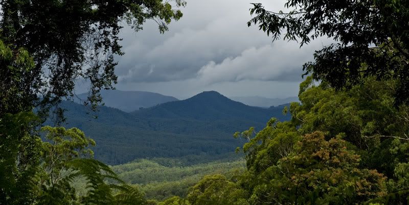
View from the car while driving up the Mount Allyn track.
Image
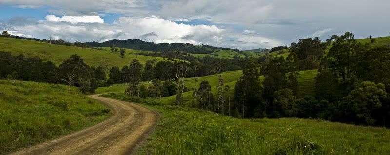
single shot pano crop down in the valley on the way out

Image
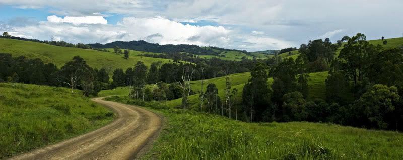
three shot pano stitched in ps

Which tone of green do you prefer?
Re: Nice and green

PostPosted: Sun Jan 09, 2011 7:01 pm
by Wink
I like the last tone of green.
The sky looks a little too blue for my liking.

Re: Nice and green

PostPosted: Sun Jan 09, 2011 7:32 pm
by gstark
colin_12 wrote:While out and about we went up into the Barrington tops via the Allyn River valley.


I love it up there. A truly beautiful part of the country.

The second and third of these images convey, to me, exactly how beautiful this area is.

Great captures.

Re: Nice and green

PostPosted: Sun Jan 09, 2011 8:35 pm
by stubbsy
Colin

Compositionally the 2nd and 3rd shots are crackers. To me the 2nd shot has a bit too much yellow in the greens whereas the balance in the 3rd is more natural. Or would be if the saturation was dialled down a touch :wink:

I do think all three shots are a little dark.

As for the first image I think the mountain isn't a strong enough subject to keep the viewer interested in the shot. That's not a problem with the 3rd image in particular where the sinuous curve of the road provides great leading lines and delivers the eye to the natural curve of the trees tucked into the hillside.

Re: Nice and green

PostPosted: Sun Jan 09, 2011 10:26 pm
by aim54x
I will agree with Peter that they seem a bit dark...but then again I am using my netbook to view so I cant really trust it for colour accuracy.

As for the images themselves...all that is missing in #2 and #3 is a little white cottage!

Great stuff

Re: Nice and green

PostPosted: Sun Jan 09, 2011 10:44 pm
by colin_12
This a bit more like it for colour and light?

I have got some of the yellow out and I could probably lighten this one up some more as well
Image


Pulled back the saturation
Image

Re: Nice and green

PostPosted: Mon Jan 10, 2011 9:56 pm
by biggerry
#2 all the way, that road is perfectly placed

It is quite dark though, a little bash with the PP stick, which also included tuning down the saturation by -20 and heres what I get;

Image

Re: Nice and green

PostPosted: Mon Jan 10, 2011 11:20 pm
by colin_12
I had already toned down the saturation by about the same in the second broader pano.
I think somewhere between yours and mine would be the go, it really was very green out there. :up:

Re: Nice and green

PostPosted: Tue Jan 11, 2011 11:46 am
by surenj
I can confirm that Barrington tops is really green like this! Add to that a cloudy day and you get really saturated colour.

Colin I think your monitor needs to have it's brightness turned up a notch as these are all a little dark looking. Do you print much? If so, does your prints comeout bright or dark?

Re: Nice and green

PostPosted: Tue Jan 11, 2011 2:39 pm
by colin_12
I rarely print much, pity really.
Most of the prints that I have done have come out darker than the monitor image.