Page 1 of 1

Maroubra Pre Dawn...

PostPosted: Mon Feb 14, 2011 9:00 pm
by Remorhaz
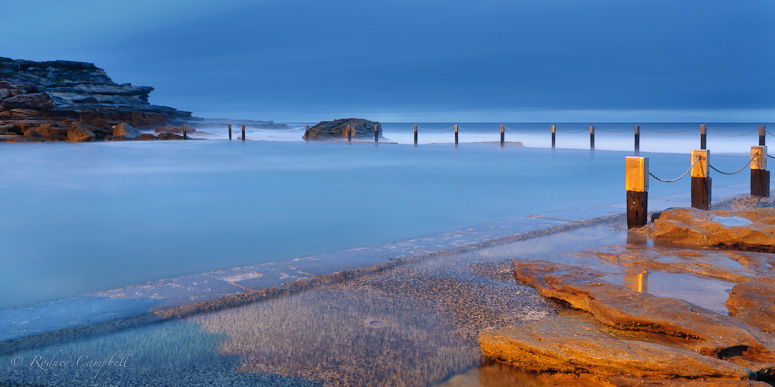
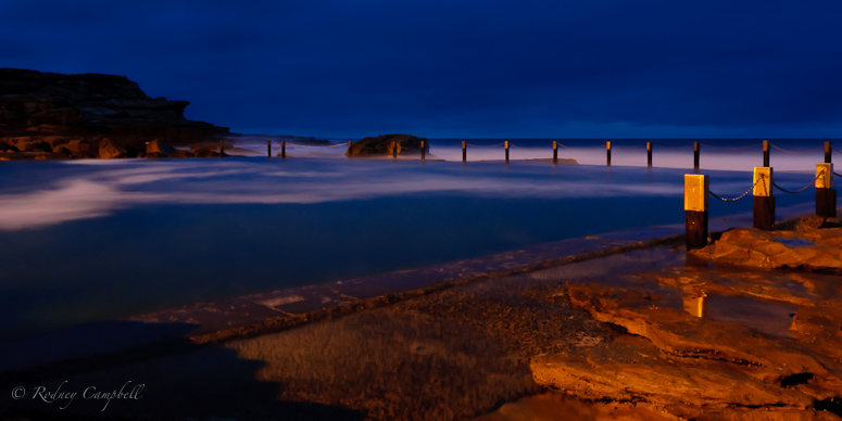
Here are two of the Pre Dawn images (6AM - about 30 mins before sunrise) from Mahon Pool... you can see the effects of the tungsten pool lighting...

The first was my first image of the day - a test exposure (underexposed clearly - but I liked the feel none the less):

Image
NIKON D90 + 17.0-50.0 mm f/2.8 @ 17 mm, 60 sec at f / 22, ISO 200 + CPL

This was the next exposure (much longer and more correctly exposed):

Image
NIKON D90 + 17.0-50.0 mm f/2.8 @ 17 mm, 452 sec at f / 22, ISO 200 + CPL

I know which I like better but I'd be interested in what others think...

Re: Maroubra Pre Dawn...

PostPosted: Tue Feb 15, 2011 6:41 am
by CraigVTR
I like the first, dark and moody. One between the two exposures might be good.

Re: Maroubra Pre Dawn...

PostPosted: Tue Feb 15, 2011 7:15 am
by gstark
Rod,

Remorhaz wrote:but I liked the feel none the less


As do I.


(much longer and more correctly exposed)


I'm not so sure.

Yes, it's clearly a much longer exposure, but I'm curious as to why you say this is "more correctly" exposed.

As you say, these images were made pre-dawn, yet this does not look, to me, as if it's pre-dawn. It looks like it's almost shot in daylight. Early morning, warm glow ... but post, rather than pre, dawn.

Re: Maroubra Pre Dawn...

PostPosted: Tue Feb 15, 2011 10:12 am
by Remorhaz
gstark wrote:Yes, it's clearly a much longer exposure, but I'm curious as to why you say this is "more correctly" exposed.

As you say, these images were made pre-dawn, yet this does not look, to me, as if it's pre-dawn. It looks like it's almost shot in daylight. Early morning, warm glow ... but post, rather than pre, dawn.


By more correctly exposed I meant the histogram for the second is mostly in the middle to right without any clipping on the left or right. Whereas the first image has the histogram bunched up on the far left with lots of shadow clipping - the two shots were taken directly after each other.

As the sky was completely cloud filled we had no sunrise as such so the sky was quite light even before it came up - even here at 6AM (30 mins before actual sunrise) - however much of the (golden) light you see on the rocks and posts most likely provided by the spot lights behind us lighting the pool.

Re: Maroubra Pre Dawn...

PostPosted: Tue Feb 15, 2011 10:19 am
by gstark
Remorhaz wrote:
gstark wrote:Yes, it's clearly a much longer exposure, but I'm curious as to why you say this is "more correctly" exposed.

As you say, these images were made pre-dawn, yet this does not look, to me, as if it's pre-dawn. It looks like it's almost shot in daylight. Early morning, warm glow ... but post, rather than pre, dawn.


By more correctly exposed I meant the histogram for the second is mostly in the middle to right without any clipping on the left or right. Whereas the first image has the histogram bunched up on the far left with lots of shadow clipping - the two shots were taken directly after each other.


Ok, thanks.

That's an interesting interpretation, but I'm willing - wanting - to discuss this with you (and anyone else) if you're open to it. And if you're not, that's cool too.

What do others think? I have my views on this, but I'll withhold them for a little while, because I'd like to hear what others think on this point.

What's also of interest is your observation that the two histograms are quite different. While it's a simple observation to make, it's also a very astute observation, and it should also form a part of this discussion.

And to be clear, I think that any such discussion is (or should be) an important part of the critique of these images. I do believe that there's a couple of important lessons in these images.

Re: Maroubra Pre Dawn...

PostPosted: Tue Feb 15, 2011 10:32 am
by surenj
IMHO There is no 'right' or 'wrong' exposure. Just use what you need to evoke the emotion that you are intend to. Because there is an element of subjectivity, you might not succeed with everyone. :wink: Dat's art for you.... :mrgreen:

Re: Maroubra Pre Dawn...

PostPosted: Tue Feb 15, 2011 12:06 pm
by CraigVTR
I agree there is no right or wrong exposure The value of the histogram is that it allows you to get the exposure that has all the detail and then you can adjust the levels in post to get what you consider to be a good and artistic interpretation of what you saw at the time.

Re: Maroubra Pre Dawn...

PostPosted: Tue Feb 15, 2011 12:34 pm
by Peanut
I agree that histograms are just tools... Knowing what a histogram looks like is interesting, but emotions come from the image, not the histogram... (I could go on a tangent about how a histogram is just a summary of a much larger dataset, and so can't possibly convey as much, and that nothing could summarise emotion, etc... but I won't... ;))

If I shoot my small brown dog on a sunny beach (and it's not a close-up portrait), a bell shaped histogram would be an underexposed and dark shot. A better looking image would have a small clump in about the left third, not much in the middle and a much larger peak up in the right third, but not running off the end.

The opposite is true as well... A moonlit scene, or a pre-dawn scene, with only a few light elements that captures the feeling of light beginning to fight off the dark is likely to still have lots of deep shadows and a couple of lighter elements, so it's histogram might have much more of its weight in the left third, and only a few sections in the right half...

In the case of your two shots, I personally think the first captures the mood much better... I like the swirling on the surface in particular...

Re: Maroubra Pre Dawn...

PostPosted: Tue Feb 15, 2011 7:20 pm
by Remorhaz
Peanut wrote:In the case of your two shots, I personally think the first captures the mood much better... I like the swirling on the surface in particular...


Thanks - the first was by far my personal favourite as well.

Re: Maroubra Pre Dawn...

PostPosted: Tue Feb 15, 2011 7:25 pm
by Remorhaz
gstark wrote:That's an interesting interpretation, but I'm willing - wanting - to discuss this with you (and anyone else) if you're open to it. And if you're not, that's cool too.

What do others think? I have my views on this, but I'll withhold them for a little while, because I'd like to hear what others think on this point.

What's also of interest is your observation that the two histograms are quite different. While it's a simple observation to make, it's also a very astute observation, and it should also form a part of this discussion.

And to be clear, I think that any such discussion is (or should be) an important part of the critique of these images. I do believe that there's a couple of important lessons in these images.
 BTW: I'm completely happy to have this discussion and also to have these two images referenced for the discussion - it was sort of why I posted them both - I felt that whilst I thought that the second image had a better 'exposure', by my definition above, but that I much preferred the look of the first (although to be honest I did have to rescue it quite a bit - the as shot histogram was practically all bunched at the very left - I felt it probably could have done with an extra stop or so of exposure in camera to get it more like you see here to start with and then play from there).

OK have at it :)

Re: Maroubra Pre Dawn...

PostPosted: Wed Feb 16, 2011 7:46 am
by gstark
Hi Rod,

Remorhaz wrote:I'm completely happy to have this discussion and also to have these two images referenced for the discussion - it was sort of why I posted them both - I felt that whilst I thought that the second image had a better 'exposure', by my definition above, but that I much preferred the look of the first (although to be honest I did have to rescue it quite a bit - the as shot histogram was practically all bunched at the very left - I felt it probably could have done with an extra stop or so of exposure in camera to get it more like you see here to start with and then play from there).


Ok ... let's start here ....

"The shot histogram was practically all bunched at the very left" ....

That's what I would expect. The scene is a dark scene - pre-dawn - and as such, what you are seeing is correct for the scene in question.

Peanut wrote:I agree that histograms are just tools... Knowing what a histogram looks like is interesting, but emotions come from the image, not the histogram...


A very important point ...

But here's the meat and potatoes:

If I shoot my small brown dog on a sunny beach (and it's not a close-up portrait), a bell shaped histogram would be an underexposed and dark shot. A better looking image would have a small clump in about the left third, not much in the middle and a much larger peak up in the right third, but not running off the end.

The opposite is true as well... A moonlit scene, or a pre-dawn scene, with only a few light elements that captures the feeling of light beginning to fight off the dark is likely to still have lots of deep shadows and a couple of lighter elements, so it's histogram might have much more of its weight in the left third, and only a few sections in the right half...


Precisely!

While, for a daylight scene, the bell-curve that you were trying to achieve is appropriate, the images presented here were not daylight scenes. Despite that, the second image has been "distorted" to large extent, exposure wise, to the point where it appears, to me, to look like a daylight scene.

As noted so astutely by Peanut, the histogram is a tool - one of many - that we can use to help us determine some elements of an image. As also noted by Peanut, and also by Suren and others, we also have the emotion within an image that we should try to take account of. I would even contend that it's a more important element than "correct" exposure, whatever that might happen to be.

In the first image, you have the emotion. You also state that you like it better. it has drama, light and shade, and the histogram, correctly (IMHO) reflects these elements. While I wasn't there, this is an image that more correctly displays what I would be expecting to see from a pre-dawn shot.

The second image has a flatter histogram, but not a lot else. :) It's lost the shading, and it's lost the drama. It certainly doesn't look, to me, as if it's what I would be expecting to see in a pre-dawn image.

In summing up, I think that while it's fair to accept that the concept of "correct" exposure is a very subjective thing, in using tools like an exposure meter or histogram, we also need to keep in mind the image's context. I come up against a similar problem when shooting bands in bars ... the lighting is very poor, with very high dynamic range. Forget HDR, as you encounter rapidly moving subjects, areas that are totally unlit and areas that are lit with coloured spots.

Set for default metering modes, the camera screws it up all the time, and I'm left with bland, thin, underexposed images. When I switch to spot metering, and expose for a well illuminated subject, one that properly should be the prime subject of the image, I then get a rich image, properly exposed (whatever that might mean) but with a histogram that might look like crap. :)

Your pre-dawn shot presents similar challenges. Decide what your prime subject will be; ensure that you're exposing to get a good clean image of that item, and the rest will follow. Check the histogram, but check it for reasonableness too: if the image has large dark areas, then the histogram should correctly display those properties.

Am I making sense?
Re: Maroubra Pre Dawn...

PostPosted: Wed Feb 16, 2011 9:19 pm
by biggerry
pfft histograms - soo over rated :wink:

The way I see it, a histogram is merely a consistent means to convey a 'technically' correct exposed scene from the camera to the user, much like we have mathematical formulae to explain physics, its just a representation of the law in a bunch of symbols and numbers - emotion does not enter into that part of the equation. However that is why we, as the user, have whats called a brain and creativity these should be used to put together an image using all the tools, like the histogram, like the filter, like the shutter speed, the list goes on, to create emotion.

enough waffle.. onto the two images, you cannot just say one is exposed more correctly than the other in this case beacuse the shutter speed has actually changed the composition. Even if you reduced the exposure on teh second image in post to match the first it would not be the same image, the water in the pool has changed due to the shutter speed. In the first image it is more interesting because of the band of white created by the frothy water, in the second, this is removed due to the lengthened shutter speed.

Re: Maroubra Pre Dawn...

PostPosted: Wed Feb 16, 2011 10:20 pm
by colin_12
Firstly I like both representations of this scene Rodney. :cheers:
To buck the trend though....I tend towards the lighter image as a personal preference. I am one who generally creates dark images so find it more interesting. That said I would like to see it a tad darker than it is. The colour depth seems to have been lost to some extent.
I agree that exposure is a subjective issue and needs to accomodate the artists intent more for some styles of image than others. I think we are looking at almost two poles of exposure here, as Gerry stated the composition has been altered somewhat by the time utilised.
Very interesting discussion, thanks all. :up:

Re: Maroubra Pre Dawn...

PostPosted: Thu Feb 17, 2011 2:03 pm
by Murray Foote
I think there's a couple of separate things here.

The first image looks better because of the swirl and a more night-time feel to it. However, to say that a histogram biased to the left accurately captures the tonal values of the image is not the same as saying this should be the histogram of the captured image.

The second image will have better shadow detail than the first because all the detail is in the right-hand sectors of the original histogram. However, the images are not the same. A longer exposure might mute the swirl perhaps (or might not) but the light has changed and quite possibly the sea has changed.

Perhaps it would be worthwhile to process the second image to resemble the first, in which case you would also have to increase contrast for the foreground water. That would at least tell you how much the image quality of the first image would have been lifted had you exposed at that time for a "correct" histogram and then darkened it.

The first image also has the oversaturated look of underdevelopment which might perhaps be pleasing but better renditions might be available.