Kirribilli Markets - Street Images...
On the weekend my eldest daughter and I visited the <a href="http://www.kncsydney.org/index.php?content=kmapplicationpack.html">Kirribilli Markets</a> - which is held on the fourth Saturday of the month at Bradfield Park, on the corner of Alfred St and Burton St, Milsons Point, just outside Milsons Point Station (basically just under the Sydney Harbour Bridge on the north side).
Whilst we were there along with browsing the food and wares we took a walk across the bridge and also grabbed some street images.
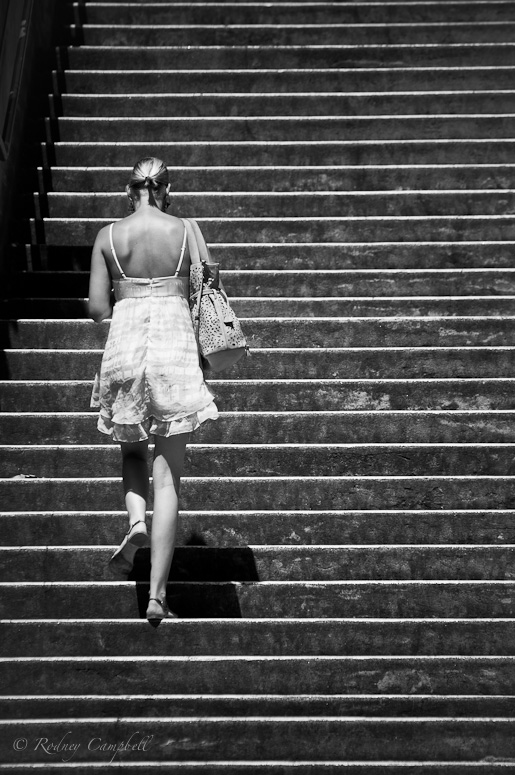
Just as we were coming back down the stairs up to the pedestrian walkway across the Sydney Harbour Bridge I spotted this young lady heading up the stairs and waited for the right moment and composition with a long lens.
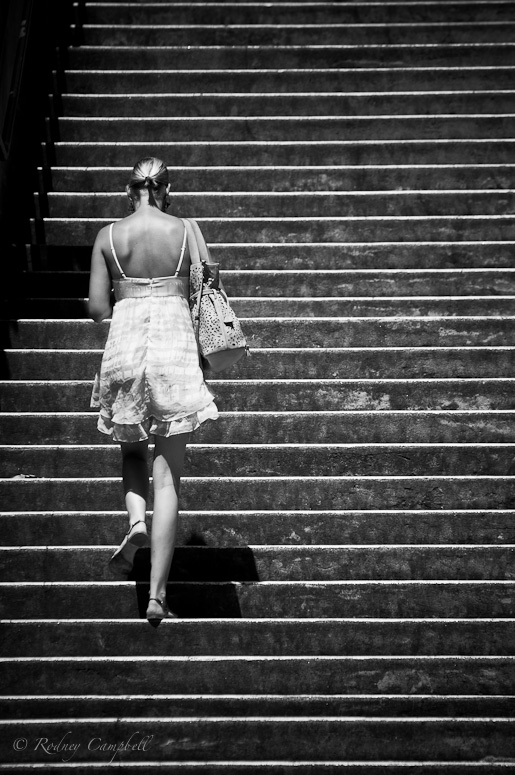
NIKON D90 + 70.0-300.0 mm f/4.5-5.6 @ 200 mm, 1/1600 sec at f / 5.3, ISO 200
It was a very sunny and hot day at the open air Kirribilli Markets and there were lots of women toting umbrellas as shade from the sun - I took a number of umbrella shots and I liked the feeling of this composition.
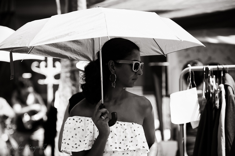
NIKON D90 + 70.0-300.0 mm f/4.5-5.6 @ 180 mm, 1/1000 sec at f / 5.0, ISO 200
Lastly an image of my daughter at the midway point on the bridge with our cakes (which we ate momentarily ).
).
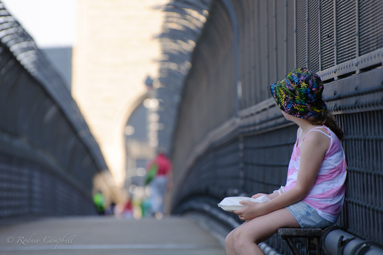
NIKON D90 + 70.0-300.0 mm f/4.5-5.6 @ 230 mm, 1/250 sec at f / 5.3, ISO 200
Whilst we were there along with browsing the food and wares we took a walk across the bridge and also grabbed some street images.
Just as we were coming back down the stairs up to the pedestrian walkway across the Sydney Harbour Bridge I spotted this young lady heading up the stairs and waited for the right moment and composition with a long lens.

NIKON D90 + 70.0-300.0 mm f/4.5-5.6 @ 200 mm, 1/1600 sec at f / 5.3, ISO 200
It was a very sunny and hot day at the open air Kirribilli Markets and there were lots of women toting umbrellas as shade from the sun - I took a number of umbrella shots and I liked the feeling of this composition.

NIKON D90 + 70.0-300.0 mm f/4.5-5.6 @ 180 mm, 1/1000 sec at f / 5.0, ISO 200
Lastly an image of my daughter at the midway point on the bridge with our cakes (which we ate momentarily

NIKON D90 + 70.0-300.0 mm f/4.5-5.6 @ 230 mm, 1/250 sec at f / 5.3, ISO 200
