Pretty fungi
Actually managed to take a few pics today as there was plenty to see.
I would like critique on these, especially the composition.
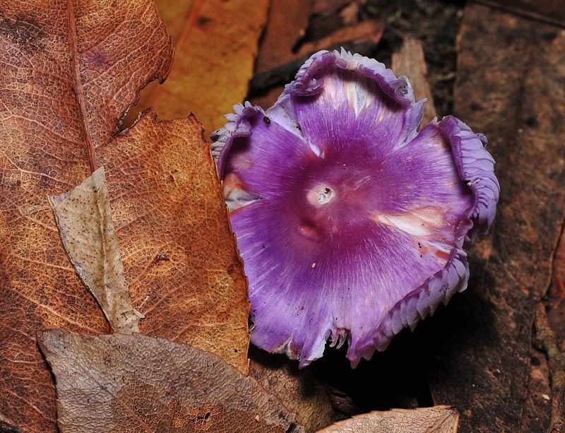
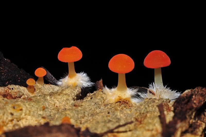
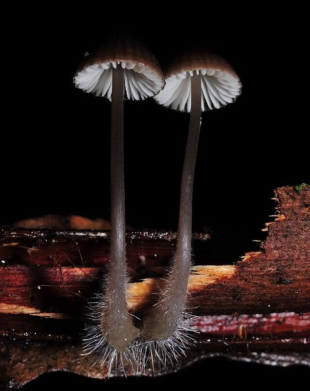
I would like critique on these, especially the composition.


A discussion forum - and more - for users of Digital Single Lens Reflex cameras.
https://d70users.net/


Rooz wrote:i never knew such beautiful fungi existed !
Geoff M wrote:I would not have seen the subjects in the first place!