Page 1 of 1

Gerry's Big Plant Thingy...

PostPosted: Wed Mar 30, 2011 3:59 pm
by Remorhaz
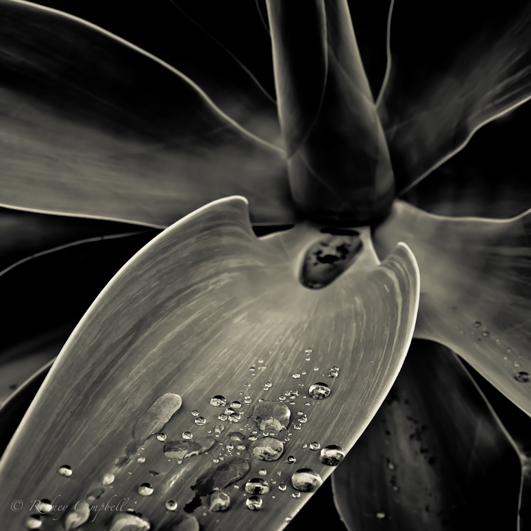
During our recent photowalk through Newtown Suren and I took some images of a big plant thingy (sorry don't know it's name) - similar to one Gerry had photographed in the botanic gardens... here is my version for C&C...

Mercury
Image
NIKON D7000 + 17.0-50.0 mm f/2.8 @ 17 mm, 1/60 sec at f / 8.0, ISO 200

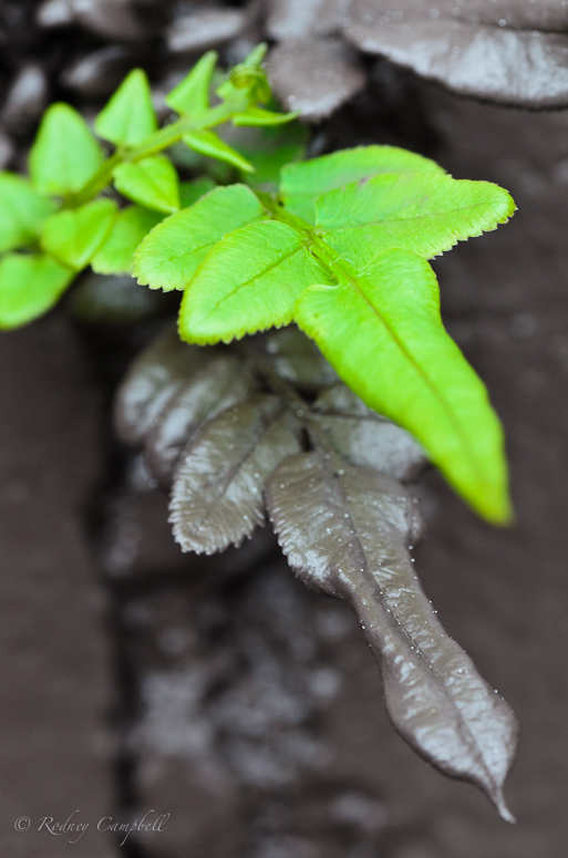
Growing through the brick walls lining a railway line workers had obviously come and spray painted the entire wall in thick grey/brown paint covering everything including the plants growing there - new growth however will have it's way :)

Painted Leaves
Image
NIKON D7000 + 90.0 mm f/2.8 @ 90 mm, 1/60 sec at f / 16, ISO 1000

Re: Gerry's Big Plant Thingy...

PostPosted: Wed Mar 30, 2011 8:49 pm
by biggerry
Re: Gerry's Big Plant Thingy...


:shock:

for a second I thought I had been sprung, *runs out the back to check on the crop...* :rotfl2:

I like the image of the plant, however I think there is something fundamentally wrong with the composition, the focus, the subject, is on the water droplets, which btw are very nice, however to get to them you have to wander thru a wilderness of OOF area. IMO placing the droplets in teh centre of teh image, or the top and using the lines of the leaf to lead to the focus/subject point would have worked better.

I also think a crop would make this particular image better, crop from the top and the right to make a square ratio with the pool of water at the heart of the plant at the top right os the image - this would work nicely imo.

the BTW conversion is quite nice.

Re: Gerry's Big Plant Thingy...

PostPosted: Fri Apr 01, 2011 11:02 am
by Remorhaz
biggerry wrote:I like the image of the plant, however I think there is something fundamentally wrong with the composition, the focus, the subject, is on the water droplets, which btw are very nice, however to get to them you have to wander thru a wilderness of OOF area. IMO placing the droplets in teh centre of teh image, or the top and using the lines of the leaf to lead to the focus/subject point would have worked better.
I also think a crop would make this particular image better, crop from the top and the right to make a square ratio with the pool of water at the heart of the plant at the top right os the image - this would work nicely imo.
the BTW conversion is quite nice.


Thanks - I hear you :) The plant was quite high - I was standing on tippy toes as it was :)

I've cropped my image (at home) a little in from the top right.

I too liked the B&W conversion (was very happy with that) and I personally still like the overall pic none the less.

Re: Gerry's Big Plant Thingy...

PostPosted: Fri Apr 01, 2011 11:28 am
by surenj
That is certainly a nice conversion! Did you have this in mind when you took the photo? The waterbubbles look so 3D!

I quite like this composition but that puddle in the middle looks a little distracting.

Re: Gerry's Big Plant Thingy...

PostPosted: Fri Apr 01, 2011 7:01 pm
by Remorhaz
surenj wrote:That is certainly a nice conversion! Did you have this in mind when you took the photo? The waterbubbles look so 3D!
I quite like this composition but that puddle in the middle looks a little distracting.


I didn't necessarily have the monochrome conversion in mind (although I had suggested that for Gerry's :)) - but I did want the close water droplets to be the in focus area and the rest of the plant to be oof as it fell away.

Re: Gerry's Big Plant Thingy...

PostPosted: Fri Apr 01, 2011 11:04 pm
by colin_12
It looks like an Agave Rodney. Nice water drops