|
Got a thin skin? Then look elsewhere. Post a link to an image that you've made, and invite others to offer their critiques. Honesty is encouraged, but please be positive in your constructive criticism. Flaming and just plain nastiness will not be tolerated. Please note that this is not an area for you to showcase your images, nor is this a place for you to show-off where you have been. This is an area for you to post images so that you may share with us a technique that you have mastered, or are trying to master. Typically, no more than about four images should be posted in any one post or thread, and the maximum size of any side of any image should not exceed 950 px.
Moderators: Greg B, Nnnnsic, Geoff, Glen, gstark, Moderators
Forum rules
Please note that image critiquing is a matter of give and take: if you post images for critique, and you then expect to receive criticism, then it is also reasonable, fair and appropriate that, in return, you post your critique of the images of other members here as a matter of courtesy. So please do offer your critique of the images of others; your opinion is important, and will help everyone here enjoy their visit to far greater extent.
Also please note that, unless you state something to the contrary, other members might attempt to repost your image with their own post processing applied. We see this as an acceptable form of critique, but should you prefer that others not modify your work, this is perfectly ok, and you should state this, either within your post, or within your signature.
Images posted here should conform with the general forum guidelines. Image sizes should not exceed 950 pixels along the largest side (height or width) and typically no more than four images per post or thread.
Please also ensure that you have a meaningful location included in your profile. Please refer to the FAQ for details of what "meaningful" is.
 by biggerry on Mon Jun 13, 2011 2:06 pm by biggerry on Mon Jun 13, 2011 2:06 pm
man, with that title I am bound to at least get some great google views  Nonetheless the title is not completely irrelevant to the images, only midly.. Sunrise at Little bay with the crazy swelled resulted in nothing but a heap of fluffly white waves and foam, i am not one to let that kinda opportunity pass me up so I did try and get a few snow filled frames. Additionally, I gave the 105mm f2.5 a quick bash to see what I could get with that. Thanks to Suren for the lend of the bigstopper, I am gonna have to buy one of these or else Suren's gonna start charging me rent. Critique always welcome on any aspect, composition, processing etc..particularly the BW conversion (an aspect that I never feel happy with)     and a little series set to give a bit of an idea of the swell.. 
-

biggerry
- Senior Member
-
- Posts: 5930
- Joined: Tue May 13, 2008 12:40 am
- Location: Under the flight path, Newtown, Sydney
-
by zafra52 on Mon Jun 13, 2011 8:16 pm
Lovely set. I like them all...but, the title?
-

zafra52
- Senior Member
-
- Posts: 4895
- Joined: Thu Dec 01, 2005 10:22 pm
- Location: Brisbane
by Remorhaz on Tue Jun 14, 2011 10:37 am
#2 for me - the colours and compo are nice and the wider view you got makes that foreground hole look bigger and better I reckon.
#1 just doesn't look right for me - possibly just a personal thing? - all dark, colourful and contrasty on the top left and misty white on the bottom right
#3 the soft B+W is good and probably suits the scene we saw. I reckon we could have done with a 300mm tho and really focused on a compressed just the front of the headland and those crashing waves.
D600, D7000, Nikon/Sigma/Tamron Lenses, Nikon Flashes, Sirui/Manfrotto/Benro SticksRodney - My Photo BlogWant: Fast Wide (14|20|24)
-

Remorhaz
- Senior Member
-
- Posts: 2547
- Joined: Thu Apr 29, 2010 8:14 pm
- Location: Sydney - Lower North Shore - D600
-
by aim54x on Tue Jun 14, 2011 10:02 pm
These are nice Gerry. #1 I like the contrast between the rock and the misty water, you have great colour and saturation in this #2 what dont you have here? Movement, colour, lines....not much left out! #3 the weak link in my opinion. You dont quite have enough contrast, nor tone, but I am sure you going to whip something up out of this biggerry wrote:Thanks to Suren for the lend of the bigstopper, I am gonna have to buy one of these or else Suren's gonna start charging me rent.
Well I did post that coupon code.... Cameron Nikon F/Nikon 1 | Hasselblad V/XPAN| Leica M/LTM |Sony α/FE/E/Maxxum/M42Wishlist Nikkor 24/85 f/1.4| Fuji Natura BlackScout-Images | Flickr | 365Project
-

aim54x
- Senior Member
-
- Posts: 7305
- Joined: Fri Feb 01, 2008 10:13 pm
- Location: Penshurst, Sydney
-
by biggerry on Wed Jun 15, 2011 1:03 am
zafra52 wrote:Lovely set. I like them all...but, the title?
fluffly white powder = cocaine, i need something to jazz up the seascapes nowadays..  Remorhaz wrote:#1 just doesn't look right for me - possibly just a personal thing? - all dark, colourful and contrasty on the top left and misty white on the bottom right
thats cool, each to their own water is flowing out the image - probably does not help the feel of teh image Remorhaz wrote:#3 the soft B+W is good and probably suits the scene we saw. I reckon we could have done with a 300mm tho and really focused on a compressed just the front of the headland and those crashing waves.
true, however i reckon you need a third element in there, in this case the golfers provide context and scale - howeve r the 300 mm might have just gotten close enough to nail that dude way out in the BG on teh rocks! aim54x wrote:#3 the weak link in my opinion. You dont quite have enough contrast, nor tone, but I am sure you going to whip something up out of this
yeah, the image lacked colour hence the BW option however I cannot get it to look 'right', i compo wise its a winner but the PP angle lets it down. aim54x wrote:#1 I like the contrast between the rock and the misty water, you have great colour and saturation in this
yeah its amazing, there is actually not much work on this image, sooc with the bigstopper and GND and things looked pretty sweet. aim54x wrote:Well I did post that coupon code....
no tlong now
-
biggerry
- Senior Member
-
- Posts: 5930
- Joined: Tue May 13, 2008 12:40 am
- Location: Under the flight path, Newtown, Sydney
-
by colin_12 on Thu Jun 16, 2011 10:32 pm
I like the second and fourth Gerry. I had a play with the second.... 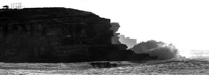 .....Maybe a bit dark but you get the gist I am sure. Regards Colin
Cameras, lenses and a lust for life
-

colin_12
- Senior Member
-
- Posts: 1853
- Joined: Thu Jan 04, 2007 7:10 pm
- Location: Hazelbrook
by biggerry on Mon Jun 20, 2011 10:49 am
colin_12 wrote:I like the second and fourth Gerry.
I had a play with the second....
.....Maybe a bit dark but you get the gist I am sure.
I like it, good edit Colin, I would leave the left side on to give it a bit more balance but this pano crop and bumped contrast seems to work for me.
-
biggerry
- Senior Member
-
- Posts: 5930
- Joined: Tue May 13, 2008 12:40 am
- Location: Under the flight path, Newtown, Sydney
-
Return to Image Reviews and Critiques
|
