Page 1 of 1

The BigStopper Diaries...

PostPosted: Tue Jun 14, 2011 10:51 am
by Remorhaz
I'd purchased the B+W ND 3.0 (1000x) 10-Stop ND filter some time ago but I hadn't gone out and shot any images with the specific intention of using the effect of the filter. I have been out shooting other things and then whipped out the bigstopper for a few shots but I hadn't until now made a conscious plan to go out with the intention of composing and using the filter in mind.

So over the long weekend I waited for the opportunity to arise. I had a specific location in mind (Bradley's Head) which is a headland protruding from the north shore of Sydney Harbour (near Taronga Zoo). I was hoping for a large expanse of moving water, overcast skies and not too bright conditions so I could use really long exposures, windy conditions leading to moving cloud formations and ideally something like fog or mist over the city on the other side of the harbour (the last perhaps too much to ask for :)).

I got a bit of a break in the weather late one day and I ventured out to take some long exposures. This was also an ideal time to use my new $20 remote LCD timer which worked a treat allowing me to dial in specific timed exposures without having to manually monitor things.

Composition is hard enough for me at the best of times and composing for the specific effect you get with the 10 stop ND is quite tricky, I'd love any C&C and/or suggestions on these (subject, composition, cropping, monochrome conversion, etc) - be brutal :)

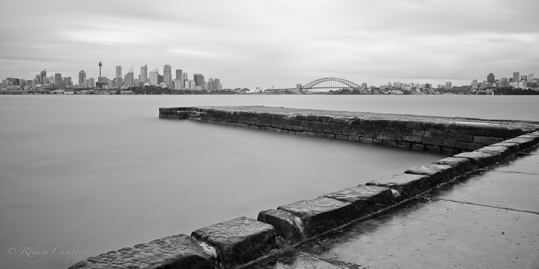
Stones in the Mist
Image
NIKON D7000 + 17.0-50.0 mm f/2.8 @ 17 mm, 135 sec at f / 16, ISO 100 + ND3.0

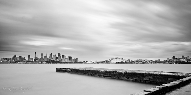
Road to Sydney
Image
NIKON D7000 + 17.0-50.0 mm f/2.8 @ 38 mm, 180 sec at f / 16, ISO 100 + ND3.0

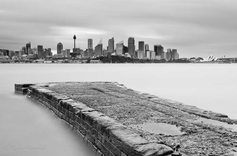
Milk
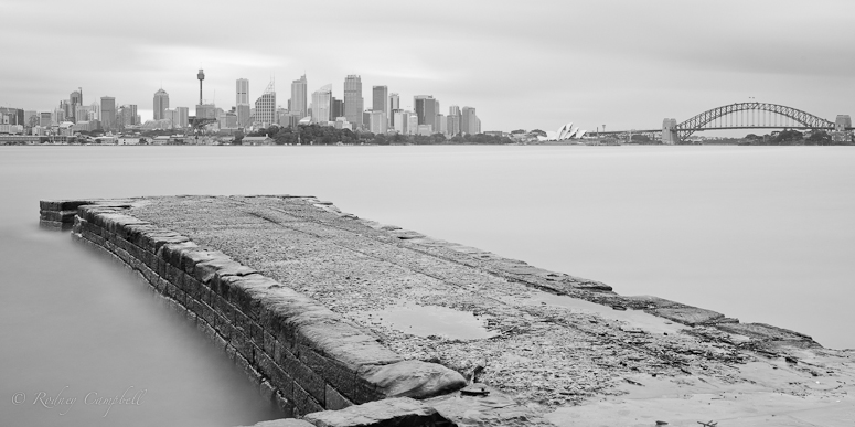
Image
NIKON D7000 + 17.0-50.0 mm f/2.8 @ 27 mm, 150 sec at f / 16, ISO 100 + ND3.0

This last exposure I've left in colour, taken just as the sun was setting. This was one of the longest exposures (at 300 seconds) and I used the trusty moving hand grad (for about two minutes of the exposure) to tone down the sky a little so it wouldn't blow out.

Long Sunset
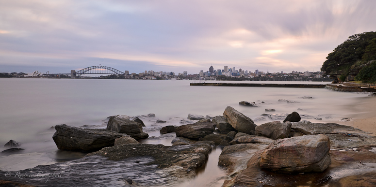
Image
NIKON D7000 + 17.0-50.0 mm f/2.8 @ 17 mm, 300 sec at f / 13, ISO 100 + ND3.0

Re: The BigStopper Diaries...

PostPosted: Tue Jun 14, 2011 7:20 pm
by zafra52
The are very nice, specially the first one.
I haven't used a 10 ND so I can't advise on
its use, but I like your pics.

Re: The BigStopper Diaries...

PostPosted: Tue Jun 14, 2011 9:57 pm
by aim54x
These nicely demonstrate the effects of a big stopper but they are a bit bland in some ways. I wouldnt mind seeing a bit more contrast

Re: The BigStopper Diaries...

PostPosted: Wed Jun 15, 2011 12:57 am
by biggerry
Remorhaz wrote:Composition is hard enough for me at the best of times and composing for the specific effect you get with the 10 stop ND is quite tricky, I'd love any C&C and/or suggestions on these (subject, composition, cropping, monochrome conversion, etc) - be brutal :)


brutal eh...

its a struggle to get people to comment let alone be brutal..but nontheless, here we go.

#1 poor choice in cropping/or framing the line of the stonework is broken by the interesection on the right handside breaking the flow of the image. Crop the bottom 1/3rd of you current version and problem goes away and looks good imo. Lacks contrast and looks like sydneys been thru the washing machine and lost its colour, make blacks black and whites white. take with a grain of salt since i struggle with BW.

#2 what does the bigstopper add to this scene? good composition tho.

#3 same as #1 but crop out the RHS of the image and concentrate on where the eye gets led. the effect is interesting here (albeit only on th eLHS of the stonework) and adds to teh frame IF the RHS is cropped away. I reckon ditch the SHB and work with teh city and the tower as anchor or subject points.

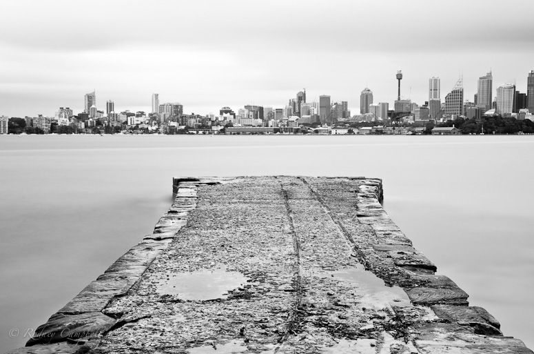
#4 probably the best (personal opinion) but lacks punch, a bit of PP love could go along way here.


would you liek me to come round with teh whip and chains now? :wink:

hth (if it don't, tough titties :rotfl2: )

Re: The BigStopper Diaries...

PostPosted: Wed Jun 15, 2011 2:59 pm
by surenj
biggerry wrote:its a struggle to get people to comment let alone be brutal..but nontheless, here we go.

:mrgreen:

I think you have achieved the look you wanted. The skies and water look nice and creamy. :cheers:

Composition is strongest in #2 then #4. Although the other compos are ok the boring stone wall dominates the image and I assume that it is not the subject.

Overall they look a little bland except perhaps #2. You can do with a little selective clarity and contrast in the non-water and non-sky areas.

#3 (Milk) why don't you try and crop out that rock and keep the sydney city as a pano?

#4 definitely needs a bit of lift and I think it will be a nice image. The foreground rocks and the background are nicely balanced as is the composition which draws you in.

Not every image needs to be contrasty or punchy and I guess you could experiment with a further extremely washedout effect with some of these. :idea:

HTH and if it doesn't please halve my pay. :wink:

Re: The BigStopper Diaries...

PostPosted: Wed Jun 15, 2011 3:56 pm
by Remorhaz
aim54x wrote:These nicely demonstrate the effects of a big stopper but they are a bit bland in some ways. I wouldnt mind seeing a bit more contrast


biggerry wrote:brutal eh...
its a struggle to get people to comment let alone be brutal..but nontheless, here we go.


Thanks guys - this is pretty much exactly what I'm after :)

I could post to flickr if all I wanted was to have people blow smoke up my a$$ and tell me how wonderful the pictures look. I know I'm essentially fine with the technical aspects of taking images but what I struggle with is composing to tell a story or to enhance the subject and the thoughtful post processing to enhance that vision.

NB: these images generally weren't PP'd much - just cropped (straightened & lens corrected where necessary) and then a fairly simple monochrome conversion. For the two new ones below I've now done selective PPing to taste...

#1 poor choice in cropping/or framing the line of the stonework is broken by the interesection on the right handside breaking the flow of the image. Crop the bottom 1/3rd of you current version and problem goes away and looks good imo. Lacks contrast and looks like sydneys been thru the washing machine and lost its colour, make blacks black and whites white. take with a grain of salt since i struggle with BW.


Point (almost :)) taken - I wasn't exactly sure what you meant by the above - I assume you meant that the long rock wall meeting the other long rock wall right on the right hand edge was bad (truth be told I was trying to exclude something to the bottom right from the frame - I probably should have cloned it out in post). However rather than further pano crop - what do you think of this a re-cropping and PPing...

Image

#2 what does the bigstopper add to this scene? good composition tho.


Basically just milky water and sky :)

#3 same as #1 but crop out the RHS of the image and concentrate on where the eye gets led. the effect is interesting here (albeit only on th eLHS of the stonework) and adds to teh frame IF the RHS is cropped away. I reckon ditch the SHB and work with teh city and the tower as anchor or subject points.


Thanks - other than #2 this was my favourite image so again I've done some more selective PP and gone back to a 3x2 ratio...

Image

#4 probably the best (personal opinion) but lacks punch, a bit of PP love could go along way here.


:) funny this was my least favourite of the 4 - and pretty much untouched from a PP point of view (other than to set the WB to cloudy and adjust the exposure and vibrance). I'll make sure I revisit i=and see what I can do :)

Re: The BigStopper Diaries...

PostPosted: Wed Jun 15, 2011 9:44 pm
by aim54x
Remorhaz wrote:
aim54x wrote:These nicely demonstrate the effects of a big stopper but they are a bit bland in some ways. I wouldnt mind seeing a bit more contrast


biggerry wrote:brutal eh...
its a struggle to get people to comment let alone be brutal..but nontheless, here we go.


Thanks guys - this is pretty much exactly what I'm after :)

I could post to flickr if all I wanted was to have people blow smoke up my a$$ and tell me how wonderful the pictures look. I know I'm essentially fine with the technical aspects of taking images but what I struggle with is composing to tell a story or to enhance the subject and the thoughtful post processing to enhance that vision.


Glad that someone is after critique and not an ego boost!

Re: The BigStopper Diaries...

PostPosted: Thu Jun 16, 2011 6:48 pm
by Remorhaz
surenj wrote:I think you have achieved the look you wanted. The skies and water look nice and creamy.


Thanks - that was the easy part :)

Composition is strongest in #2 then #4. Although the other compos are ok the boring stone wall dominates the image and I assume that it is not the subject.


... well... actually - my intent was to highlight that so called boring stone whatever it is that goes out into the water :)

Overall they look a little bland except perhaps #2. You can do with a little selective clarity and contrast in the non-water and non-sky areas.


and done :)

#4 definitely needs a bit of lift and I think it will be a nice image. The foreground rocks and the background are nicely balanced as is the composition which draws you in.


I did try some PP love on this image but I couldn't really get it much further along :(

Not every image needs to be contrasty or punchy and I guess you could experiment with a further extremely washedout effect with some of these.


Yep - my original intent was for the washed misty out look - I probably didn't wash out enough (maybe because my eyes want at least some contrast) - maybe I should have gone for total washout?

aim54x wrote:Glad that someone is after critique and not an ego boost!


:)